Let’s say you want to go out for an expensive dinner. But since it is expensive, you want to make an informed decision about where to go. So you pick up a set of magazines that review such restaurants. And to help you decide, you plot the ratings in a visual format, say a separate column chart for each magazine.
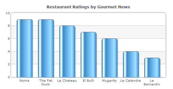
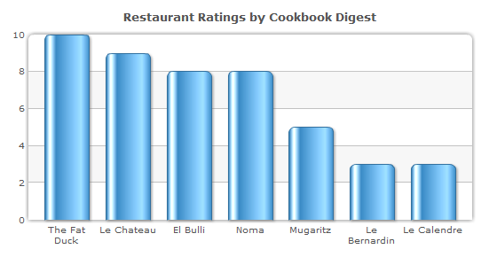
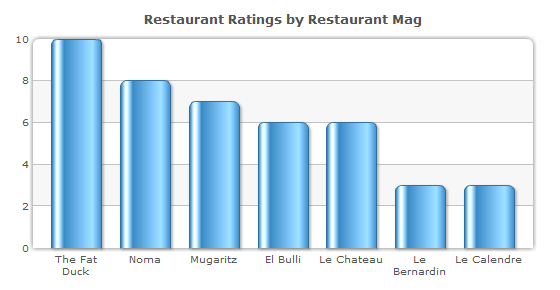
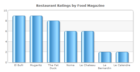
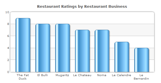
The column charts do a great job of bringing out the highs and the lows in the ratings. You can easily see that Noma and The Fat Duck come highly recommended by Gourmet News, and Le Benardin is best avoided. But knowing how subjective these ratings are, which the column charts clearly show, wouldn’t you like to consider all the ratings at once to make your decision?
Bring in the Heat Map Chart
The Heat Map Chart represents data in a tabular format with user-defined color ranges like low, average and high. So putting together all the ratings from different magazines, you will arrive at the following heat map chart. [Explore more Heat Map Charts] 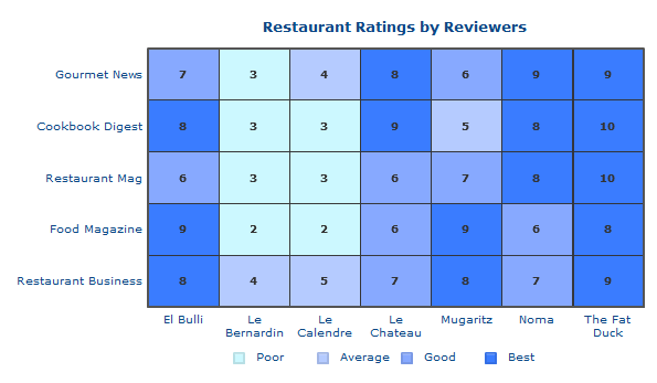
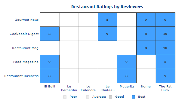 Now how about taking it a step further? Rather than having predefined ranges, how about choosing your own range on the chart itself?
Bring in the gradient legend
The gradient legend is a continuous range, instead of being broken into three discrete ranges. This affects the rest of the chart as well since the data sets pick their color from where their value falls in the gradient range instead of one of the three discrete values.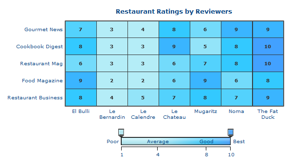
You just have to drag the pointers to select whatever range you want.
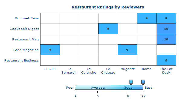
Isn’t it much easier to choose a restaurant using the Heat Map chart? Of course, you wouldn’t be creating a Heat Map chart every time you need to choose a restaurant. So let’s take a look at some of the more business uses of the chart.
Applications of the Heat Map Chart
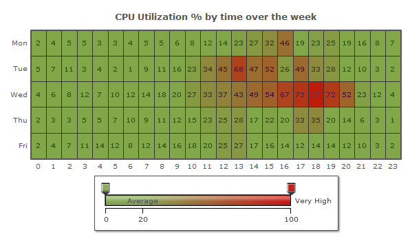
A heat map chart can be used to visualize complex data like performance comparison of different companies, market response, stock market investments, and lots more.In the chart below, we are visualizing the weekly CPU utilization of 23 computers in a network. Here you can easily know which computers have logged extreme values. If it were not for the heat map chart, the data would have been visualized using separate column or line charts which would’ve been very cumbersome.
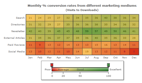
It is a similar case with a huge marketing data set. From the heat map chart below, you can easily point out the best performing mediums versus the loss-making mediums. Instantaneous understanding is where the heat map chart scores highly.
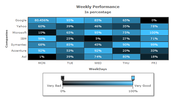
In the Weekly Performance chart below, it is very easy to distinguish the high performers from the laggards because of the color gradations.
This was all about the heat map chart. You can use it to visualize large amounts of data, and your analysis will be much quicker because of the color gradations. You can see more examples, read more about the heat map chart and download it from here.


Noufal
August 23, 2011, 6:08 pmI am searching for a heat map chart for stock market represenation.It will be same as represented above but it will have a 3d effect i will put an example link here
https://finviz.com/map3d.ashx
Please let me know where i can get such chart.It is vailable with fusion charts..
Hrishikesh Choudhari
August 23, 2011, 6:23 pmHi Noufal,
The sample chart that you linked to is a Tree Map chart. Unfortunately FusionCharts does not have a Tree Map chart in its suite.
If there is anything else you require then let us know.
Thanks for stopping by.
Yemi Thompson
May 24, 2013, 12:57 amIs there a way to place the column names on top of the chart?
Swarnam
May 27, 2013, 12:54 pmHey,
Using “xAxisLabelsOnTop” attribute allows you to display the x-axis labels on top of the chart canvas.
Ryby
August 1, 2013, 9:47 amI try it, but it doesn’t work! Did I miss something?
{
“chart”: {
“xAxisLabelsOnTop”:”1″,
“subcaption”: “In percentage”,
“caption”: “Weekly Performance”,
“bgcolor”: “CACBEE”,
“yaxisname”: “Companies”,
“xaxisname”: “Week Days”
},
“dataset”: [
{
“data”: [
{
“value”: “68”,
“columnid”: “Mon”,
“rowid”: “Google”
},
{
“value”: “35”,
“columnid”: “Tue”,
“rowid”: “Google”
},
{
“value”: “95”,
“columnid”: “Wed”,
“rowid”: “Google”
},
{
“value”: “17”,
“columnid”: “Thu”,
“rowid”: “Google”
},
{
“value”: “55.98”,
“columnid”: “Fri”,
“rowid”: “Google”
},
{
“value”: “0”,
“columnid”: “Mon”,
“rowid”: “Yahoo”
},
{
“value”: “71”,
“columnid”: “Tue”,
“rowid”: “Yahoo”
},
{
“value”: “40”,
“columnid”: “Wed”,
“rowid”: “Yahoo”
},
{
“value”: “63”,
“columnid”: “Thu”,
“rowid”: “Yahoo”
},
{
“value”: “29”,
“columnid”: “Fri”,
“rowid”: “Yahoo”
},
{
“value”: “98”,
“columnid”: “Mon”,
“rowid”: “Microsoft”
},
{
“value”: “48”,
“columnid”: “Tue”,
“rowid”: “Microsoft”
},
{
“value”: “31”,
“columnid”: “Wed”,
“rowid”: “Microsoft”
},
{
“value”: “79”,
“columnid”: “Thu”,
“rowid”: “Microsoft”
},
{
“value”: “39”,
“columnid”: “Fri”,
“rowid”: “Microsoft”
}
]
}
],
“colorrange”: {
“endlabel”: “Very Good”,
“startlabel”: “Very Bad”,
“code”: “F1C4EE”,
“minvalue”: “0”,
“gradient”: “0”,
“color”: [
{
“code”: “FFEBE8”,
“minvalue”: “0”,
“label”: “BAD”,
“maxvalue”: “30”
},
{
“code”: “C6C0FF”,
“minvalue”: “0”,
“label”: “AVERAGE”,
“maxvalue”: “70”
},
{
“code”: “C5A2EB”,
“minvalue”: “0”,
“label”: “GOOD”,
“maxvalue”: “100”
}
]
}
}
Swarnam
August 1, 2013, 12:43 pmHey,
Can you try using “placeXAxisLabelsOnTop” attribute in the chart element?
Ruby
August 1, 2013, 3:45 pmYes, using “placeXAxisLabelsOnTop” attribute is right! But why “xAxisLabelsOnTop” cannot realize the function?
Thank you very much!
Swarnam
August 5, 2013, 12:22 pmHey,
“placeXAxisLabelsOnTop” has to be used with the latest version of PowerCharts XT. However, if there is a change in the attribute name in our future release, we would update the blog post.
Peter
August 13, 2013, 5:04 pmThis heat Map Chart its free ? can i use directly JSON Or xml code .with any library ..
Sanjukta
August 13, 2013, 6:18 pmThe evaluation version of Heat Map chart is available for free of cost in the PowerCharts XT Download package that comes with an evaluation watermark. You can also purchase the non-watermarked files.
In the “Charts” folder of the Downloaded package, you will be able to find the respective Chart SWF flles (“HeatMap.swf” file in this case) besides the FusionCharts JavaScript libraries that will let you render the chart on the browser. The chart accepts data only in the supported XML/JSON data format, mentioned here in the online documentation.
You may check in this page for the steps to create a simple Heat Map chart using the JavaScript libraries and the supported data.