We like talking to our customers. Over email, phone calls and face-to-face meetings at tradeshows, we discuss how they are using FusionCharts, the problems they are facing and new capabilities they would like to see added to it. They are generous with their feedback and often have nice words to say about us. Over the last couple of quarters, we noticed something interesting. Shocking, actually. A lot of our customers were asking for features that were already there in the product. At times, they sent us 4-5 feature requests only to know that all of them were there already. And then we thought to ourselves – if our customers don’t know everything they can do with the product after they have paid money to buy a license, what about the first-time visitors? What about people who are just looking around trying to find a charting component to meet their requirements? Even though we have a vast product literature with real-life demos, chart galleries, extensive documentation and more, something was missing. What we didn’t have was something that covered FusionCharts in an all-round manner. Something that talked about everything FusionCharts can do. And that’s when we decided to create our shining new product tour.
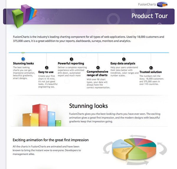 Creating the product tour was a long journey but we are very proud of what we have come up with. In this post, I will take you through this complete journey and talk about all the phases involved in great details – inspiration, conceptualization, content structure, design, development and the usability aspects we worked on throughout. I will also talk about all the challenges we faced and how we overcame them to finally develop the product tour.
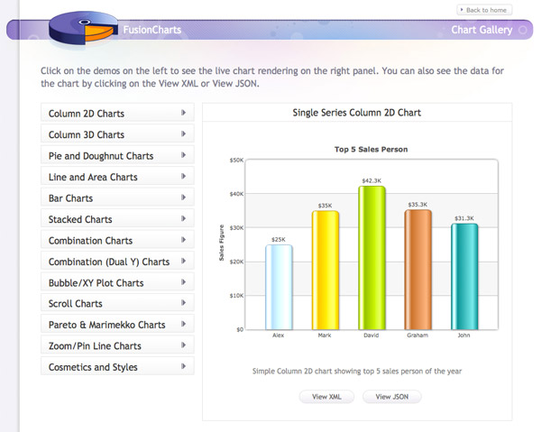 As you would have guessed, it takes a lot of time, planning and effort to create such elaborate product literature. But we feel the time and effort is well justified. We don’t want visitors to come to our website, look at our product, read through the feature list and then map them one-by-one to their requirements to see if it suits them well. We want them to come to the website, take a look at a demo (we have demos for different domains and roles) and scream – This is EXACTLY what I am looking for! This is not to say that having a list of features is bad, but that a list of features by itself is incomplete literature for most products out there. In fact, we had a half-assed feature tour ourselves that we retired recently.
Our philosophy also stems from the fact that when we started in 2002, we pioneered the very concept of Flash charting (and interactive charting in turn). Most people just couldn’t visualize how a charting component could improve the user experience of their entire application. We had to educate them on how it helps them replace their boring data and give their users a more powerful reporting experience. To do this, we had to show them how their apps could look better with better charting. Now nine years down the line, charting has become an industry in itself and most people understand the importance of a good charting component.
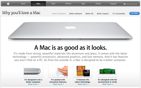
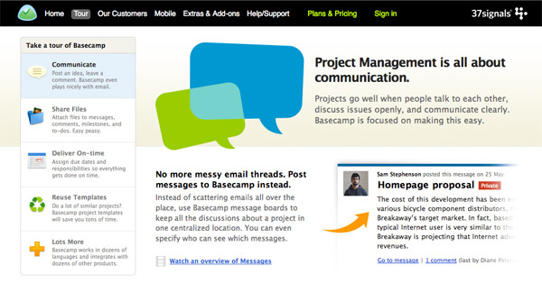 Once we saw that, we had a good picture of what the FusionCharts product tour could be like. Then we came across Apple’s Why Mac section and that was it. Our inspiration was all sorted out.
 With the headers done, we moved on to the content for the features. For the content, we were pretty clear on what we wanted right from the start. We wanted it to be like tweets – short, crisp, one idea at a time.
 The Basecamp layout had three things going very right for us:
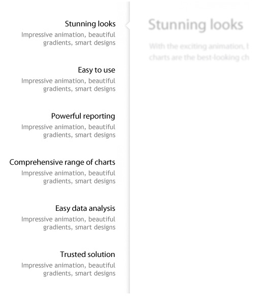 We had to get back to the drawing board again. Quite clearly, vertical navigation was not going to work for us. We don’t use horizontal navigation a lot, so we took some time to condition our brains to that. Our main concern was whether we will be able to fit the six headers side-by-side, and what happens when a seventh one comes in? To try out our concept, we quickly created a simple horizontal navigation bar.
 Whoops…this could accommodate only five headers. Even if we decided to break down comprehensive range of charts into two lines, it would still be very tight for six headers. Lowering the font size would reduce readability. No matter what we did, putting all the headers side-by-side wasn’t going to work.
What if we could create some sort of navigation in which all the headers did not have to be next to each other? The design team then came up with a circle-based “irregular” navigation style.
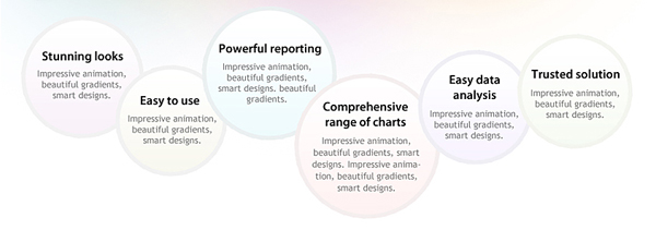 This was unlike any navigation we have seen before, and we found it very interesting. However, after some discussion, we realized that this would not be the best solution either. Since the circles have to be in different sizes, the headers in the bigger circles seem like they are more important than the smaller ones. This interferes with the left-to-right prioritization we had already set. Also, when we tried visualizing the design for the rest of the section, we did not think this would be the ideal solution. It would be too unstructured.
Then we thought if we can do an irregular navigation, why not just make it more structured with some sort of a layered navigation? The design team got back to work and came up with a two-level navigation.
 This was it! As soon as we saw it, we knew this was the navigation we were looking for. All the headers fit in well, they got enough breathing space, so did the descriptions and the priority was maintained too. Just to make sure that the user knows where exactly in the slideshow he is, we added some more tweaks to finally come to:
 So we had the navigation that worked perfectly for us. As to our concern about what happens if another header comes in, we realized that a seventh header in a product tour would anyway be an overkill. New capabilities are most likely going to find a place under one of the existing headers. And if they don’t, we would restructure the content than change the design.
The vertical navigation not working out turned out to a blessing in disguise. It meant that we would now have an open layout giving more space to the images accompanying the features. The design team was very happy. It also meant that the tour will have a more slideshow feel with the horizontal navigation, instead of a mix of both.
Time to decide on the navigation bar at the bottom now. Again we wanted to give it a slideshow feel but not restrict the visitor to just the next and previous slide. So we decided to have a paginator-style navigation for jumping to any slide with a click.
 The Previous and Next is also clickable. While it looked very neat, the user will be left guessing what the next slide is when you click on Next, and dependent on his memory when he clicks on Previous.
How about adding the slide names as a tooltip when the user hovers over Previous or Next? That would put an end to the guesssing games.
 Sweet, don’t you think? But wait a minute. Why should someone spend time to hover over Previous/Next for the slide name? Why can’t we just put the slide name instead of Next and Previous?
Finally, we decided to have the paginator in the middle for quick navigation and the previous/next slide names at the opposite ends of the bar.
 When the user needs to jump to a slide other than the previous or next one, he can just hover over the paginator buttons and he will get a tooltip with the name of the slide it takes him to.
 So with this navigation bar, everything we were looking for was covered in a very user-friendly manner.
Time to move on to the most important thing – the content area. We had to conceptualize and design the images to accompany the features. Our aim with the images was to make them so clear that just looking at the images gives a clear idea of what the feature is. Only if you want more in-depth details, you would have to read the text.
We put together our pointers on what the images should be to explain the feature the best, and passed it on to the design team. Design then went into hiding, but when they finally came out of it, we saw the most stunning images we have ever seen in our product literature.
 Each and every feature was explained clearly with the minutest attention to details.
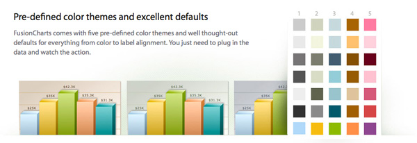 Also with an open layout, we could play around with the shape and size of the image the way we needed. The way the feature needed, to put more aptly. So we had images small enough to be sitting pretty next to the text, images big enough to occupy the entire horizontal space and then there were those that pretty much engulfed the text.
 The only thing we needed to add now was a way to get out once the tour was over. The visitors would either like to see the charts in action in online demos or chart galleries, download an unlimited trial of it or if the the tour did a good job, they might want to check out the licensing. So we added these four call-to-action buttons on the last slide.
 The reason we did not add the call-to-action buttons in the intermediate slides was that it would distract the viewers during the guided tour, and they might end up in unintended places. But what if for someone, one set of features (say comprehensive range of charts) was all they were looking for and they want to download a trial copy right after that? To strike a balance between the two, we decided to put the links in text instead of the bold buttons in all the other slides, in a font smaller than the slide names.

 The images had to be preloaded as well. We incorporated a common CSS where images were sprited and arranged in such a way that they load in the order the tour is viewed. Just like the page content, even when a particular section is not being viewed, its images continue to load in the background.
During development as well, we have put in a lot of effort to make the tour as usable as possible. We have added animated scrolling to help users navigate from one slide to another. So when the user clicks on a slide name, either using the navigation at the top or bottom, the page automatically scrolls to the place where the content of the slide starts with some cool animation.
 Also within the slideshow, the user can use the browser’s back and next button to move back and forth. So he isn’t restricted only to the navigation we provide.
Beyond everything else, we wanted to make the tour compatible on a wide range of browsers and OS. And for that, we ensured that everything had a graceful degradation. Even the lack of AJAX (for browsers without JavaScript) has an alternative viewing method.
 Creating the product tour was a long journey but we are very proud of what we have come up with. In this post, I will take you through this complete journey and talk about all the phases involved in great details – inspiration, conceptualization, content structure, design, development and the usability aspects we worked on throughout. I will also talk about all the challenges we faced and how we overcame them to finally develop the product tour.
Table of Contents
First, a little history
Ever since FusionCharts was born, we have always believed that a product without accompanying product literature is only half complete. And I am not talking about literature that tells you how to implement the product. That is a given for any good product. I am talking about literature that tells the user what is in it for him, gets him thinking about things he can do with it and helps jumpstart his development. Right from day one, we have had real-life demos and a chart gallery to show users exactly what they can do with FusionCharts. Over time, we have added other things like a 3-min video overview as well for people who are too busy to go through the demos and gallery. As you would have guessed, it takes a lot of time, planning and effort to create such elaborate product literature. But we feel the time and effort is well justified. We don’t want visitors to come to our website, look at our product, read through the feature list and then map them one-by-one to their requirements to see if it suits them well. We want them to come to the website, take a look at a demo (we have demos for different domains and roles) and scream – This is EXACTLY what I am looking for! This is not to say that having a list of features is bad, but that a list of features by itself is incomplete literature for most products out there. In fact, we had a half-assed feature tour ourselves that we retired recently.
Our philosophy also stems from the fact that when we started in 2002, we pioneered the very concept of Flash charting (and interactive charting in turn). Most people just couldn’t visualize how a charting component could improve the user experience of their entire application. We had to educate them on how it helps them replace their boring data and give their users a more powerful reporting experience. To do this, we had to show them how their apps could look better with better charting. Now nine years down the line, charting has become an industry in itself and most people understand the importance of a good charting component.
Why the need for a product tour?
Good question. So while we had a lot of product literature, none of them served the purpose of talking about FusionCharts in a well-rounded, yet concise manner. The demos are great for the this-is-exactly-what-I-want moment and later on, to help jumpstart development (both for inspiration and learning best practices), but we don’t want to push features in them just for the sake of it. We want to keep them as true to the domain as we can. The chart gallery is good for understanding everything possible with the charts individually, but not with the product as a whole. Also, the demos and the gallery give us a chance to bring out only the end user side of things. They don’t talk about the implementation side of things. The 3-min video is what came the closest to it but there’s only so much a video can cover – and you can’t have call-to-action links in them as neatly as in a web page. The feature tour was too text-based, and it was a “feature” tour. We started getting serious about our product tour first when we saw Basecamp’s tour. Coming from 37signals, known for their great copywriting and no-nonsense approach to business, it clearly explains everything Basecamp can do for you. No buzzwords, no feature lists, only benefits. Once we saw that, we had a good picture of what the FusionCharts product tour could be like. Then we came across Apple’s Why Mac section and that was it. Our inspiration was all sorted out.

Starting out
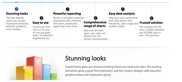
To start the project, we had to figure out the structure of the tour. Now FusionCharts is a comprehensive charting suite containing multiple products and a lot of different features. To give you an idea of what we are talking about, let me quickly throw some facts at you. Don’t worry it they don’t make sense. The charts are animated, they are interactive and they can be in 2D and 3D. They are available in Flash & JavaScript and work on PCs, Macs, iPads, iPhones and a majority of other mobile devices. There are over 90 chart types each with their different use. Then there are things about drill-down, image export, number formatting options, data highlighting and ninety five other things FusionCharts can do for you. And then things about the extensive documentation and knowledge base, the wonderful community and the customer base side of things. Quite clearly, simply listing all of these out was not going to work. It would make it another feature tour. We had to group them under meaningful heads so that they were easy to find and remember. Now the thing is we don’t sell features, we sell benefits. That is one of the reasons our feature tour always remained half-assed and wasn’t updated with new releases. I mean, will you care about everything a product can do? No. You will only care about what it can do for you. So when we had to categorize all the features of FusionCharts under headers, they had to be benefit-driven. Some of the headings chose themselves – stunning looks, powerful reporting, comprehensive range of charts and trusted solution. For the others, we had to think of ways to encapsulate all the features (let’s call them features for the sake of a smooth read) grouped under them. After much deliberation, we finally came to six headers (easy to use and easy data analysis being the other two) and put them in the order of priority. With everything put under headers, we decided that the tour would be like a slideshow with a slide for every header. Each slide will have a description to accompany the header and summarize all the features in that slide. This makes it easier for the user to understand which slides are of interest to him before he clicks on them. With the headers done, we moved on to the content for the features. For the content, we were pretty clear on what we wanted right from the start. We wanted it to be like tweets – short, crisp, one idea at a time.

On to the layout and design
For the layout, we went back to Basecamp. We really liked their layout, and decided a similar one would work perfectly for us too. The Basecamp layout had three things going very right for us:
- It had a structure very similar to ours. Five headers, each having a short description, clubbing features under them.
- When you select a header, a slightly more detailed description comes up with an accompanying image.
- The description of the features were very similar to the length we had.
- The web and design team thought that the images accompanying the features weren’t getting enough space. They thought we needed a more open layout (since charting is not as easy to relate to as project management) and that the content section could be more modern.
- The tour had more of a website feel than a slideshow or a guided tour. With PPTs, we are used to navigating horizontally, not vertically.
 We had to get back to the drawing board again. Quite clearly, vertical navigation was not going to work for us. We don’t use horizontal navigation a lot, so we took some time to condition our brains to that. Our main concern was whether we will be able to fit the six headers side-by-side, and what happens when a seventh one comes in? To try out our concept, we quickly created a simple horizontal navigation bar.
 Whoops…this could accommodate only five headers. Even if we decided to break down comprehensive range of charts into two lines, it would still be very tight for six headers. Lowering the font size would reduce readability. No matter what we did, putting all the headers side-by-side wasn’t going to work.
What if we could create some sort of navigation in which all the headers did not have to be next to each other? The design team then came up with a circle-based “irregular” navigation style.
 This was unlike any navigation we have seen before, and we found it very interesting. However, after some discussion, we realized that this would not be the best solution either. Since the circles have to be in different sizes, the headers in the bigger circles seem like they are more important than the smaller ones. This interferes with the left-to-right prioritization we had already set. Also, when we tried visualizing the design for the rest of the section, we did not think this would be the ideal solution. It would be too unstructured.
Then we thought if we can do an irregular navigation, why not just make it more structured with some sort of a layered navigation? The design team got back to work and came up with a two-level navigation.
 This was it! As soon as we saw it, we knew this was the navigation we were looking for. All the headers fit in well, they got enough breathing space, so did the descriptions and the priority was maintained too. Just to make sure that the user knows where exactly in the slideshow he is, we added some more tweaks to finally come to:
 So we had the navigation that worked perfectly for us. As to our concern about what happens if another header comes in, we realized that a seventh header in a product tour would anyway be an overkill. New capabilities are most likely going to find a place under one of the existing headers. And if they don’t, we would restructure the content than change the design.
The vertical navigation not working out turned out to a blessing in disguise. It meant that we would now have an open layout giving more space to the images accompanying the features. The design team was very happy. It also meant that the tour will have a more slideshow feel with the horizontal navigation, instead of a mix of both.
Time to decide on the navigation bar at the bottom now. Again we wanted to give it a slideshow feel but not restrict the visitor to just the next and previous slide. So we decided to have a paginator-style navigation for jumping to any slide with a click.
 The Previous and Next is also clickable. While it looked very neat, the user will be left guessing what the next slide is when you click on Next, and dependent on his memory when he clicks on Previous.
How about adding the slide names as a tooltip when the user hovers over Previous or Next? That would put an end to the guesssing games.
 Sweet, don’t you think? But wait a minute. Why should someone spend time to hover over Previous/Next for the slide name? Why can’t we just put the slide name instead of Next and Previous?
Finally, we decided to have the paginator in the middle for quick navigation and the previous/next slide names at the opposite ends of the bar.
 When the user needs to jump to a slide other than the previous or next one, he can just hover over the paginator buttons and he will get a tooltip with the name of the slide it takes him to.
 So with this navigation bar, everything we were looking for was covered in a very user-friendly manner.
Time to move on to the most important thing – the content area. We had to conceptualize and design the images to accompany the features. Our aim with the images was to make them so clear that just looking at the images gives a clear idea of what the feature is. Only if you want more in-depth details, you would have to read the text.
We put together our pointers on what the images should be to explain the feature the best, and passed it on to the design team. Design then went into hiding, but when they finally came out of it, we saw the most stunning images we have ever seen in our product literature.
 Each and every feature was explained clearly with the minutest attention to details.
 Also with an open layout, we could play around with the shape and size of the image the way we needed. The way the feature needed, to put more aptly. So we had images small enough to be sitting pretty next to the text, images big enough to occupy the entire horizontal space and then there were those that pretty much engulfed the text.

The marketing stuff and some further tweaks
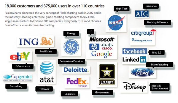
When we were conceptualizing the tour, we were thinking of it as a guided tour that a first-time visitor to the website takes and nothing else. Once the design was complete and we were able to see what it actually looked like, we thought it would make for a great landing page as well. Sending people from our marketing campaigns to a page which summarized everything the product did in a nice graphical way would be great. However, they might feel lost if they are directly sent to a page with six headers being thrown at them. We had to warm them up by telling them what FusionCharts is and how it helps them before we get into details. And we had to do this quick. So we added a two-line description of FusionCharts right at the top of the tour. Anyone new would feel at home, anyone returning can comfortably skip it. The only thing we needed to add now was a way to get out once the tour was over. The visitors would either like to see the charts in action in online demos or chart galleries, download an unlimited trial of it or if the the tour did a good job, they might want to check out the licensing. So we added these four call-to-action buttons on the last slide.
 The reason we did not add the call-to-action buttons in the intermediate slides was that it would distract the viewers during the guided tour, and they might end up in unintended places. But what if for someone, one set of features (say comprehensive range of charts) was all they were looking for and they want to download a trial copy right after that? To strike a balance between the two, we decided to put the links in text instead of the bold buttons in all the other slides, in a font smaller than the slide names.

Moving on to development
On the development side, our main objective was to make the pages load fast given the number of images and make sure it worked on a majority of browsers and operating systems just like our products 🙂 Since the product tour is like a slideshow, every page in it has to be preloaded. For that, we used AJAX to fetch the page content. This not only made the initial load fast, but also enabled the pages to load in the background while the user is viewing one section. The images had to be preloaded as well. We incorporated a common CSS where images were sprited and arranged in such a way that they load in the order the tour is viewed. Just like the page content, even when a particular section is not being viewed, its images continue to load in the background.
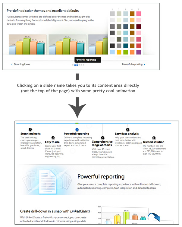
During development as well, we have put in a lot of effort to make the tour as usable as possible. We have added animated scrolling to help users navigate from one slide to another. So when the user clicks on a slide name, either using the navigation at the top or bottom, the page automatically scrolls to the place where the content of the slide starts with some cool animation.
 Also within the slideshow, the user can use the browser’s back and next button to move back and forth. So he isn’t restricted only to the navigation we provide.
Beyond everything else, we wanted to make the tour compatible on a wide range of browsers and OS. And for that, we ensured that everything had a graceful degradation. Even the lack of AJAX (for browsers without JavaScript) has an alternative viewing method.

katrina Scotto di Carlo
January 8, 2014, 1:56 amGreat post! A team of one over here tasked with making a tour, so this was extremely helpful. Thanks so much for generously sharing your process.