Have you ever been overwhelmed by a massive data set and wondered, “How do I make sense of all this?” We’ve all been there. The good news? There’s a simple yet powerful way to visualize data that cuts through the chaos: the bubble map.
Bubble maps aren’t just another pretty way to display numbers—they’re game-changers for anyone who wants to spot patterns, trends, and outliers quickly. So, buckle up! We’re about to dive into the world of bubble maps, exploring what they are, how they work, and why you should start using them to make your data sing.
Table of Contents
What Is a Bubble Map?
Let’s start with the basics. A bubble map is a type of chart that uses circles (or “bubbles”) to represent data points. The size of each bubble corresponds to a specific value, while the position of the bubble on the X and Y axes represents other variables. It’s kind of like a scatter plot but with an added dimension—size.
In a nutshell, bubble maps make complex data easier to digest by turning numbers into visual elements. The bigger the bubble, the larger the value. Pretty straightforward, right?
Key Features of a Bubble Map:
- Bubbles represent values: Each bubble’s size indicates a data value, making it easy to compare different values at a glance.
- Multiple variables: The position of bubbles on the X and Y axes allows you to compare two other variables simultaneously.
- Color-coded bubbles: Often, bubble maps use color to represent an additional variable, adding another layer of insight.
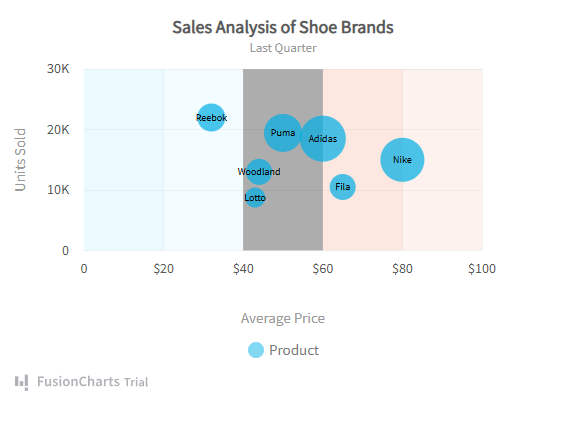
We’ve featured a sample bubble chart created using the FusionCharts library to provide a practical example. This interactive chart, crafted by Madhulika Mukherjee, demonstrates how bubble charts can transform complex data into intuitive visual insights. You can explore this example directly on CodeSandbox.

Why Use a Bubble Map?
Now, you might be wondering, “Why should I use a bubble map instead of other types of charts?” Great question! Here’s why bubble maps deserve a place in your data visualization toolkit:
- Easily Identify Patterns and Trends
Bubble maps make it easy to see correlations between different variables. With just a glance, you can spot patterns that might be hidden in a table full of numbers.
- Showcase Outliers
Outliers—those data points that don’t fit the norm—tend to stand out on bubble maps. If one bubble is dramatically larger (or smaller) than the others, you’ll notice it immediately.
- Condense Complex Data
If you’re working with a lot of variables, a bubble map lets you visualize multiple data dimensions in one chart, saving you time and space.
- Engage Your Audience
Let’s face it—tables can be boring. Bubble maps, on the other hand, are visually engaging and easier for your audience to interpret. Whether you’re presenting to stakeholders, clients, or colleagues, a well-designed bubble map can help you tell a compelling data story.
How to Read a Bubble Map
Reading a bubble map is as easy as pie—once you know what to look for! Here’s a quick breakdown:
- Bubble Size
The size of the bubble represents the value of the variable. A larger bubble means a larger value, and a smaller bubble means… you guessed it, a smaller value.
- Position on X and Y Axes
Just like with a scatter plot, the position of the bubble on the X and Y axes represents two variables. For example, on a sales bubble map, the X axis might represent the number of units sold, and the Y axis might represent profit margins.
- Bubble Color
In some bubble maps, the color of each bubble represents a third variable. For example, bubbles might be color-coded to show geographical regions or customer segments.
- Clusters and Gaps
When reading a bubble map, look for clusters of bubbles. Clusters often indicate a trend or correlation between variables. Gaps, on the other hand, may suggest an absence of data or a lack of correlation.
When to Use a Bubble Map
Bubble maps aren’t just for fun—they’re perfect for specific scenarios where standard charts fall short. Here are some situations when a bubble map shines:
-
Market Analysis: Compare market share (bubble size), product demand (X axis), and profit margins (Y axis).
Sales Data: Visualize sales figures by region, with bubble size representing revenue and bubble position representing volume.
Survey Results: Use a bubble map to compare multiple survey metrics, such as satisfaction score (X axis), response time (Y axis), and the number of responses (bubble size).
How to Create a Bubble Map
Creating a bubble map doesn’t require rocket science—just a solid data set and the right tool. Here’s a step-by-step guide to building one from scratch:
- Gather Your Data
First things first: make sure you’ve got a good data set. You’ll need at least three variables to create a bubble map. For example, you might collect sales figures, customer satisfaction scores, and market share percentages.
- Choose a Charting Tool
There are plenty of tools out there that make creating bubble maps a breeze. Here are a few popular options:
- FusionCharts: A robust JavaScript library for creating interactive and responsive charts, including bubble maps.
- Google Sheets: If you’re working with simple data, Google Sheets has a bubble chart option built right in.
- Tableau: A favorite among data professionals, Tableau offers advanced bubble map features with customizable options.
- Set Your Axes and Data Points
Once you’ve chosen your tool, it’s time to plot your data. Assign one variable to the X axis, another to the Y axis, and a third to the bubble size. If your tool allows for it, add a fourth variable by color-coding the bubbles.
- Customize Your Map
To make your bubble map truly stand out, don’t forget to customize it. Adjust the color scheme, add labels, and tweak the axis scales to ensure your map is easy to read and visually engaging.
- Analyze and Share
With your bubble map complete, take some time to analyze the data and identify key insights. Then, share it with your team or clients to help them understand the story behind the numbers.
FAQs about Bubble Maps
What’s the difference between a bubble map and a scatter plot? While both charts use the X and Y axes to display data, a bubble map adds a third dimension—bubble size—representing an additional variable. This makes bubble maps more versatile for displaying complex data sets.
Can I use a bubble map for categorical data? Yes! While bubble maps are typically used for numerical data, you can also use them to represent categorical data by assigning categories to bubble color or position.
Are bubble maps suitable for large data sets? Absolutely. Bubble maps excel at condensing large data sets, allowing you to visualize multiple variables in a single chart. Just be sure not to overcrowd your map with too many bubbles—otherwise, it might get hard to read.
Conclusion
Bubble maps are a powerful tool for making sense of complex data. Whether you’re comparing market performance, analyzing survey results, or exploring sales trends, a bubble map can help you visualize key insights in an intuitive, engaging way. With just a few clicks, you can create a bubble map that not only simplifies your data but also tells a compelling story.
So, next time you’re staring down a massive spreadsheet, don’t sweat it—try building a bubble map and watch your data come to life.


