Table of Contents
What Does This Mean for You?
A lot. But in a nutshell, here’s what you can do with FusionCharts Free:- Use it for any purpose, commercial or personal.
- Modify its source code to suit your needs.
- Share it with your friends and neighbors.
- Re-distribute FusionCharts Free, modified, or the way it is, as part of your software or hardware applications.
Why Choose Open Source?
There is one main reason why we decided to go open-source. It’s a slightly longer explanation, but we would be glad if you stayed with us on this. Charting is a very generic product. No, not the Microsoft Office type-generic, but a wide variety of people still uses it. Different people with different technical backgrounds and different requirements. While the BI folk would like the charts to make for a comprehensive reporting experience, the people using them in Facebook applications would like to see striking graphics and cool animations. And then there are the people who use it in networking tools, website analytics, health monitors, surveys, etc. While we could patiently sit down on a lazy Sunday afternoon and try granting all your wishes, let’s accept it – YOU know best what you need. Figuring out everything that you need and, more importantly, how you need it will be a pretty long-winded process for us. Also, it would not be too wise to overwhelm new users with thousands of features when a simple animated chart is all they need. And what’s that thing called file size? With FusionCharts Free as open-source, you can take up the source code and keep what you like, throw what you do not, add what you would like. Just do everything to make it perfectly suited to your needs.More Than Just Source Code
Someone famous once famously said, “A project does not become open source simply by publishing its source code.” We couldn’t agree more. While we would be pretty happy if you made FusionCharts Free entirely suited to your requirements, we would be even happier if you could share that with the community. Did you:- Find a bug?
- Add a new data input method?
- Improve the cosmetics?
- Add more customization options?
A Little Spark
There are lots of things that you can customize now with the source code in your hands. So how about giving your imagination a tiny little spark, and then you can pump in some more and ignite a fire?- Bigger anchors on hover: Currently hovering on an anchor in a line chart, the tooltip corresponding to that data point is displayed. Additionally, you could make the anchor bigger and show a vertical line in the background to mark out the hovered data point.
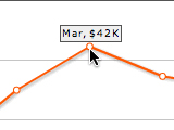
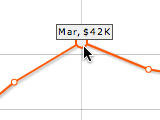
Possible Customization: Bigger anchors
- Slanted labels: Yes, some names can be pretty long. So how about adding support for slanted labels rather than just the horizontal and vertical labels that are supported now?
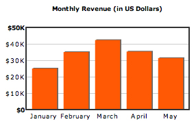
Currently supported: Horizontal (and vertical) data labels
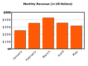
Possible customization: Slanted data labels
- Add new attributes: You could add new attributes, like displaying the company name right at the top of every chart. Or add fade-in or bounce effects to the chart animation, and then provide an option to choose from one of the numerous animation styles.

Shamasis Bhattacharya
August 30, 2009, 3:53 pmGreat news!
Going open source also opens up new avenues for existing open-source softwares.
Pankaj
November 24, 2009, 7:11 amhey this is really very attractive kind of analysis i love to use in my website but i dont know much about the webtechnology.. how to do this .. please help me
Sanket (FusionCharts Team)
November 24, 2009, 7:26 am@Pankaj: Thanks for your kind words. Please check out our documentation at http://www.fusioncharts.com/free/docs > Creating your first chart to see how to go about the same. It is a very simple process so you should be able to grasp it very quickly.
Yagnesh Siddhapura
August 26, 2017, 10:27 pmDoes it contains radar or spider charts ?