In the first part of this series on personal finance apps with amazing dashboards, we covered Britain’s Money Dashboard. With its ability to directly link to all your various bank accounts and provide real-time graphical analysis of your spending, we saw how Money Dashboard makes managing personal finance quite easy. In the 2nd part of this series we are going to have a look at another finance app with an amazing dashboard—Toshl Finance. Like Money Dashboard, Toshl is a money tracker and budgeting tool which lets you manage your expenses and income using a dashboard. Where it lags behind Money Dashboard is that it does not allow automatic import of data from your bank accounts. Every income and expense data has to be entered manually. Where it wins over Money Dashboard is its multi-platform availability—in addition to a well-designed web app, it supports iOS, Android, Symbian and Windows and syncs smoothly across different devices. Without further ado let’s have a closer look at the app dashboard.
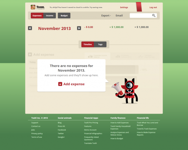 Toshl has 3 main tabs in its header—Expenses, Income and Budget with Expenses being the default tab. Export and Email are the other links in the header.
When you log in to your account for the first time, you find the Toshl monster asking you to enter some expenses. These monsters (read: brand mascots) are found throughout the app—sometimes guiding users to various tasks they can perform using the app, sometimes giving them quick financial tips and sometimes adding a dash of humor here and there. (Related read: 10 Emerging Dashboard Design Trends.)
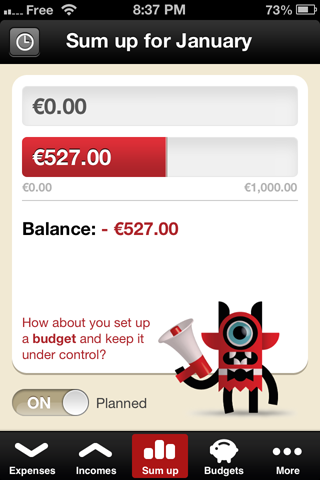
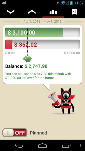
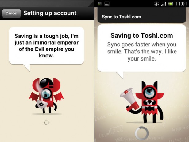 Nice way to make the tedious job of tracking personal finances more fun.
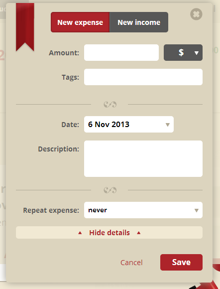 The form is nicely designed and makes good use of white space. Related fields are neatly grouped together by using separators (eg: Fields like Amount and Tags form one group, Date and Description forms another group).
However, aligning the field labels to the left (rather than to the right) would have made it further easier for users to scan the form. With left-justified labels, the user’s eyes can move in a straight line and will not have to figure out the beginning of each new line.
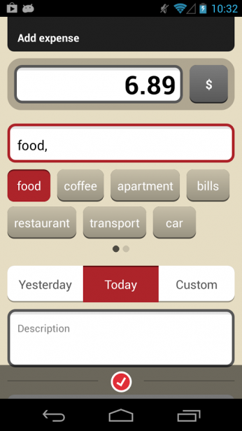 Toshl also allows you to choose the currency for your amount from the menu next to the amount text field. It supports 161 currencies with exchange rates updated daily. A helpful feature for users to keep a tab on their expenses while traveling abroad.
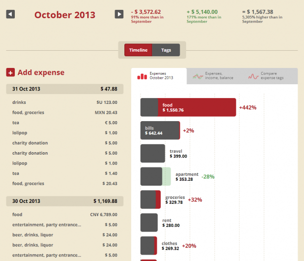 At the top is the month name that you have selected for your analysis and the month’s expenses and income along with the percentage difference from that of the previous month. You can change the selected month by using the arrows on the left and the right.
 This snapshot of information given at the very beginning helps the user understand where he stands with respect to his current finances.
 The Timeline/Tags tab helps you to visualize your data either in a timeline format or tags format. Timeline is the default tab.
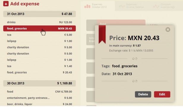 The left column visualizes your expenses in a tabular form. What catches the attention in this section is the bold Add expense link. Users interested in adding new expenses can easily find this link without any unnecessary looking around. The list of expenses is grouped date wise. When you click on any of the expenses, a pop up opens where you can see the exchange rate of your expense with respect to your primary currency (selected at the time of signing up) as well as edit and delete your expense.
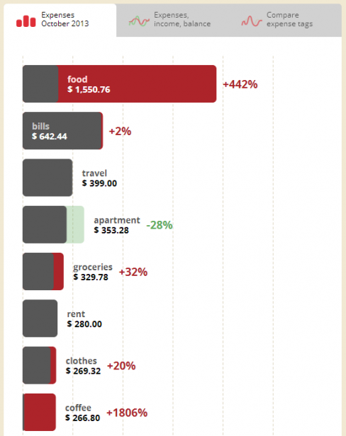 This section has 3 tabs:
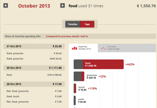 It takes you to a new page where the details of your food expenses (along with the related tags) are listed in a tabular format date wise (in the left column) and as bar charts on the right.
You can also compare expense tags using the Compare expense tags tab.
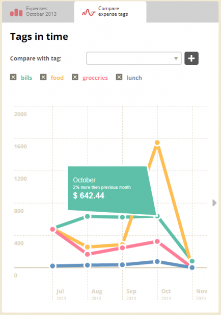 The line charts help you to understand your expense trends across various expense tag categories over a period of time. Tooltips are used to provide details about each data point.
However, instead of line charts they could have used column charts to compare the expense tags. This would have brought out the difference in expenses between the categories more clearly. (Related read: Selecting the right chart type for your data)
Also, it needs an additional click from the user to open and close the tool tip. Instead the tooltip could have been provided on hover on the specific data point. This would have saved the user from an unnecessary additional click. (This is how we do it.)
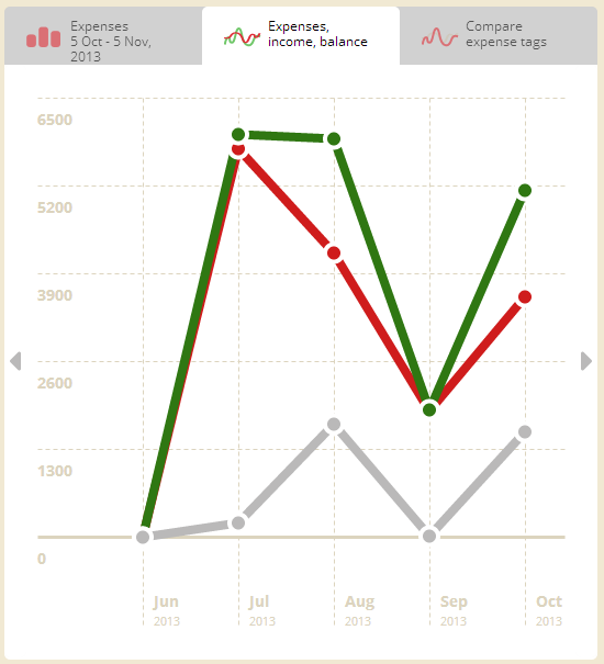
2. The Expense, income, balance tab uses line charts to show the trend of your expenses, income and balance over a period of time. Here too, additional information is put in the tooltip which can be obtained by clicking on a data point. You can scroll through the chart by clicking on the arrows on the left and right. However, a date selector here could have made it easier for users to choose a specific time period for their analysis.
 3. The Compare expense tags tab helps you to compare your expenses across various tag categories.
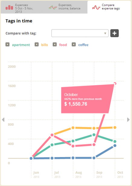 You can add new tags for comparison by using the drop down menu at the top which has the entire list of tags that you used while entering your expenses.
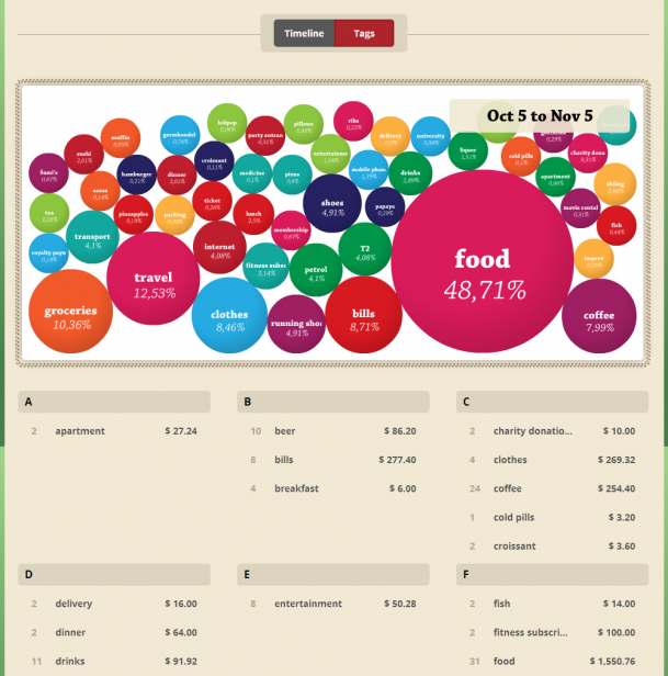 Though this chart may be a visual treat, I have reservations about its actual usage. Apart from the leading 2-3 categories, it is difficult to figure out the difference in size of one bubble from the other. Due to the limitations of the color palette, the bubbles do not have unique colors for each tag (eg: petrol and drinks share the same color). The big bold dates sitting at the top hides the bubbles below it. Also, alphabetical arrangement of tags does not serve any major purpose. Arranging the tags in ascending or descending order of value would have made more sense. May be the team needs to reconsider this page for it to be of any use to the user.
 Moving on to the income tab, it works in the same way as the expense tab.
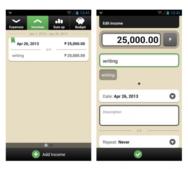
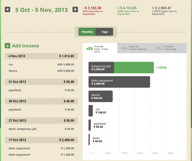 A consistent user interface creates a seamless experience for the user and the Toshl app dashboard has successfully created that experience.
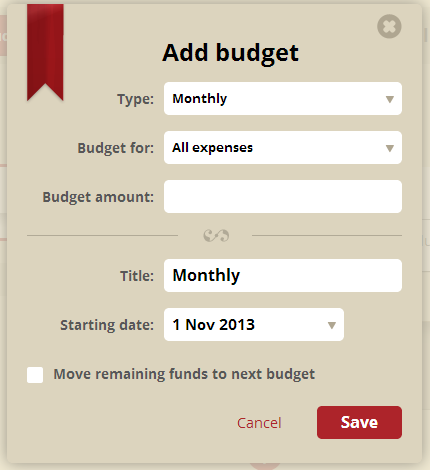 Adding a budget is simple and similar to adding an expense or income.
You can set the frequency of a particular budget (monthly, weekly, biweekly, etc.) from the drop down menu in the Add budget pop up form. This will automatically add the specific budget to your list of budgets based on the set frequency. You do not need to re-enter the same budget again.
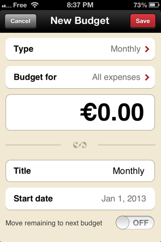 You can also choose whether you want to set a combined budget for all expenses or for specific tags. Budgets can be set up to carry forward any remaining balance from the previous period.
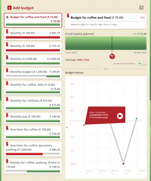 The rest of the budget page is simple and easy to understand. The left column is for the budgets that you have added and the progress bars indicate where you stand with respect to your planned budget. The right column is primarily used to visualize each budget in detail. At the top is your edit option for the specific budget with a reminder for budgets due in a few days. The progress bar indicates your status on the current day. The budget history line chart helps you to understand the trend of that specific budget over a period of time.
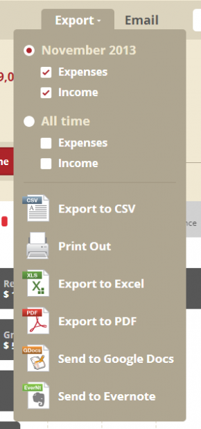
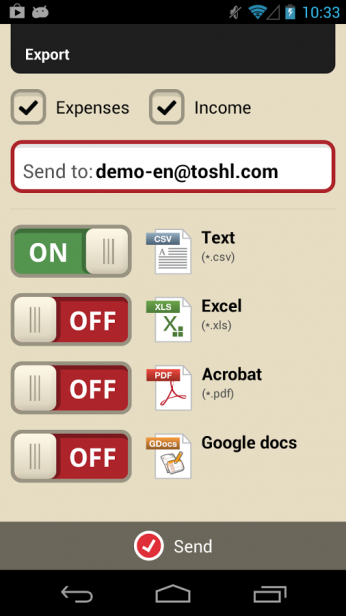 Toshl allows you to directly export your data in multiple formats. You can customize your reports using the check boxes (and on/off buttons).
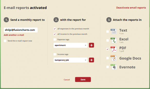 Also you have option to receive reports via email. You can customize your email reports too by using the check boxes.
 Toshl has 3 main tabs in its header—Expenses, Income and Budget with Expenses being the default tab. Export and Email are the other links in the header.
When you log in to your account for the first time, you find the Toshl monster asking you to enter some expenses. These monsters (read: brand mascots) are found throughout the app—sometimes guiding users to various tasks they can perform using the app, sometimes giving them quick financial tips and sometimes adding a dash of humor here and there. (Related read: 10 Emerging Dashboard Design Trends.)


 Nice way to make the tedious job of tracking personal finances more fun.
Adding Expenses and Income
Adding an expense or an income is easy. A pop up opens when you click on Add expense where you can enter the details of your expenses. The form is nicely designed and makes good use of white space. Related fields are neatly grouped together by using separators (eg: Fields like Amount and Tags form one group, Date and Description forms another group).
However, aligning the field labels to the left (rather than to the right) would have made it further easier for users to scan the form. With left-justified labels, the user’s eyes can move in a straight line and will not have to figure out the beginning of each new line.
 Toshl also allows you to choose the currency for your amount from the menu next to the amount text field. It supports 161 currencies with exchange rates updated daily. A helpful feature for users to keep a tab on their expenses while traveling abroad.
Expenses
After you have entered all your expenses, the Expense page will look like this: At the top is the month name that you have selected for your analysis and the month’s expenses and income along with the percentage difference from that of the previous month. You can change the selected month by using the arrows on the left and the right.
 This snapshot of information given at the very beginning helps the user understand where he stands with respect to his current finances.
Timeline/Tags
 The Timeline/Tags tab helps you to visualize your data either in a timeline format or tags format. Timeline is the default tab.
Timeline left column
 The left column visualizes your expenses in a tabular form. What catches the attention in this section is the bold Add expense link. Users interested in adding new expenses can easily find this link without any unnecessary looking around. The list of expenses is grouped date wise. When you click on any of the expenses, a pop up opens where you can see the exchange rate of your expense with respect to your primary currency (selected at the time of signing up) as well as edit and delete your expense.
Timeline right column
 This section has 3 tabs:
- Expenses,
- Expenses, income, balance and
- Compare expense tags
 It takes you to a new page where the details of your food expenses (along with the related tags) are listed in a tabular format date wise (in the left column) and as bar charts on the right.
You can also compare expense tags using the Compare expense tags tab.
 The line charts help you to understand your expense trends across various expense tag categories over a period of time. Tooltips are used to provide details about each data point.
However, instead of line charts they could have used column charts to compare the expense tags. This would have brought out the difference in expenses between the categories more clearly. (Related read: Selecting the right chart type for your data)
Also, it needs an additional click from the user to open and close the tool tip. Instead the tooltip could have been provided on hover on the specific data point. This would have saved the user from an unnecessary additional click. (This is how we do it.)
2. The Expense, income, balance tab uses line charts to show the trend of your expenses, income and balance over a period of time. Here too, additional information is put in the tooltip which can be obtained by clicking on a data point. You can scroll through the chart by clicking on the arrows on the left and right. However, a date selector here could have made it easier for users to choose a specific time period for their analysis.
 3. The Compare expense tags tab helps you to compare your expenses across various tag categories.
 You can add new tags for comparison by using the drop down menu at the top which has the entire list of tags that you used while entering your expenses.
Tags
The Tags view visualizes all your expense tags as tag bubbles where size of the bubble depends on the percentage share of the monthly expense. Tags are also arranged alphabetically below the chart with details of the exact amount spent on that particular tag category along with the frequency of their appearance. Though this chart may be a visual treat, I have reservations about its actual usage. Apart from the leading 2-3 categories, it is difficult to figure out the difference in size of one bubble from the other. Due to the limitations of the color palette, the bubbles do not have unique colors for each tag (eg: petrol and drinks share the same color). The big bold dates sitting at the top hides the bubbles below it. Also, alphabetical arrangement of tags does not serve any major purpose. Arranging the tags in ascending or descending order of value would have made more sense. May be the team needs to reconsider this page for it to be of any use to the user.

 A consistent user interface creates a seamless experience for the user and the Toshl app dashboard has successfully created that experience.
Budget
The Budget page helps you to plan your finances based on your income and expenses. Adding a budget is simple and similar to adding an expense or income.
You can set the frequency of a particular budget (monthly, weekly, biweekly, etc.) from the drop down menu in the Add budget pop up form. This will automatically add the specific budget to your list of budgets based on the set frequency. You do not need to re-enter the same budget again.
 You can also choose whether you want to set a combined budget for all expenses or for specific tags. Budgets can be set up to carry forward any remaining balance from the previous period.
 The rest of the budget page is simple and easy to understand. The left column is for the budgets that you have added and the progress bars indicate where you stand with respect to your planned budget. The right column is primarily used to visualize each budget in detail. At the top is your edit option for the specific budget with a reminder for budgets due in a few days. The progress bar indicates your status on the current day. The budget history line chart helps you to understand the trend of that specific budget over a period of time.
Export & Email

 Toshl allows you to directly export your data in multiple formats. You can customize your reports using the check boxes (and on/off buttons).
 Also you have option to receive reports via email. You can customize your email reports too by using the check boxes.


Joanra
August 19, 2014, 10:37 pmGood review. I use the app for windows phone and is very useful to track all my expenses. And the sync is so fast. I’m like use the windows phone app and the website to control the expenses.
shilpi
August 20, 2014, 12:05 pmThanks Joanra. All the best with your expense tracking 🙂
teresa1kiss
September 18, 2015, 4:05 amHi, great app but I have still not understand the difference among Income and Budget. I mean I have a salary, that is slightly different per months, and I do not understand if is better to put in the Income space or in Budget :p