Data purists may shun them. But users are just loving them. The dashboard in its new avatar is more user-friendly and definitely more appealing than its grim predecessor. From flat designs to interactive charts, let’s see the emerging trends in dashboard design in 2013.
Table of Contents
1. Metro/modular layout
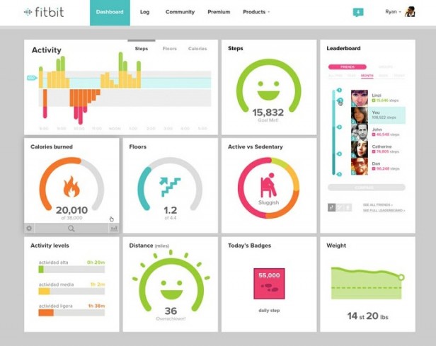
Popularized by Windows 8, the metro/modular layout draws its inspiration from the International design style (or the Swiss style) of the 1950s. Max Huber, Emil Ruder, Josef Müller-Brockman and Armin Hofman were the pioneers of this design style. This design style finds its application in arts, architecture, culture, and now even in web design. Key characteristics that mark this style of dashboard design are grid-based layout, good use of whitespace, more reliance on typography and simple, minimalistic graphics. In a dashboard, this design style works superbly well because it lays emphasis on the content and sees that the story is communicated in a clear and concise manner.
Expense Tracker’s tile-based metro layout
(Image credit: play.google.com)
Fitbit’s metro layout with simple and minimalistic graphics
(Image credit: marketingfacts.nl)
2. Charts that are intuitive and interactive
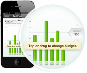
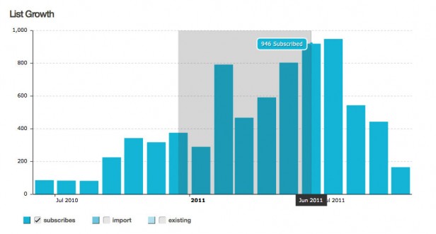
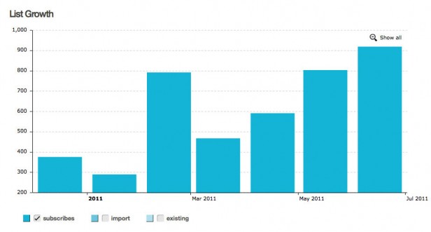
Data visualization using charts and graphs form an important part of any dashboard. They help bring out the crucial story in your data which could have otherwise been lost. Today’s dashboards are equipped with charts that have intuitive and interactive features.
Mint’s charts can be directly edited by a tap or drag option
(Image credit: mint.com)
MailChimp uses charts which can be zoomed in for a detailed view
(Image credit: blog.mailchimp.com)
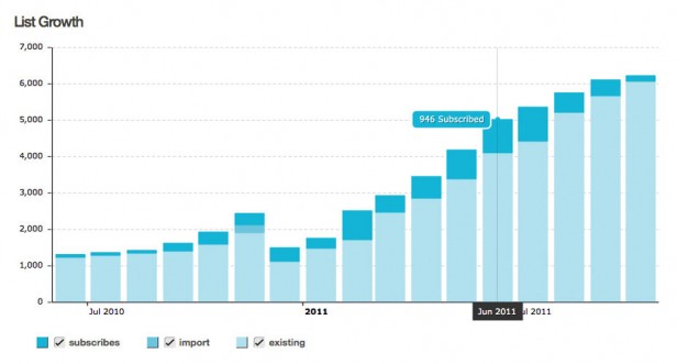
MailChimp also provides users with checkboxes to select the data they want to see
(Image credit: blog.mailchimp.com)
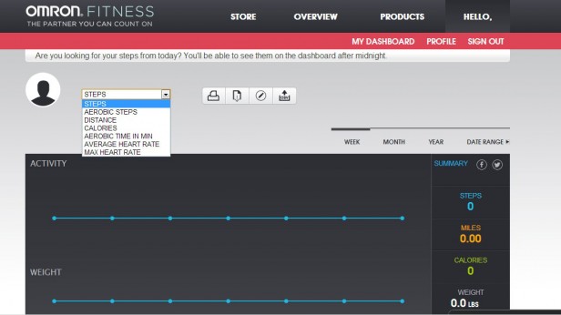
Alternatively, Omron provides filters to select data
(Image credit: omronfitness.com)
3. Color trends
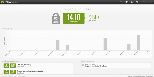
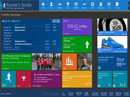
While traditionally, data purists would have stuck to 2-3 colors at the maximum, today’s dashboards are seeing a skillful use of a broader color palette. Blame it on the Swiss style of design which propagates the use of bold, bright colors or simply on the human mind’s love for the colorful, the 2013 dashboard is marked by various permutation and combination of colors. On the one hand, we have dashboards which use shades of gray as their core color with a few other colors as accents. On the other hand, there are dashboards with bold and uncommon color combinations. And somewhere in between, are the dashboards which use bright pastel colors against a muted background.
Viewabill’s light gray dashboard which uses a few color accents
(Image credit: law.com)
Runner’s Studio’s bold colors in uncommon combinations
(Image credit: runnersstudio.com)
Toshl’s bright pastel colors against a muted background
(Image credit: cdn3.brafton.com)
SproutSocial uses labeled icons in the header navigation
(Image credit: automotivesocial.com)
5. An upcoming trend: Mascots
Though we are not sure about the future of this trend, but brand mascots are gradually finding their way into dashboards too.
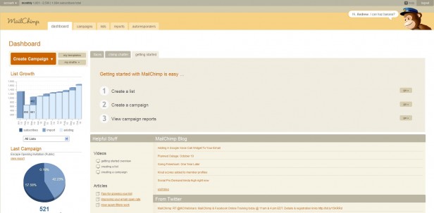
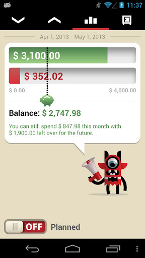
Be it Freddie of MailChimp or the Monsters of Toshl or the Financial Assistant of Expense Tracker, these mascots are changing the way we look at dashboards. Adding a dash of humor with their random banana talks (as it’s done in MailChimp) or sharing their pearls of wisdom (as in Toshl and Expense Tracker), will they be employed by other dashboards in future? Or, will they be discarded as yet another chartjunk? Time shall tell!
Freddie (MailChimp monkey) with his banana talks
(Image credit: blogs.ukoln.ac.uk)
Toshl Monsters giving some quick financial tips
(Image credit: all-apk.com)
Expense Tracker’s Financial Assistant asking us to cut down on our unnecessary expenditures (yeah..that beer!)
(Image credit: play.google.com)
Know of any other dashboard trends that we have missed out here? Add them in the comment section below.
If you liked this post, do check out the next in this two-part series:
Dashboard Design Trends to watch out for – Part 2


shilpi
September 22, 2014, 11:03 amHi Daniel
Your welcome 🙂
Sure, will definitely give it a spin. All the best!
Thanks
Shilpi
Jason A
June 25, 2015, 1:26 amVery insightful article that has useful comments on modern dashboard designs!
Thanks.