Google Docs is a free productivity software collection that can perform many of the same tasks as much more expensive software programs. Using Google Docs, you can display your collected data in a graph using the spreadsheet program, making it much easier to visualize the information. Charts are the most common way to express data, which is why they can be found in programs such as Google Docs. A bar chart is one of the most fundamental and frequently used visuals in business presentations. Unfortunately, many people don’t know what a bar graph is or how it works on Google Docs. Therefore, this article will cover how to make a bar graph on Google Docs.
 Bar charts are frequently used for either categorical or grouped data. It’s made up of many rectangles lined up in a row with the same baseline. Bars represent the numerical levels of a categorical feature in a bar chart. On the chart, the x-axis represents levels, whereas the other represents values. Each categorical value claims one bar, and its value determines its length. Make value comparisons simple by plotting bars on a shared baseline. The graph’s bar can either be horizontal or vertical.
Bar charts help show the distribution of data points or compare metrics among different subgroups of data.
The React chart framework is a popular visualization tool used by developers worldwide. It offers various tools for flow chart creation and provides a chart editor for manipulating other types of charts, like bar or pie charts. With React, you have a wide range of tools to create amazing visualizations helping you in your business.
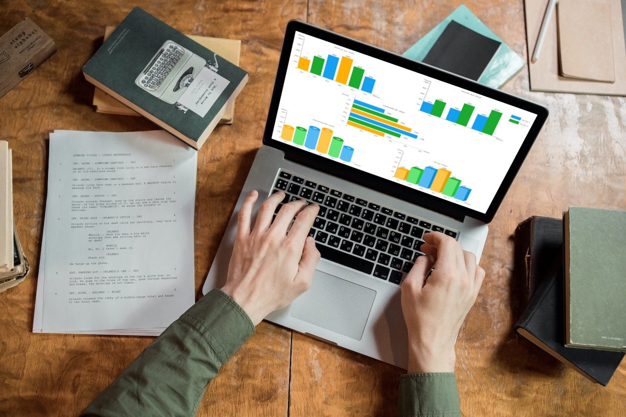 There are four main types of bar graphs:
 Making a bar graph in Google Docs is an effective way to organize your data. Log in to your Google Drive account before we walk you through the steps. You can then create a bar graph in Google Doc in 4 easy steps:
 Math and statistics commonly use bar graphs. Some uses of a bar graph are:
 Create shareable documents that you can constantly update with Google Docs. It allows you to create documents and access them from any internet-connected device. In addition, you can create graphs in Google Docs to enhance your document and tailor them to your objectives.
Bar or column charts can represent quantitative values across various subcategories. This article covered all the essential information you will need to create meaningful bar chats in Google Docs.
FusionCharts is an incredible platform that allows you to create responsive, sleek, and visually appealing visualizations. Moreover, these visualizations are capable of updating as the data variables change. In addition, FusionCharts allows you to integrate your charts on your website and manipulate your visualization in many ways, like colors for React Charts. Another great thing about FusionCharts is that it can efficiently handle big data and create organizational charts, like the popular jQuery Organizational Chart.
FusionCharts is one of the best data visualization tools for creating stunning bar charts. So, go ahead and click here to get started!
Table of Contents
What Is A Bar Graph?
 Bar charts are frequently used for either categorical or grouped data. It’s made up of many rectangles lined up in a row with the same baseline. Bars represent the numerical levels of a categorical feature in a bar chart. On the chart, the x-axis represents levels, whereas the other represents values. Each categorical value claims one bar, and its value determines its length. Make value comparisons simple by plotting bars on a shared baseline. The graph’s bar can either be horizontal or vertical.
Bar charts help show the distribution of data points or compare metrics among different subgroups of data.
The React chart framework is a popular visualization tool used by developers worldwide. It offers various tools for flow chart creation and provides a chart editor for manipulating other types of charts, like bar or pie charts. With React, you have a wide range of tools to create amazing visualizations helping you in your business.
What Are The Types Of Bar Graphs?
 There are four main types of bar graphs:
Vertical Bar Graphs
Standard vertical bar or column charts are among the most popular types, and almost all tools have the functionality to create them built-in. Another name for them is column graphs. Vertical bars represent the numerical value of research variables based on categorical data arranged on the x axis, where the lengths of bars are proportional to quantities in the vertical bar chart.Horizontal Bar Graphs
In a horizontal bar graph, the use of horizontal bars helps represent the data variables proportional to the value. In this particular graph, the vertical axis is the data category, and the horizontal axis is the numerical value. Horizontal bar charts are a common visual representation of comparisons between nominal variables. This tool allows you to display lengthy data labels, while leaving room for textual information using horizontal rectangles. As a result, horizontal bars typically look like their vertical counterparts turned upside down. However, they are a great option for lengthy category names, as there is space on the left side horizontal position of text.Stacked Bar Graph
Stacks of bars come in both vertical and horizontal variations. You can display each category’s constituent parts, and compare the sums by scanning the ends. Horizontal stacked bar charts give visual variants for data segmentation. In most cases, the graph’s horizontal bars represent data categories, with each bar’s subcategories represented by a different color. This bar graph style makes it simple to see the different parts of a data variable. Consequently, knowing which subcategory contributes the most to a data variable is helpful. A vertically stacked bar chart uses vertical bars to compare different data variables. Data categories can form stacks using this statistical tool, so that each bar shows the total number of subcategories in a data set.Grouped Bar Graphs
The clustered bar graph is another name for the grouped bar graph. In the case of two or more categorical data, it displays the discrete value. The same colors indicate the secondary category level within each group of rectangular bars, which form groups on the base of position for levels of a single categorical variable. A particular color indicates a clear series across all data categories represented in a horizontal bar chart, which compares multiple data categories. Because of this, these graphs are also known as clustered bar graphs or multi-set bar charts. Information about different data sets in a vertical grouped chart provides further subcategories. It can show multiple subgroups within each category, but it might be difficult to understand if the chart has too much information.What Are The Properties Of Bar Graph?
The following list includes some characteristics that set a bar graph apart from other types of graphs:- First, the width and spacing between each rectangular bar should be the same.
- Either horizontally or vertically can be used to draw the rectangular bars.
- The rectangular bars’ height equals the height of the data they depict.
- Finally, there must be a common base for the rectangular bars.
What Are The Steps For Making A Bar Graph On Google Docs?
 Making a bar graph in Google Docs is an effective way to organize your data. Log in to your Google Drive account before we walk you through the steps. You can then create a bar graph in Google Doc in 4 easy steps:
- Step 1: Open the Google Doc where you want to make a graph.
- Step 2: Next, navigate to the menu bar, and tap on ‘Insert.’
- Step 3: Now, hover over ‘Chart’ on your Google Doc, and various options appear.
- Step 4: Select ‘Bar’.
Editing The Bar Graph
After you’ve finished these steps, you’ll have a customizable bar graph. Follow these steps to customize your chart style and add the necessary data:- Step 1: Once you insert a graph, tap on the arrow pointing down in the upper right corner.
- Step 2: Click on ‘Open Source,’ which will take you to a Google Sheet document and display the chart with the data in individual columns.
- Step 3: You can change the data in each column.
- Step 4: You can also use the ‘Edit Chart’ option to create a stacked bar chart and change colors, fonts, chart titles, grid lines, and more.
- Step 5: Once you’re done with the changes, go back to your Google Docs file.
- Step 6: You’ll see ‘Update’ on the graph. Tap on it.
What Are The Uses Of A Bar Graph?
 Math and statistics commonly use bar graphs. Some uses of a bar graph are:
- Comparisons between various variables are simple and practical.
- It is the simplest diagram to create and takes little work.
- It is the most popular technique for representing data. Various industries use it.
- Compare data sets with it. There is no interdependence between data sets.
- Therefore, long-term patterns can be studied with its aid.
Final Thoughts
 Create shareable documents that you can constantly update with Google Docs. It allows you to create documents and access them from any internet-connected device. In addition, you can create graphs in Google Docs to enhance your document and tailor them to your objectives.
Bar or column charts can represent quantitative values across various subcategories. This article covered all the essential information you will need to create meaningful bar chats in Google Docs.
FusionCharts is an incredible platform that allows you to create responsive, sleek, and visually appealing visualizations. Moreover, these visualizations are capable of updating as the data variables change. In addition, FusionCharts allows you to integrate your charts on your website and manipulate your visualization in many ways, like colors for React Charts. Another great thing about FusionCharts is that it can efficiently handle big data and create organizational charts, like the popular jQuery Organizational Chart.
FusionCharts is one of the best data visualization tools for creating stunning bar charts. So, go ahead and click here to get started!


