Table of Contents
Introduction to Column Chart
A column chart is a technique that helps in data visualization. The categories are represented in the form of vertical columns. The height of each category is directly proportional to the values plotted. The height of each column depicts the magnitude or the frequency of data. Columns are arranged on a horizontal axis for easy comparison of different categories.Introduction to Stacked Column Chart
A stacked column chart is an expansion of the standard bar chart that depicts the comparisons and compositions of several variables. These charts usually represent a series of columns or bars stacked above each other. Usually, these charts effectively portray comparisons between total values across multiple categories. There is one little drawback of stacked charts, i.e., they can be used only for limited scenarios. But once you properly understand how to use them, even the most complex data can be represented seamlessly.Best Practices for Choosing the Right Chart
Choosing the correct chart is crucial for effective data visualization, as it directly impacts how well your audience comprehends information. Here are four best practices to consider when selecting a chart:Understand Your Data Type
Different data types require different chart types. For categorical data, consider bar charts or pie charts. Line charts are often more suitable for showing trends over time. Knowing your data’s nature helps you choose a chart that accurately represents the information you want to convey.Simplicity is the Key
Avoid clutter and complexity. Choose a chart that simplifies your message and facilitates straightforward interpretation. Column charts are ideal for showcasing individual data points, while stacked bar chart illustrate part-to-whole relationships within a category. Ensure that the chosen chart type aligns with the complexity of your data.Consider Your Audience
Tailor your choice based on your audience’s familiarity with data visualization. On the one hand, bar charts, and line graphs are generally more universally understood, and stacked column charts provide a holistic view. On the other hand, more complex charts like heatmaps may require a more data-savvy audience.Highlight Key Insights
Emphasize the key insights you want to communicate. Use color, labels, and annotations strategically to draw attention to important data points. Whether highlighting a peak in a line chart or showcasing proportions in a pie chart, ensure your chosen chart enhances the viewer’s understanding of your message.When To Use Stacked Bar Chart
By using a stacked bar graph maker you can excel in illustrating how different components contribute to the total of each category. It effectively visualizes the individual value of each segment and the overall composition, providing a clear and brief representation of complex data sets. Below mentioned are a few of the occasions where you can use a stacked bar chart:Comparing Subcategories
In a stacked bar chart, subcategories within a larger group are visually segmented, allowing a straightforward comparison of their proportions. Each bar represents the cumulative total, while different segments represent the contribution of individual subcategories. This visual hierarchy facilitates a quick understanding of how each component contributes to the whole.Highlighting Trends
Stacked bar charts are instrumental in highlighting trends and variations across different segments. As the bars evolve over time or across categories, patterns become evident. For instance, in a marketing context, a stacked bar chart may showcase the distribution of leads from various sources over several months, revealing trends in lead generation sources and helping marketers in adapting their strategies accordingly.Visualizing Composition
When the goal is to display the composition of various elements within a category, stacked bar chart provide a concise and clear representation. Each bar represents the entire category, while the segments depict the proportional contribution of individual elements. This visualization is handy when emphasizing the makeup of a whole, such as illustrating the distribution of expenses in a budget or the demographic composition within a population.When To Use Column Chart
Column charts are a versatile and widely used tool for data visualization and finding applications in various scenarios. Here are a few instances where people commonly make use of column charts:Comparing Categories
Column charts are effective when there is a need to compare individual values or categories easily. The vertical bars provide a clear visual representation of the relative magnitudes, making identifying trends or disparities straightforwardly.Showcasing Trends Over Time
When data involves a time component, column charts are often employed to showcase trends and changes over different periods. This makes them valuable in visualizing patterns or fluctuations.Highlighting Disparities
Column charts are useful for emphasizing disparities or variations in data. Whether it’s comparing sales figures for different products or performance metrics for various teams, column charts make these differences visually apparent.The Difference Between Clustered Column Chart and Stacked Column Chart
The column chart and the stacked column chart can display data using rectangular bars where the length of the bar is proportional to the data value. However, in the column chart, data values are displayed side-by-side, whereas they are stacked one over the other in the stacked chart.Stacked column charts work better when you want to compare the whole and distinct parts. It isn’t easy to compare columns that don’t start at the same baseline. If the focus of your chart is to compare multiple parts across all your totals, choose small multiples instead.
Let’s understand the usage of these charts with an example.
Say you want to compare your region-wise sales for 2012. A column chart can easily facilitate that comparison.
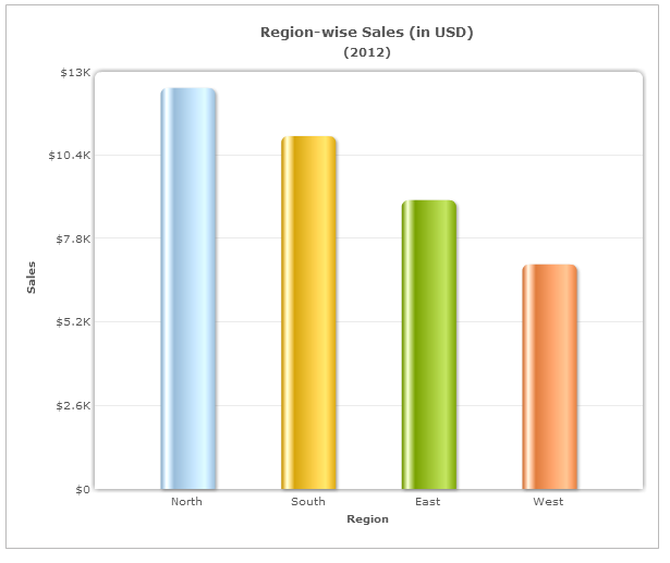
But what if you also want to show the quarterly contribution from each region? The stacked column chart is beneficial in this scenario, as it can facilitate both comparisons and part-to-whole relationships.
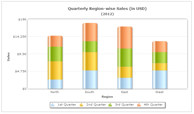 From the stacked column chart above, you can compare the sales of each region and analyze the breakdown of each regional sales into its constituent quarters (part-to-whole). The stacked chart is effective as it can visually aggregate the parts of a whole.
Grouped Column vs. Stacked Column Chart
Data interpretation using a stacked column chart becomes difficult when you want to compare the constituent parts of each entity across the various entities. Try comparing the 2nd Quarter sales across the regions from the above chart!In the Javascript chart above, the parts (quarters) in the individual entities (regions) do not share a common base. You can compare the sales of North across the regions (as it has the same baseline), but it is cumbersome to do the same for the other regions.
To facilitate such an analysis, we can use the grouped column chart.

When several column charts are combined side-by-side to form individual groups, they are called grouped column charts.
In the grouped column chart, all the columns have the same baseline, and thus it is much easier to compare the heights of the individual columns.
Furthermore, to make the analysis easy, bring those columns closer to aid comparison.
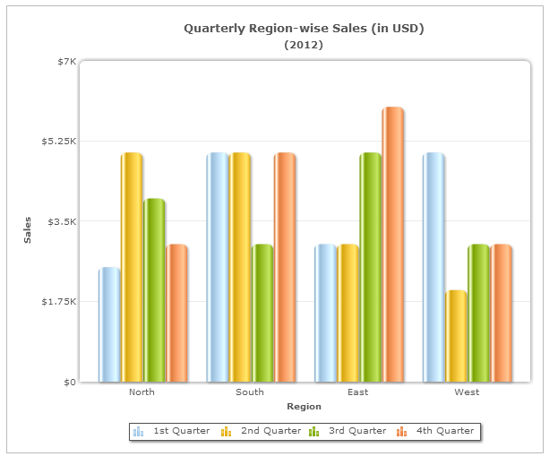
In this chart, we have brought the quarterly sales of each region closer to form four groups―North, South, East, and West. You can easily compare the sales of North across the four quarters from this chart.
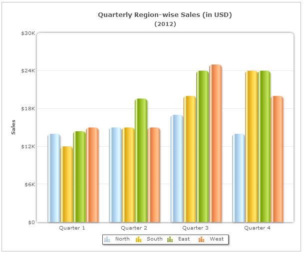
On the other hand, in this chart, the North, South, East, and West sales form four groups―Quarter 1, Quarter 2, Quarter 3, and Quarter 4. It is easy to compare each region’s sales within a group (quarter) due to their proximity with one another.
While the column chart can facilitate all comparison-based analysis, it is better to use the stacked column chart to show the part-to-whole relationship (along with comparison).
Conclusion
Column charts and stacked column charts both represent numerical data through vertical bars, but they serve distinct purposes. Column charts are best for comparing values between categories, while stacked column charts depict relationships between wholes and their components. Choosing the right chart depends on the type of insights needed, and proper attention to labeling, colors, and fonts ensures clarity and ease of understanding for audiences.Frequently Asked Questions
Q. What types of data are column charts best for presenting?
Column charts are most effective for directly comparing numerical values between different categories or time periods. They work well when you want to see which category has higher or lower values than others.Q. How do stacked column charts differ from regular column charts?
Stacked column charts are designed to demonstrate the relationship between a whole and its constituent components or parts. Unlike regular column charts that focus solely on category comparisons, stacked column charts allow users to examine how individual elements contribute toward the larger aggregate number.Q. Which type of chart should I choose if I want to understand the contribution of specific components to the total amount?
If your goal is to analyze how individual components relate to the overall total, then you should opt for stacked column charts as these charts provide greater detail regarding the proportionality between smaller portions and the entirety of the figure.PS: We have more posts that talk about charting best practices. You can check them out here.
Prabu
November 13, 2018, 8:32 pmThe graph that shows contrasting trends between levels of an independent variable is
Options:
A. Float Graph
B. Belt Graph
C. Pyramid Graph
D. Radar Chart