So the last time you got drunk what did you do? Danced on a table? Went ahead and asked her out? Or, simply drank and drank till the time you actually passed out? Well, we all have our share of drunk moments but we seem to be having some never-ending drunk chart moments too. So here’s our second set of drunk charts from around the world. (See our first set of drunk charts.)
Remember Part 1, where we had charts that partied harder than you on a Friday night? Well, they’re back, and they’re just as tipsy! And before we begin, here’s our new favorite “Go home, you’re drunk” meme.
Alright, enough chit-chat! We’re diving headfirst into Part 2 of “Chart, You Are Drunk, Go Home!” Hold on tight, these charts are about to get wilder than your karaoke rendition of Bohemian Rhapsody.
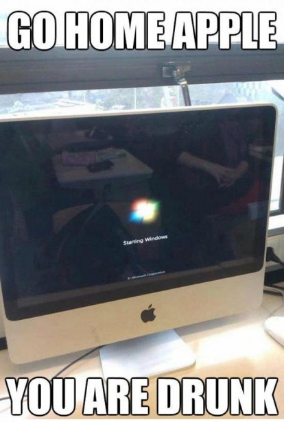
Table of Contents
Honey, I blew up the kid
(Source: @DanaDanger)
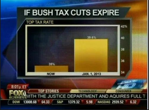
Fox News seems to be a repeat offender in our list of drunk charts. With the y-axis avoiding the zero, the difference between the columns looks much bigger than it actually is. Just like in Part 1, where CNN’s pie chart seemed to be a victim of some seriously questionable decisions, Fox News’ chart follows suit with a wildly exaggerated representation.Go Home You’re Drunk Meme: Honey, I shrunk the kids
(Source: FirstPost)
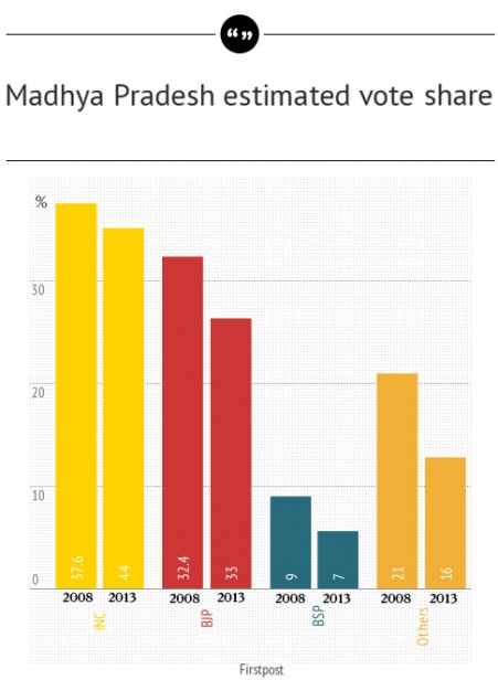
In 2013, though INC and BJP have more vote share than in 2008, their columns are smaller…it seems somebody just shrunk them. Looks like the chart had a few too many at the election party and decided to play a prank. Seriously, chart, go home, you’re drunk go home!Is it my head or is it the wheel that’s spinning?
(Source: Jakob Nielsen, Nielsen Norman Group)
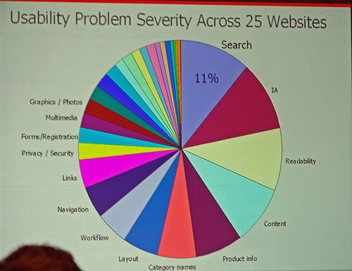
Usability problems…heck yeah! Recommended detox:5 tips to increase the usability of your charts instantlyIt’s not just the alcohol! Go Home, You’re Drunk!
(Source: TechnicallyFunny)
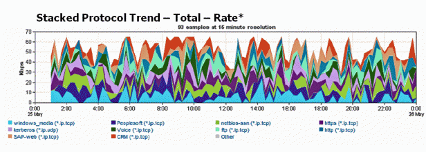
This definitely seems to be tripping on something else. Recommended detox:Choosing the right chart type: Line charts vs Area charts Stay tuned for more such drunk chart moments and feel free to add yours in the comments. Till next time…cheers!Remember, if your chart’s making you dizzy, it might just be time to put it to bed. Let’s keep the charts sober and the data clean!


