Drill-down charts are everywhere. They help maximize business information by presenting the data in digestible chunks. While implementing drill-down charts is no rocket science (shameless plug: especially with our first-of-its-type LinkedCharts concept), the interface for using them still has some way to go. Haven’t you ever come across a report where you had no idea that the charts could be drilled down into? Or you drilled down multiple levels into the chart only to lose track of where you are?
In this post, I will be talking about how the interface for drill-down charts can be made intuitive so that using them is a breeze and your users don’t face the same problem you did.
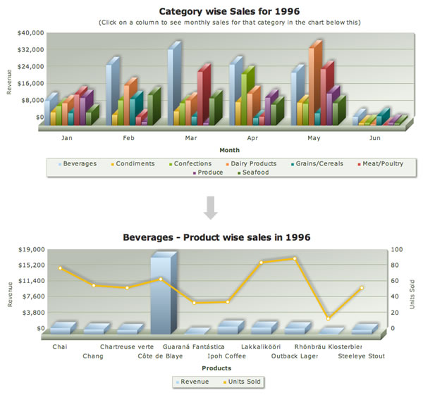
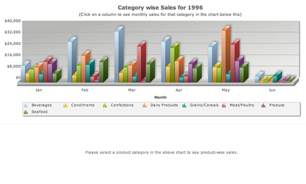
 When you have the drill-down charts replacing the parent chart, the message is pretty simple as discussed above. However, if the child chart does not replace the parent chart and is displayed either below the parent chart or on the side, then the message has be to more descriptive to ensure everyone understands it. For example, in a retail dashboard, if you have product categories and their sales shown on a chart and the user can click on them to see the break-up of the category right under the parent chart, then the chart below would need to have a message like: “Please select a product category in the above chart to see product-wise sales.”
 When there is just one drill-down level, it is pretty easy for the user to keep track of where he is but more than that becomes a cause of concern for the user, especially when he is deep in his data analysis. That’s where breadcrumb style captions come in.
 Of course, it is not essential to use a breadcrumb style caption in its entirety, especially for time-based drill-down. For example if you have a drill-down from 2010 > Q1 > January showing sales figures, then the caption could just say: Sales Figures for January 2010. However, in category-based drill-down, a complete breadcrumb-style caption is the best way to go.
 The idea behind using the same chart style is to build the sense of familiarity with the chart so that there is no discovery phase at every level. The user’s eyes get used to the chart style and he can focus all his energy on interpreting the data itself.
Do you agree with all these points? What else do you do to make your drill-down interface more intuitive? Let us continue the discussion in the comments.
Table of Contents
Understand the data thoroughly
What data are you plotting using the drill-down charts? Sales figures? Production figures? Will you allow drill-down from annual figures to quarterly figures, and finally to monthly figures? Or directly from annual to monthly? Or will you be having category-based drill-down like continents to countries? Having answers to all these questions is essential to create an intuitive drill-down interface and plan the overall layout. It helps understand what chart type is needed at each level and know how many data sets will be displayed at each level.Understand what chart type is needed at each level
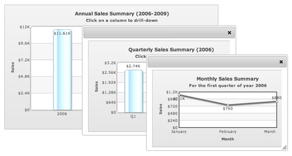
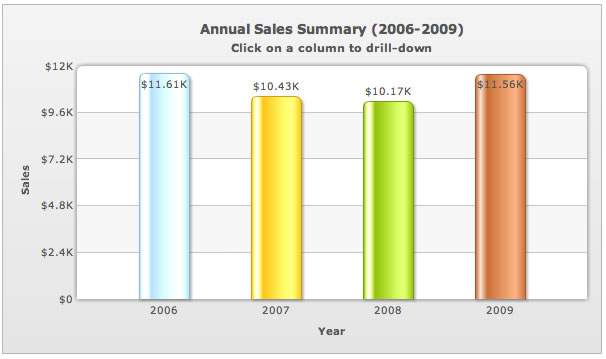
Typically, the chart type remains the same at all levels but there are a number of cases where the type of data analysis needed changes from one level to another. For example, you are displaying sales comparison starting with a column chart for comparing the annual sales over 3 years and these columns can be drilled down into for showing the monthly comparison for that year. Now for the monthly comparison, if you want to highlight the overall trend of sales rather than individual figures, you would need a line chart instead of the column chart. Once you know the chart type required at each level, you can plan the layout and the space required accordingly.
Know how many data sets will be displayed at each level
With time-based drill-down, you know the exact number of data sets that will be displayed at each level. With category-based drill-down, you need to have a rough idea of the number of data sets. This helps ensure that the space you have allotted for the chart will not be overshot or get cluttered with too many data sets being displayed at the same level.
Clearly indicate the chart has drill-down
While this may sound obvious, it is pretty apalling to see charts where the user has no idea that he can drill down into them. Even we have been guilty of this in some of our demos but over time, we have learnt this important lesson. Have a message at the top clearly indicating that you can drill down into the chart – the sub-caption typically works well for this. This could be something as simple as “Click on a column to drill-down” to something more descriptive like “Click on a column to drill-down to monthly sales in the chart below.” When you have the drill-down charts replacing the parent chart, the message is pretty simple as discussed above. However, if the child chart does not replace the parent chart and is displayed either below the parent chart or on the side, then the message has be to more descriptive to ensure everyone understands it. For example, in a retail dashboard, if you have product categories and their sales shown on a chart and the user can click on them to see the break-up of the category right under the parent chart, then the chart below would need to have a message like: “Please select a product category in the above chart to see product-wise sales.”

Use breadcrumb-style captions
Breadcrumbs are a navigation aid used in websites, applications and documents. It helps users keep track of where they are within the website with the ability to jump to any of these locations. When there is just one drill-down level, it is pretty easy for the user to keep track of where he is but more than that becomes a cause of concern for the user, especially when he is deep in his data analysis. That’s where breadcrumb style captions come in.
 Of course, it is not essential to use a breadcrumb style caption in its entirety, especially for time-based drill-down. For example if you have a drill-down from 2010 > Q1 > January showing sales figures, then the caption could just say: Sales Figures for January 2010. However, in category-based drill-down, a complete breadcrumb-style caption is the best way to go.
Use the same chart style for all levels
Depending on the kind of data analysis that you need to facilitate at different levels, the chart types could be same or different. If the data analysis that is to be done is the same at all levels, it makes no sense to introduce a new chart type. In either case, it is essential to use the same chart style at all levels – in terms of looks, placement of labels, the number scale used etc. The idea behind using the same chart style is to build the sense of familiarity with the chart so that there is no discovery phase at every level. The user’s eyes get used to the chart style and he can focus all his energy on interpreting the data itself.
Do you agree with all these points? What else do you do to make your drill-down interface more intuitive? Let us continue the discussion in the comments.
Ramón Esparza Ramos
May 17, 2012, 3:55 amHi my names is Ramon and I’m developer at transnational company, recently I started to try your charts and I have a question about cosmetic functions I would like to know if there is any option to assign directly the bar color for example I plot a bar chart where I show four different status Open,Past Due,Released,Closed so I need that Open status bar appears in red, Past due in yellow and so on, I hope you can answer my question
Best regards
Ing. Ramón Esparza R.
Hrishikesh Choudhari
May 17, 2012, 1:08 pmHi Ramon,
If you want to set colors for each bar of the Bar Chart of the FusionCharts XT, you can provide Hex color code (without # symbol) to the <set> element of your XML data.
Ref. Code:
<chart …>
<set label=’open’ value=’420000′ color=’FF00FF’ />
…
</chart>
Please note that the above setting will retain the Gradient effect of the bar along with the provided color.
If you want to remove that Gradient, then put “plotGradientColor” value as NULL in the <chart> element of your XML data. Also you can set different gradient color for the all bars by providing hex color code to this attribute.
Ramón Esparza Ramos
May 17, 2012, 8:09 pmThanks for your quick response, I just have a question more in my case I getting the values from a query so how can I set the color value on this way?, I’m including the code line that I’m using to do it
xmlStr.AppendFormat(“<set label='{0}’ value='{1}’ />”, dr[“Description”].ToString(), dr[“Percentage”].ToString());
Shamasis Bhattacharya
August 20, 2013, 3:05 pm<code>xmlStr.AppendFormat(“<set label='{0}’ value='{1}’ color='{2}’ />”, dr[“Description”].ToString(), dr[“Percentage”].ToString(), dr[“Color”].ToString());</code>
Assuming that your colour data is stored in dr[“Color”] in hexadecimal format.
Leo Joseph
August 7, 2014, 12:29 pmHi, can any one lead me to an example which says how can I create a drill down where the first chart is bar graph and on clicking any bar it gives a grid in the second level of drill down?
Swarnam
August 7, 2014, 6:51 pmHi Leo,
A sample has been showcased in the below link:
https://docs.fusioncharts.com/charts/Code/JavaScript/Basics/UsingLinkedCharts/linked-charts-config-basic-xml.html
You, will need to do the following changes in the code:
FusionCharts(“myChartId”).configureLink (
{
type: “SSGrid”,
…..
}
If you need a sample, please drop a mail to “[email protected]”
Hope this helps.
Harish
September 15, 2014, 3:09 pmHi,
My self Harish, iOS developer. Recently am started implementation of Fusion charts in iPad.
I am trying to implement auto drill down functionality.
Please let me know how to implement auto drill functionality.
How to detect user touchs on chart.
Sanjukta Mukherjee
September 19, 2014, 6:39 pmFusionCharts displays hand cursor on the plots wherever the chart can be clicked. Hence, visually it is detectable this way. Also, the latest version, FusionCharts v3.4 supports various events like, “chartRollOver”, “chartRollOut”, etc. These events are fired when the mouse pointer moves over and moves out of the chart.
For touch devices, these events are raised when user taps on to the chart after previously tapping onto anywhere outside the chart or when user taps on to anywhere outside the chart after previously tapping on the chart.
You can listen to this event and track when user is pointing to a chart and perform relevant actions such as highlighting information anywhere else on the page that is relevant to the chart or redirecting to another page and also track when user is no longer pointing to a particular chart.