For management executives, the quarterly meeting could be a dream or a nightmare. If you and your department have done well, it is time to thump that chest and declare how you are the best thing since beer. But if your performance figures are not up to the mark, it is time to pick from the 101 reasons to weasel out of a meeting. In this post, I would like to provide some tips on how to get out of that dreaded corporate scenario, using what I will conveniently call dressed-up reporting.
Dressed-up reporting, as you would have guessed, is all about presenting your performance data in a manner to make the drop in performance unidentifiable. Of course, you can’t hide poor performance for long. It is bound to be noticed sooner or later, but isn’t it better to be confronted in a closed one-to-one meeting with just your boss than a room full of your peers? Here are some simple tips and tricks that you can use for dressing up your poor performance.
Table of Contents
De-emphasize major differences
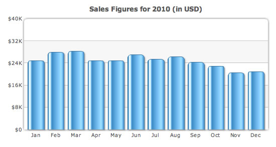
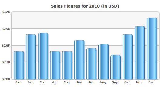
If you are reporting the monthly sales generated by your team in 2010, chances are you would pick a column chart. However, if the performance in the last couple of months has seen a major drop from the earlier months, using a straightforward column chart would clearly reveal this drop in performance.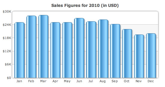
Use a wrong different chart type
Just because you have to display the Q4 sales figures does not mean you have to show monthly sales of 2010 in a simple column chart. Assuming the total sales for the last 3 years were lower than the current year’s, you can show this in a stacked column chart comparing the sales from 2007-2010 with the figures for each year broken down into quarters.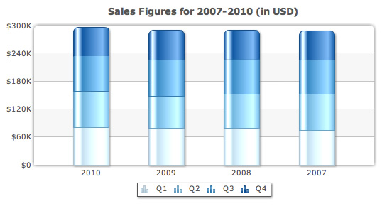
Percentages are your best friend
This is one of the most commonly used tricks throughout the industry. If your company only grew from $1M to $1.12M in annual revenue after all the hard work put in by everyone while that mighty competitor soared from $500 million to $530 million, you need to pick the heavy-duty armor…percentages. Show your boss how you had a healthy 12% growth in revenue while your competitor recorded only a small 6% growth.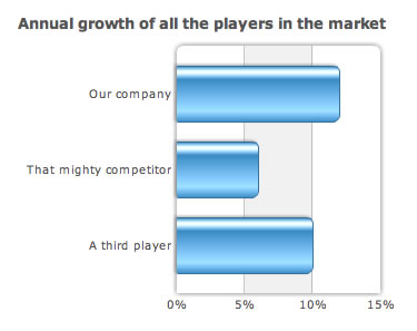
Stay away from those trendlines
Trendlines are used to provide context to data. In a sales chart, they would typically be used to show the monthly target that had been set for the year.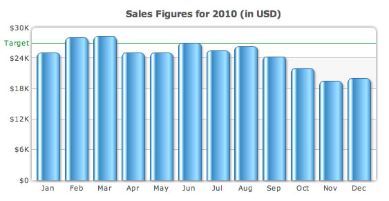
Make it all very loud
One of the most basic tricks of dressed up reporting is to take the attention away from the data.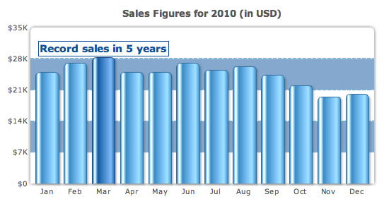
Displaying actual values? You must be nuts.
After doing all the hard of concealing your poor performance, putting in the actual values on the chart would be absolute suicide. Do not ever do it.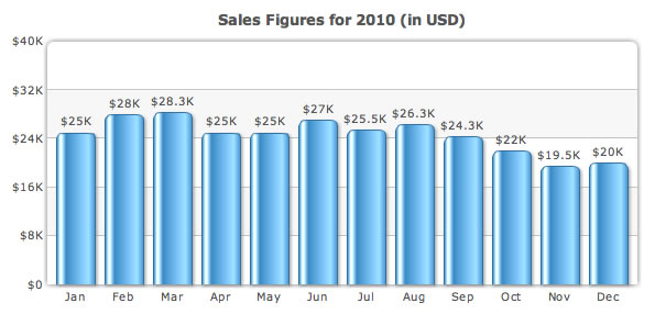

Ritesh
March 3, 2011, 10:28 pmI have been following your blog and those are some excellent articles and graphs. Amazing stuff…
Sanket Nadhani
March 5, 2011, 3:31 amThanks so much for your kind words 🙂
Dave
March 5, 2011, 3:23 amSanket,
As Ritesh’s manager, I sincerely appreciate knowing the tricks he might employ in the next quarterly review. 😉
Dave
Sanket Nadhani
March 5, 2011, 3:32 amHaha! I don’t know what to say 🙂
Suneel
June 23, 2011, 2:21 pmThe way you put in these tips are amazing Sanket. Do you really think IIMs or B-Schools do not teach these to the future managers? Ha ha but I will surely consider your tips while making my revenue projections and current status. 🙂
Sanket Nadhani
June 23, 2011, 2:52 pmThey do? I need to get into a B-School soon 🙂
Thanks for checking in Suneel.
Julien
September 6, 2012, 10:01 pmHi Sanket,
This is a very nice and funny blog post. Good to identify how people might be covering during meetings.
I just have one comment:
> If you are reporting the monthly sales generated by your team in 2010, chances are you would pick a column chart.
I beg to differ here: any time-related KPI should be represented with a line chart.