2013 saw
more and more ISVs take the data visualization route. From enterprise applications to products used by common people for managing their day to day tasks, data visualization emerged as a key value proposition of products. By making data more comprehensible and accessible, these products revolutionized the way we deal with data both big and small.
As Ramana Rao, Founder and CTO, Inxight Software Inc., states “In five years, 100 million people will be using information-visualization tools on a near daily basis. And products that have visualization as one of their top three features will earn $1 billion per year.” With brands like IBM betting big on visualization, the industry is only going to get bigger and better in 2014.
As we look forward to 2014, we bring you a roundup of our own top 10 data visualization posts of 2013. From the right selection of charts to predictive analytics to some amazing web app dashboards, here’s what was popular on our blog in 2013:
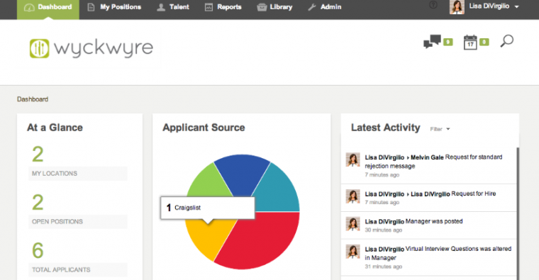
1. Is the Information Dashboard set to be the next game changer for ISVs?
This post gives an understanding into why ISVs are adding dashboards to their products and how it is impacting their bottom line. With examples from diverse sectors, this post shows how these ISVs are enhancing the value proposition of their products by embedding sophisticated information dashboards.
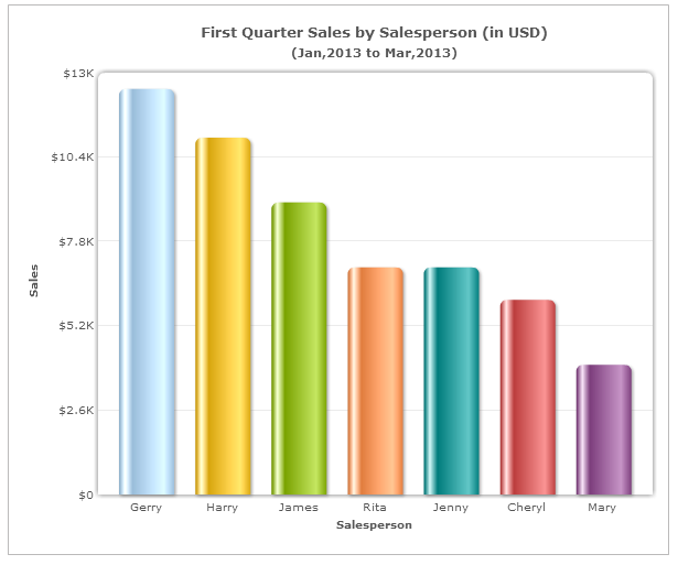
2. Choosing the right chart type: Bar charts vs Column charts
Confused when to use a Bar chart and when to use a Column chart? Though both display data using rectangular bars, their usage scenarios are different due to the difference in their orientation. This post helps you to understand the right usage of these
java script charts.
3. 5 web apps with inspiring reports and dashboards
What makes a dashboard good, you ask? A whole bunch of things, and then some more. But fundamentally, users want their dashboards to be clean, provide context like targets and benchmarks and be customizable. In this post we cover 5 popular web apps―ClickTale, FitBit, Sprout Social, MailChimp and LinkedIn―whose dashboards we find to be highly inspiring.
4. 5 Dashboard Design Trends to watch out for
From metro layouts to labeled icons for navigation to the use of bold, bright colors, this post covers the dashboard design trends which emerged in 2013. Most of these trends will continue and only grow bigger in 2014.
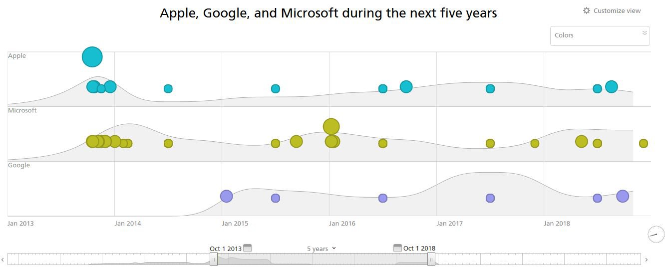
5. 3 Insanely Great Dashboards from Recorded Future – Predictive Analytics
Ever dreamt of looking through a crystal ball and predicting the future? No, we are not
Agents of Shield and we are not looking for the Clairvoyant to spice up our show. We are instead talking about predictive analytics. In this post, we see how Recorded Future, a software that provides web intelligence for business decisions, use predictive analytics to create some great live dashboards which users can play around with and customize.
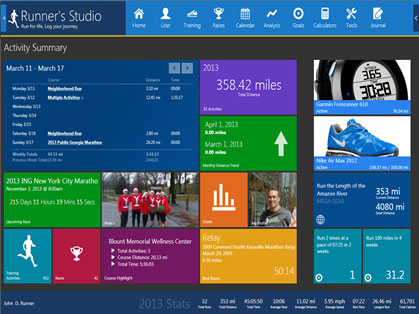
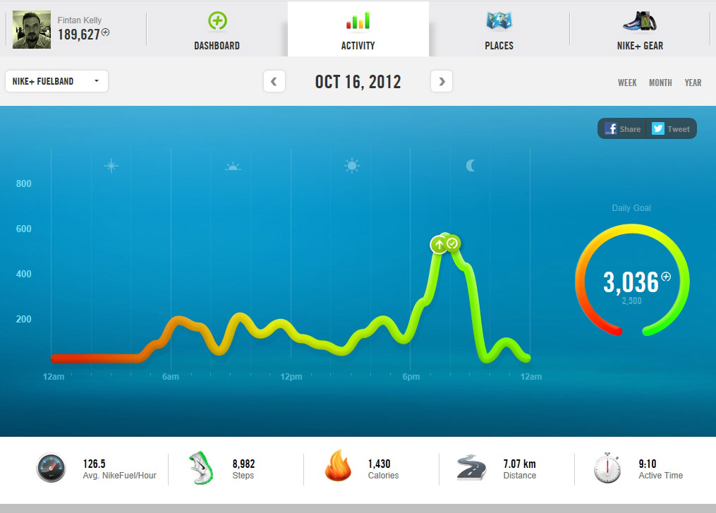
6. 10 Inspiring Fitness App Dashboards
This post showcases 10 fitness apps with rich, interactive dashboards. Funky colors, smart icons, and intelligent use of whitespace, each of these dashboards has its own characteristic style that sets it apart.
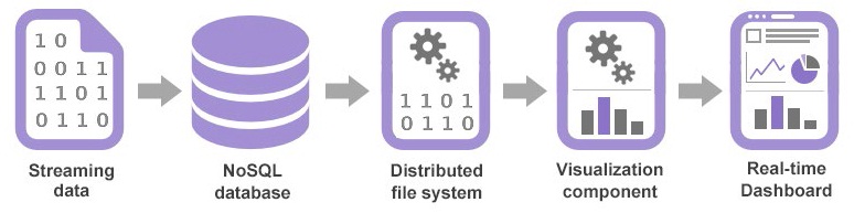
7. How Real-Time Analytics Works – A Step-by-step Breakdown
As real-time applications become popular, many businesses are facing the challenge of processing and mining these large real-time data streams.This primer helps you understand what happens behind the scenes, and how real-time data reaches the dashboard.
Our readers especially loved this image as it gives a quick summary of the step-by-step process.
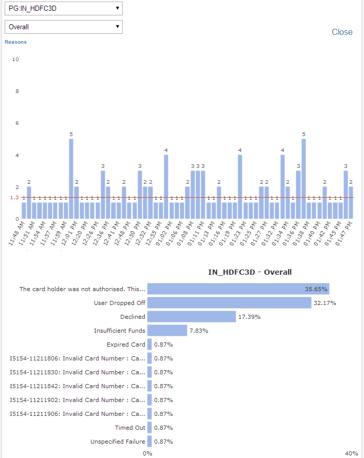
8. How Cleartrip Tracks Payment Failure in Milliseconds
Show & tell is the principle we live by or rather earn our bread and butter from (even our Christmas turkey comes from it). This post gives you an insider’s view of how Cleartrip (one of the leading online travel companies in India and the Middle East) uses dashboards to monitor day to day performance, analyze if bookings are on track or lagging, and handle payment failures using real-time data.
9. Oppan Billion Style [Infographic]
“Oppan Gangnam style”―while this had the entire world groove to
the horse dance , we paid a tribute to the K-pop star in our own small way. A nice infographic celebrating Psy’s joining the billion club by becoming the most viewed video on the web ever!
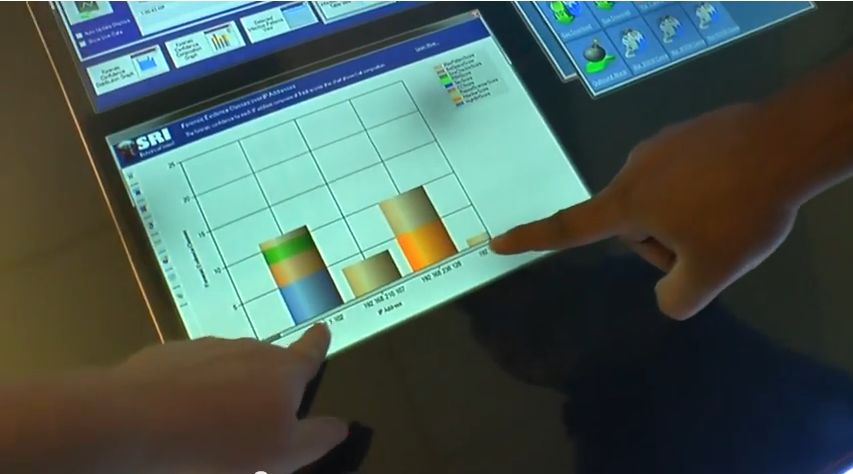
10. How the Makers of Siri Use FusionCharts Suite XT as they Invent the Workstation of Tomorrow
A little bit of reassurance that we are on the right track always helps! Yes, we had our ‘jingle bells’ moment this year when we got to know that the makers of Siri use our products. This post covers the ‘whats’ and the ‘hows’ of
FusionCharts Suite XT playing a subtle, yet important role in SRI’s (Stanford Research Institute) work. It gives us a sneak peek into the technology of the future, something we could well be using at work a few years from now!
These were our Top 10 Data Visualization posts of 2013. As always, be with us in 2014 and keep watching this space for more.
If you have any thoughts and ideas around the data visualization space which you want us to cover in our blog in 2014, feel free to add them in the comment section below.
Thank you for an awesome year! Wish you a Merry Christmas!