A Dashboard is an important tool for efficiently conveying information and engaging your audience.
The dashboard creation process takes into account the data your user needs and understands how they want to view it. It is important for every organization. This is because dashboards are widely used for various scenarios – sales, marketing, accounting, management, SaaS, or analytics.
While it is not complicated, there are some steps you need to follow to create a dashboard:
Firstly, you’ll need to understand your audience and the metrics that matter to them. You’ll also need to realize that the audience wants to view visually exciting essential business insights, KPIs, and real-time data.
If you’re looking for a straightforward route to dashboard creation, this step-by-step guide will be helpful to you.
Let’s jump right in.
 Area Charts – Present multiple data series with part to whole relationships or individual series representing a physically countable set.
Tables – Illustrate detailed information with different variables of measure.
Gauges – Display one or more values using indicators and appropriate metrics.
For an effective dashboard, use a combination of these chart types only when and where it is appropriate.
Area Charts – Present multiple data series with part to whole relationships or individual series representing a physically countable set.
Tables – Illustrate detailed information with different variables of measure.
Gauges – Display one or more values using indicators and appropriate metrics.
For an effective dashboard, use a combination of these chart types only when and where it is appropriate.
Table of Contents
How to Create an Effective Dashboard? (8 Steps)
When creating a valuable dashboard for your audience, you need to keep them in mind with every step you take. Your audience is the end-user of your dashboard, and you must strongly consider their needs and interests while creating it. It would be best if you were also mindful of the decisions they want to make based on the data. Take note of the metrics most important to them and make sure they get them. Here’s how to create an intuitive, visually appealing dashboard.1. Define Your Audience
First, you need to define your target audience. Your target audience is an integral part of the dashboard creation process. The dashboard needs to be relevant, accessible, and easy for them to use. To properly define your audience in your dashboard creation process, consider providing answers to the following questions:- Who are you creating a dashboard for?
- Why do they need it, and what do they want to achieve?
- What are their daily work-related activities?
- Which KPIs/metrics do they need to measure to reach their goals frequently?
- How do they view those KPIs/metrics currently?
2. Look Closely at Your Data
Take a look at the data you already have and see how it can inform your dashboard creation thought process. After identifying the data and insights you need, pair that with your audience’s needs and objectives to serve as proper building blocks. Depending on which audience objectives you’re working on, you should consider data sources within or outside your department. Plus, don’t forget that the data must be accurate, quality, and clean.3. Use the Right Chart Type
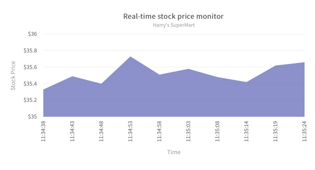
Using the right chart type to visualize your data can have a massive difference on your dashboard. The visualization chart type on your dashboard should be informed by the KPIs and metrics that matter to your audience. Here are some of the most common types of charts used and when to use each one: Line Charts – Visualize trends and show developments of a particular variable over time. Bar Charts – Show trends and variable comparisons. Pie Charts – Visualize variable proportions summed up to 100% (use them sparingly).
Area Charts – Present multiple data series with part to whole relationships or individual series representing a physically countable set.
Tables – Illustrate detailed information with different variables of measure.
Gauges – Display one or more values using indicators and appropriate metrics.
For an effective dashboard, use a combination of these chart types only when and where it is appropriate.