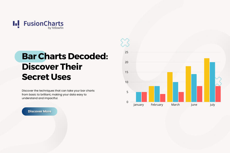
Imagine you’re comparing the sales performance of your top product lines across different regions, or perhaps tracking website traffic trends over the last year. In both cases, a bar chart can instantly reveal patterns, helping you make quick, informed decisions. Bar charts are among the most versatile tools in data visualization, offering an intuitive way to present categorical data and highlight comparisons.
A bar chart displays data using rectangular bars, with their lengths or heights representing the values they hold. These bars can be arranged either horizontally (bar chart) or vertically (column chart – you can find more details on this difference here). In this post, we’ll dive into how bar charts can be used effectively in different scenarios, from comparing categories and tracking trends to identifying outliers and visualizing part-to-whole relationships.
Common Uses of Bar Charts
AI for data visualization can revolutionize documentation by tailoring it to individual user needs. Imagine a documentation system that understands your specific context and delivers information precisely when you need it.
Comparing Categories
One of the most common uses of bar charts is to compare different categories of data. Whether you’re analyzing sales performance across product lines or understanding website traffic sources, bar charts provide a clear view of how each category stacks up against the others.
Example Use Cases:
- Sales Performance: You might use a bar chart to compare sales figures across different products in your catalog. Each bar would represent a product, making it easy to spot the top performers and identify those needing attention.
https://www.fusioncharts.com/dashboards/sales-and-collaboration-dashboard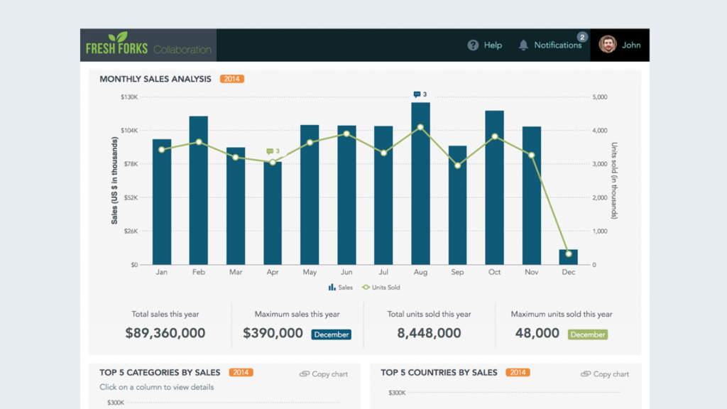
- Website Traffic Analysis: Another example could be visualizing website traffic sources, where bars represent different channels like direct visits, organic search, and social media. This lets you quickly assess which channels are driving the most traffic.
https://www.fusioncharts.com/dashboards/marketing-dashboard Bar chart variations, like stacked and grouped bar charts, offer even more flexibility. A stacked bar chart can show the breakdown of total sales by product and region, while a grouped bar chart lets you compare multiple sub-categories within the same chart. However, it’s important to avoid overcrowding your chart with too many categories, which can make it difficult to read.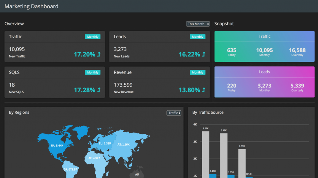
Tracking Trends Over Time
While line charts are often the go-to for visualizing trends over time, bar charts can be just as effective, especially when comparing discrete time intervals. A bar chart with time periods on the x-axis and data values on the y-axis is perfect for displaying how metrics like monthly revenue, user sign-ups, or website traffic fluctuate over time.
Best Practices for Visualizing Time Trends:
- Use consistent time intervals (e.g., months, quarters, years) to maintain clarity.
- Ensure labels for dates or periods are easy to read and positioned appropriately.
Visualizing trends with bar charts allows you to spot seasonal patterns, growth trends, or declines in key performance metrics at a glance.
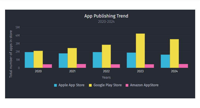
Identifying Distributions and Outliers
Bar charts can also be used to explore the distribution of data and pinpoint outliers—data points that significantly differ from the rest. For instance, you can use a bar chart to represent the frequency distribution of data points across categories
 https://www.fusioncharts.com/
Identifying such outliers quickly can lead to actionable insights, such as addressing customer complaints or revising marketing strategies.
Part-to-Whole Relationships
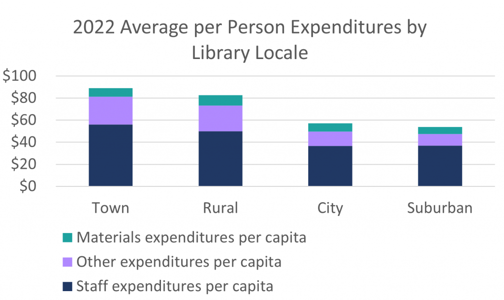
Understanding how different components contribute to a whole is another key use of bar charts. Stacked bar charts are particularly effective in visualizing part-to-whole relationships, where each segment of the bar represents a component of the total.
Example Use Cases:
- Budget Allocation: You might use a stacked bar chart to break down a budget by department (e.g., marketing, production, R&D) to see how each segment contributes to the total budget.
 https://www.lrs.org/2023/09/22/stacking-bar-charts-to-breakdown-budgets/
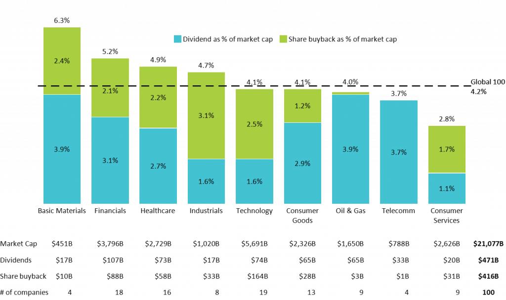
- Market Share Analysis: Another example could be visualizing the market share distribution of different players in an industry
 https://www.lrs.org/2023/09/22/stacking-bar-charts-to-breakdown-budgets/
When using stacked bar charts, ensure the segments are well-labeled and color-coded to prevent confusion. Clear labeling makes it easier for viewers to grasp the relationship between parts and the whole.
https://www.lrs.org/2023/09/22/stacking-bar-charts-to-breakdown-budgets/
When using stacked bar charts, ensure the segments are well-labeled and color-coded to prevent confusion. Clear labeling makes it easier for viewers to grasp the relationship between parts and the whole.
Integration with FusionCharts
If you’re looking to take your bar charts to the next level and create stunning visuals (like 3D bar charts! here), consider using FusionCharts, a powerful JavaScript charting library. FusionCharts offers highly customizable bar charts with interactive features like tooltips, drill-downs, and real-time data updates. Whether you need a simple bar chart or an advanced multi-series one, FusionCharts provides flexibility to suit various use cases. Learn more about comparing different chart types like bar graphs and pie charts and how to create bar graphs on Google Docs.
For example, you can enhance your bar charts with:
- Data labels that provide precise information without cluttering the chart.
- Interactive legends for filtering data points in grouped or stacked bar charts.
- Drill-down capabilities that let users explore detailed data by clicking on specific bars.
To see these features in action, explore FusionCharts’ interactive demos or visit the product page to learn more about how it can streamline your data visualization efforts.
Conclusion
Bar charts remain one of the most effective tools for comparing categories, tracking trends, identifying outliers, and understanding part-to-whole relationships. By choosing the right type of bar chart and following best practices, you can communicate your data clearly and compellingly. Whether you’re a data enthusiast or an analyst, leveraging bar charts can enhance how you present and interpret information.
For those ready to dive deeper, FusionCharts offers the perfect platform to create polished, interactive bar charts that stand out in any report or dashboard.