
When it comes to representing categorical data, two commonly used chart types are “the column chart” and “the bar chart.” To break it down in the simplest way, column charts are ideal for showcasing trends over time, whereas, bar charts excel in comparing individual categories.
However, to pinpoint the ideal choice for your needs, delve into our comprehensive guide – Column Chart vs Bar Chart.
With this writing, you will get to know the distinctive features of each, examining their strengths, weaknesses, and the scenarios where one might be more suitable than the other.
By understanding the nuances of these chart types, you can enhance your ability to present data in a way that resonates with your audience and facilitates a more insightful interpretation of the information at hand.
You may use a graph maker made by FusionCharts to help you create the chart you need.
Table of Contents
Figure: Bar chart
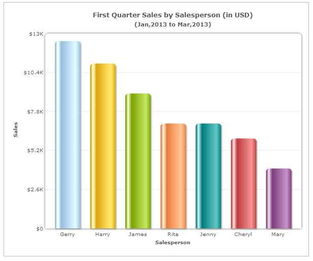
Figure: Column chart
Bar charts are suitable for displaying long data labels.
Column charts have limited space in the category axis. So, when your data labels are long, the category axis may look cluttered.You can reduce clutter by either slanting or rotating the labels.
Bar charts are good for displaying a large number of data sets on the category axis.
The column chart is a good fit for a maximum of 10-12 data sets. However, using a column chart is not the best way forward when large numbers of data sets are needed.
A bar chart with the data sets placed one below the other would be a better choice in this case as it makes optimum use of space.
Column charts are suitable for displaying data sets with negative values.
In a bar graph, negative values are displayed as bars on the left.However, we associate negative values with the downward direction (as used by the column chart) than leftward (as used by the bar chart).
Charts hold more potential than you think. They can make the complex data representation much easier with single clicks. However, the real game is knowing the right chart for the right data. This guide plots a strong argument to have clear, concise decision-making on column chart vs bar chart.
In conclusion, while the column chart is helpful to facilitate all comparison-based analysis, it is better to use the bar chart when your data labels are long, or you have too many data sets to display. Keep watching this space for more insights on charting best practices.
Happy Charting till next time 🙂
At FusionCharts, we believe in empowering developers and businesses with cutting-edge data visualization tools that…
Ever had a data set that seemed more complicated than a Rubik's cube? You’re not…
We’ve all seen them in textbooks or presentations—those overlapping circles that simplify complex information into…
We’re excited to announce the upcoming release of FusionCharts v4.1—a groundbreaking step forward in the…
Have you ever been overwhelmed by a massive data set and wondered, "How do I…
If you’ve ever tried to make sense of the stock market, you’ve probably come across…


View Comments
The bar chart with the negative values are more effective
Hi John,
As mentioned in the post, column charts would have better visualization when compared to bar charts and for comparison based analysis. Do share your thoughts on why bar chars seems to be more effective.
Hi
here i am using the basic version of fusion chart
and is this posible to set a legends in pie chart with out comparison
and in attribute the legends options are workimg or not
Hi,
Yes, its possible to add legends for Pie charts. Do set the attribute "showLegend" as 1 in the chart element. Check out this fiddle.
i use column chart design for ax report in visual studio 2010
i put many question in visual studio and ax Forms
but nothing help me to when i have one column it be very large
i want to control the width of columns
this problem take a lot of time
any help please
Column charts are good for displaying data sets with negative values
The column chart is definitely a better option for showing negative information, he looks much clearer to the audience. I do like the bar chart when there is a lot of data to communicate its easier to read. Both have pros and cons
Normally I do not learn article on blogs, however I wish to say that this write-up very forced me to try and do
so! Your writing taste has been surprised me.
Thank you, very great article.
Thanks Cleta!
Your kind words will help us push our initiatives to create awareness around data visualization.
Excellent ExplainAtion?