Demo and Source Code
Table of Contents
Understanding the Problem
Collaboration options are minimal when a business user finds an interesting insight or data point on a dashboard. They often take a PDF export or a snapshot of the relevant chart and send that to their colleagues via email.
The discussion around the data point continues over email, therefore leading to ‘tribal knowledge’ known to only a few. Anyone who was not a part of this email thread, or joined the team later, has no clue about the relevant discussion. Not to mention, after a few days, no one remembers this discussion stored in emails, or even finding such information in email requires a lot of cognitive loads.
However, most dashboards do not think of collaboration or have it as an afterthought with limited options for the business user. In this social world, we collaborate on statuses, pictures, and what’s on Facebook, but we ignore the value of collaboration around business data.A Possible Solution
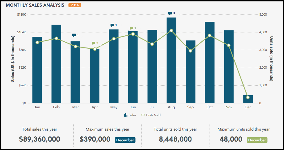
Suppose you are looking at a sales dashboard and notice a sudden jump in sales figures for August. You want to know the story behind it. How did it happen? What can you do to get more such monthly statistics?
Your whole team is looking at it, but there’s just no way you can ask your questions without leaving the dashboard. You take a couple of screenshots and start drafting a mail to investigate. All fine till now. What if you have not one but many dashboards to track? What happens then? Slowly it becomes a mess.
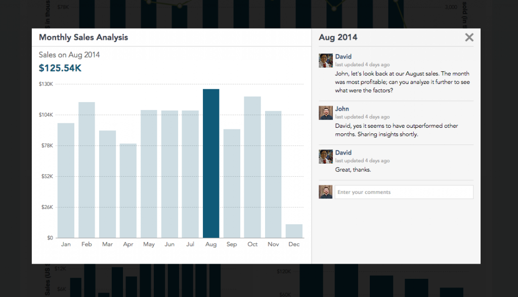
What if you don’t have to do this? What if you can ask questions at the same place that they originated? On the dashboard itself. What if you can click on a data point, and a familiar window pops up where you can post your comments, ask questions, provide answers and do a lot more? Well, no more what-ifs. We have built a solution to solve this problem of collaboration. A single place where you can geek about data. You can try it here, and this is how it looks:

Defining Requirements
When we sat out to solve this problem, we had tons of ideas. Incorporating all the suggested features would have resulted in a bloated application instead of a useful one. So we ruthlessly removed many features from our list to make it useful, light, and beautiful. Here’s what our final requirements list looked like:
-
Users should be able to see existing knowledge around the data.
-
The visual interaction model for collaboration should be similar to what we all are used to (e.g., Facebook) to reduce cognitive load.
-
Users should be able to drill into data to find relevant insights.
-
If they find an insight, they should be able to easily share the insight in form of actual data or charts. Further discussion should be allowed on this to get insights from other team members.
-
All this information should be stored persistently for anyone with access to such data or dashboard, within the organization, to get a quick picture.
Did we solve all the above problems? Of course, we did. Silly question. Isn’t it obvious this is the reason we are writing this post?
How We Did It?
Demo and source code: https://www.fusioncharts.com/dashboards/collaboration/
This section is for the curious developers out there, who are not content with just the solution but also want to know the process. So this is what went into the dashboard:
Components from FusionCharts
-
Combination chart – column and line charts combined.
Features from FusionCharts
-
Annotations – to add custom elements in the chart.
-
Events – click, hover, and keypress.
-
Themes – a separate file for applying themes.
Other Features
-
Web Storage – localStorage for storing comments in the browser. A database can be used for a full-fledged application.
The following files are in the package:
-
fusioncharts.js – FusionCharts source code. Required to render any chart built using FusionCharts.
-
data.js – Contains all the chart data including the initial set of comments.
-
fusioncharts.theme.collaboration.js – custom theme file which contains appearance settings for all the charts in the dashboard.
-
dashboard.js – contains the logic of the dashboard.
To understand the explanation below, please open the ‘dashboard.js’ file and the live dashboard. We’ll be referencing both below.
Functionality is divided into three parts.
-
Chart Rendering
-
Addition of Event Listeners
-
Loading of Comments from localStorage
Chart Rendering
When the ‘dashboard.js’ file gets executed, a ‘dashboard’ object is created, and the ‘drawCharts()’ method is called on that object. ‘drawCharts()’ method will read the data from the ‘data.js’ file and take the cosmetics settings from ‘fusioncharts.theme.collaboration.js’ (theme file) to render the chart. It will also add event listeners which is explained in the next section.
Addition of Event Listeners
We can divide the event listeners into two categories:
-
Events on chart elements
-
Events on other UI elements
Following events are applied on chart elements:
-
Click on the combination chart (‘Monthly Sales Analysis’): to open a modal window that contains collaboration features (comments and charts).
-
Hover on combination charts: to display comment count or annotation to add new comments (if there’s no comment).
-
Click on annotation (comment count): To display the modal window. It’s the same effect you get when you click on a data point on a combination chart.
-
Hover on annotations: to show the comment count when you hover over the annotation.
-
Click on the 2D column chart (‘Top 5 Categories By Sales’): to drill down on that particular category,
-
Click on the 2D column/line chart inside the modal window: to show comments related to that month.
Below are the events that are applied on UI elements:
-
Keypress (‘enter’) on comment textbox (inside modal): to add a new comment on the press of ‘enter’. That comment is also added to localStorage (depending on browser support).
-
Keypress (cmd/ctrl + v) on comment text box: to paste the chart recently copied. Pasting the chart involves rendering the chart with the original data.
-
Click on the ‘copy chart’ link on the column 2D chart: to set a flag to be used whenever a user presses ‘cmd/ctrl + v’ in the comment box.
-
Click events on the top header: eg. clicking on the notification icon will display the latest notifications.
Loading of Comments From localStorage:
Since we built this just for demo, we used localStorage. For a full-fledged application, this can be achieved via storage in a database.
Before the chart is rendered, ‘dashboard.js’ will check for comments in localStorage. If there are comments from previous sessions, the dashboard will be updated accordingly.
I hope you like what we’ve built. We’ll be more than happy to answer any questions.


