

7 common biases that influence how we understand, use, and interpret the world around usIn 2005, UCLA Econ Graduate, Michael Burry, saw the writing on the wall – the ticking numbers that form the American mortgage market. Burry’s analysis of US lending practices between 2003-2004 led him to believe that housing prices would fall drastically as early as 2007. And he turned his ideas to good use, pocketing net profits close to a whopping 489% between 2001 and 2008! Those who overlooked his insights earned a little over 2% in the same period. In the modern world, we can’t overstate the impact of accurate data analysis. The price to pay for small mistakes can be significant – running up to millions of dollars, or the failure to predict election results by a laughably wide margin. So, why do we make these errors? Why do even the best of us, with years of experience in making data-led decisions and equipped with the latest tools, often struggle to read between the numbers?
Table of Contents
1. Approaching data sets with a pre-existing idea
Also called confirmation bias, this theory suggests that decision makers use data to prove or debunk a specific theory.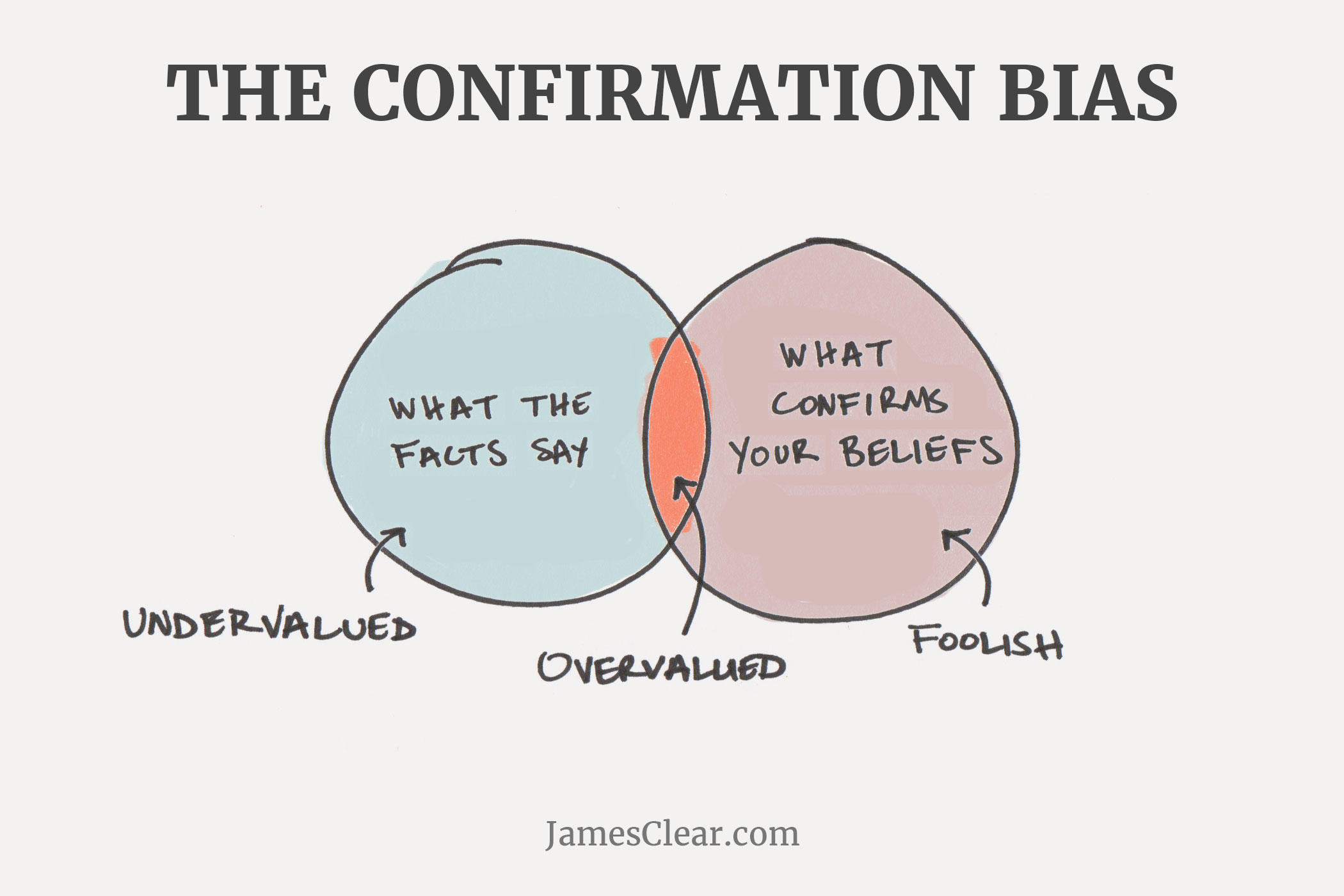 Image Source
Unlike Burry, most stakeholders looked at the data with preconceived notions of how the investment market is supposed to behave.
Instead of a generic stance, C-level executives might leverage data with a predetermined goal. That’s where the data scientist comes in – it’s their job to perform an accurate and objective analysis, gaining insights that may or may not validate the business users’ choice, or even turn out to be completely irrelevant.
Image Source
Unlike Burry, most stakeholders looked at the data with preconceived notions of how the investment market is supposed to behave.
Instead of a generic stance, C-level executives might leverage data with a predetermined goal. That’s where the data scientist comes in – it’s their job to perform an accurate and objective analysis, gaining insights that may or may not validate the business users’ choice, or even turn out to be completely irrelevant.
2. Not looking at the data, ALL the data, and nothing but the data
The broad umbrella of selection bias covers unwitting biases (like survivorship bias) or unavoidable ones, such as availability bias. Take, for example, the 7 million Americans living outside the country who weren’t included in 2016’s US pre-poll survey. Incomplete data sets let the NYT Presidential Forecast ticker go from 80% to <5% in around 12 hours.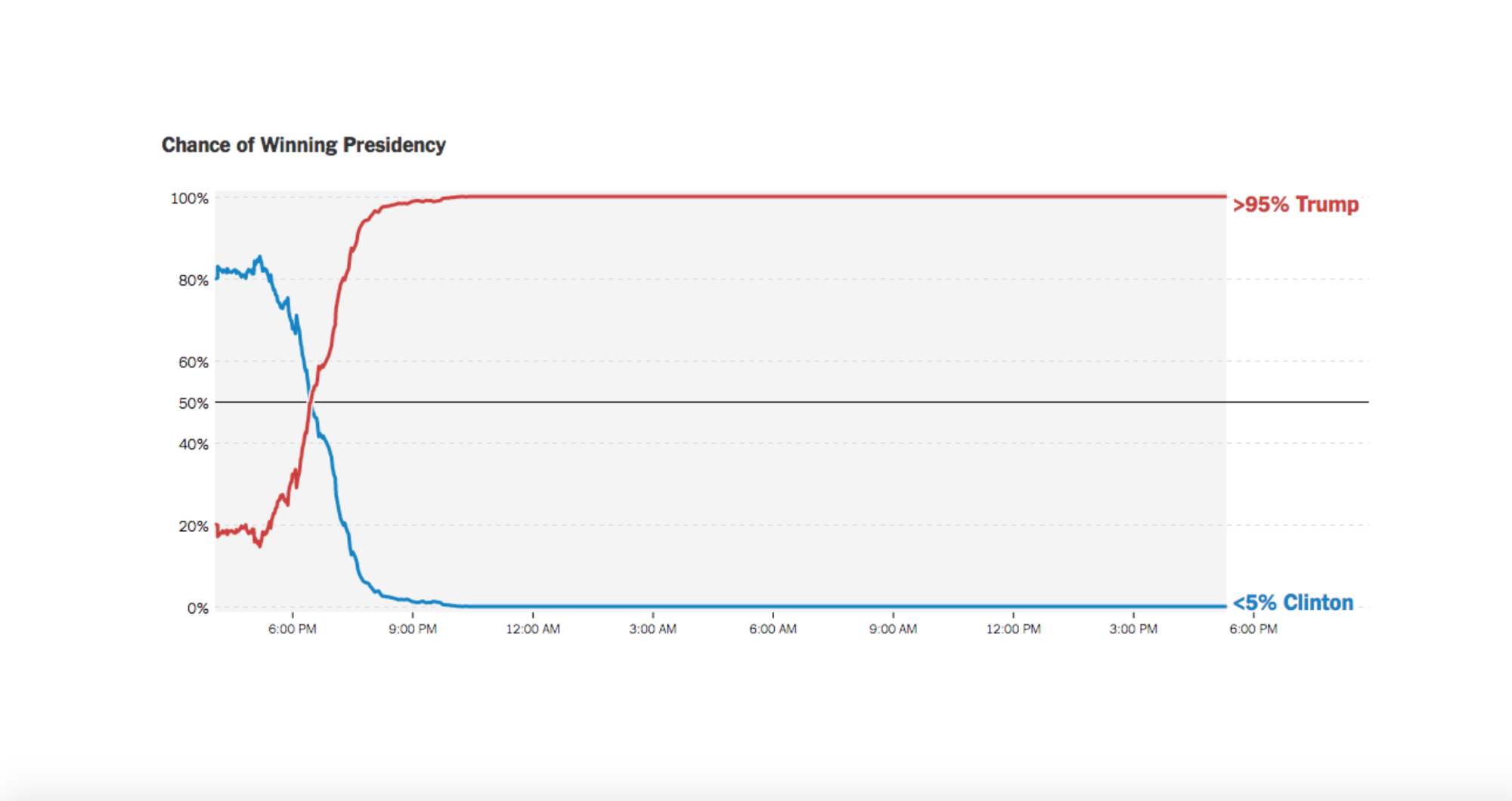 In fact, most surveys are prey to selection bias. “Many businesses only capture a small piece of the pie when it comes to data available to their segment or industry, and this means their data and subsequent analysis are skewed,” said Powerlytics CEO, Kevin Sheets, in an interview with InformationWeek.
3. Ignoring the impact of outliers (or rejecting them altogether)
Outliers are extreme data points that show a vast difference from the mean. As seen, they tend to generate ‘false’ averages that don’t reflect the real picture. In 2014, research shows the bottom 50% of the American population earned USD 25,000 on an average, while the top 1% cashed in around 81 times that amount, every year – sizable difference.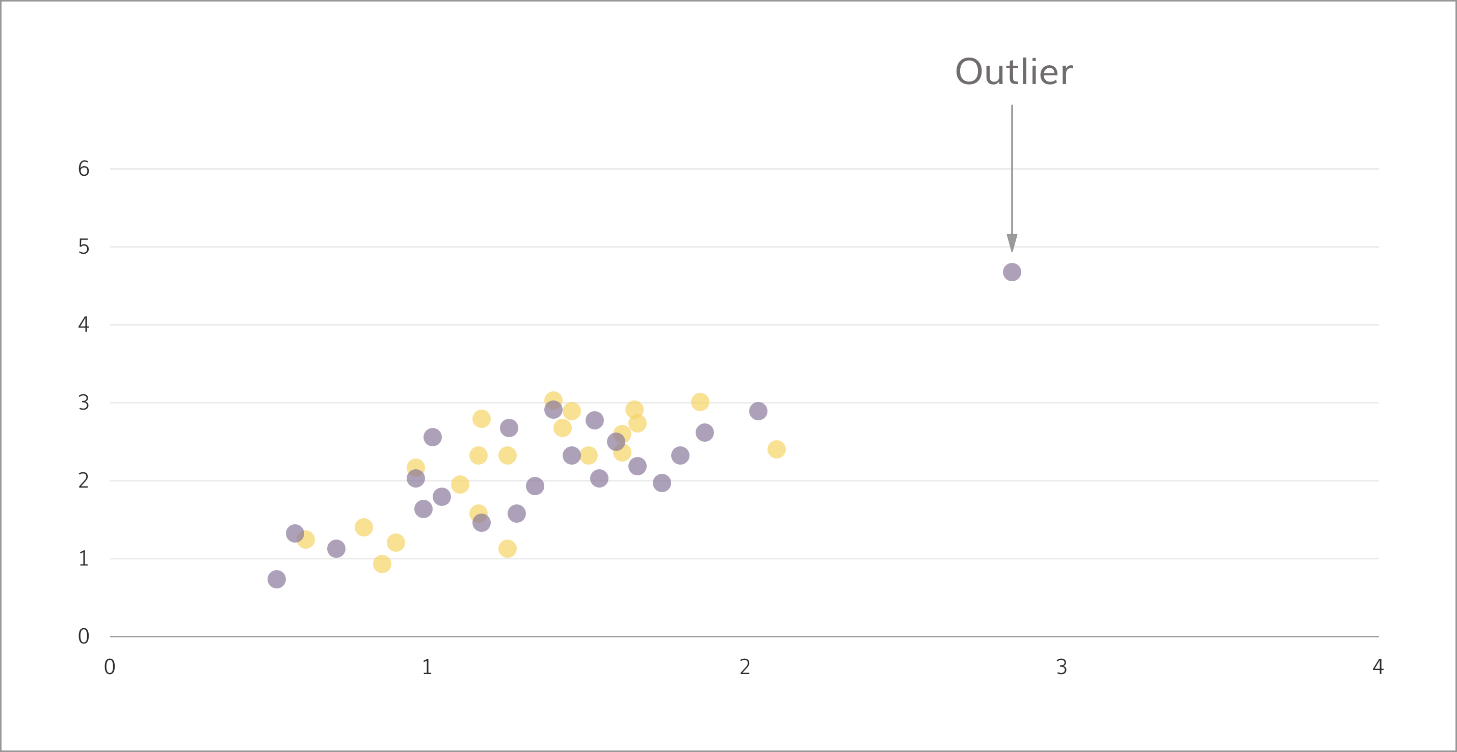 However, removing the outliers isn’t always the way forward. For the insurance industry, a set of exceptional claims can impact revenues – but must be analyzed and addressed separately.
4. Assuming a trend recurring in two data sets, holds true for the combined set as well
Those of us not familiar with the nitty gritty of statistical analysis often fall prey to what experts call ‘Simpson’s Paradox’. It says, combining two data sets might negate – or even reverse – the insights gathered from them individually. Let’s break it down: in 1973, graduate admissions in Berkeley showed a marked slant towards men who enjoyed 44% successful admission rates, in comparison to 35% for women. But among the 6 largest departments, 4 were biased against men while only 2 favored them!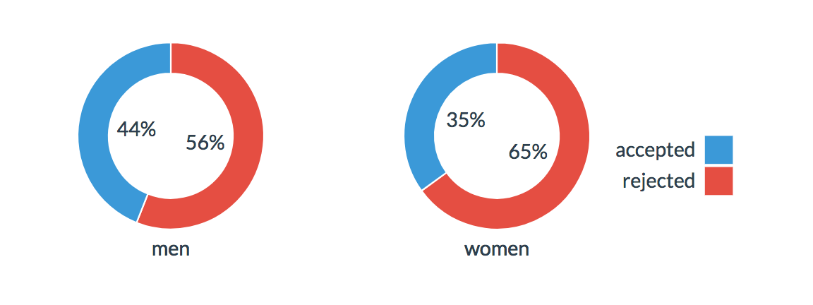 Interestingly, the Simpson’s Paradox disappears when you factor in causes and other underlying forces.
In our example, it was observed that women mostly applied to highly competitive departments – among the 341 who went for Department F, only 7% finally qualified. On the other hand, from the measly 25 who chose the less competitive B, 68% were successful.
This brings us to the cause – hidden data, called confounding variables, that can hugely impact your analyses.
Interestingly, the Simpson’s Paradox disappears when you factor in causes and other underlying forces.
In our example, it was observed that women mostly applied to highly competitive departments – among the 341 who went for Department F, only 7% finally qualified. On the other hand, from the measly 25 who chose the less competitive B, 68% were successful.
This brings us to the cause – hidden data, called confounding variables, that can hugely impact your analyses.
5. Accepting a single layer of analysis if it doesn’t display any contradictions
At first glance, an insight may appear to make perfect sense – and if accepted, can lead to incorrect decisions. Let’s say a study of men and women uncovers that men gain weight faster and more easily than women, leading to the conclusion that gender is a direct cause. On closer examination, however, it’s revealed that the average man eats more than women, and is more likely to have a desk job. This is a curious case of the confounding variable, where an earlier overlooked piece of data invalidates the conclusion. In the Berkeley scenario, the fact that women preferred highly competitive courses negated the apparent favoritism towards men. Clearly, the obvious conclusion isn’t always the right one.
6. Putting a square peg in a round hole
Right at the starting line, if the analytical model employed is out of sync with the data set, the insights generated might be subject to either overfitting or underfitting. Overfitting arises from statistical models that are overly complex and thorough, taking into account more information than was required. Underfitting, on the other hand, is a result of applying models that are too simple. Not enough aspects are considered, and in both cases the conclusions are likely to be skewed.
Mathematician Spencer Greenberg sums it up perfectly: “Overfitting is one of the most common (and worrisome) biases. It comes about from checking lots of different hypotheses in data. If each hypothesis you check has, say, a 1 in 20 chance of being a false positive, then if you check 20 different hypotheses, you’re very likely to have a false positive occur at least once.”
Overfitting arises from statistical models that are overly complex and thorough, taking into account more information than was required. Underfitting, on the other hand, is a result of applying models that are too simple. Not enough aspects are considered, and in both cases the conclusions are likely to be skewed.
Mathematician Spencer Greenberg sums it up perfectly: “Overfitting is one of the most common (and worrisome) biases. It comes about from checking lots of different hypotheses in data. If each hypothesis you check has, say, a 1 in 20 chance of being a false positive, then if you check 20 different hypotheses, you’re very likely to have a false positive occur at least once.”
7. Expecting the usual-case scenario
Normalcy bias occurs when we fail to factor in non-normality, i.e. atypical possibilities. Some statistical tests, like the t-test, is predicated on the fact that a bell curve – a normal distribution – already exists. However, if that’s not actually the case and data is force-fit into compliance, the conclusions can be vastly misleading. For instance, a hospital’s target processing time for patients in the emergency room is 4 hours. However, on-floor data mapped as a bell curve suggests it hovers between 12 hours, and 30 minutes! Does that mean the systems in place are critically flawed? Not necessarily. Greenberg recalls how a t-test returned a probability value of 0.03, meaning the hypothesis being tested had a 0.03% chance of being true. When passed through non-parametric analysis that doesn’t assume that the data is normal, the same experiment gave a result of 0.06 – a small but visible change.Don’t Blame the Bias
And the list doesn’t end. From prediction bias to loss aversions, it’s almost as if the human mind is built for flawed data analyses! Yet, biases are hardwired into our thought processes and a vital part of our organic survival mechanisms. Think about it. In case of a zombie apocalypse, is it better to a) contemplate the forces that would reanimate a corpse and instill it with the desire to eat human flesh, then work out the most effective solution to block this cycle? Or, b) start shooting until it stopped moving. The difference is, while time and energy continue to be precious resources, modern computational tools and analytical methods have far surpassed such cognitive limitations. Errors can now be easily avoided by applying the right tools on the right information – all you have to do is deep-dive, and explore the vast, ever-growing world of analysis ideas. While you’re at it, why don’t you enjoy this comic strip: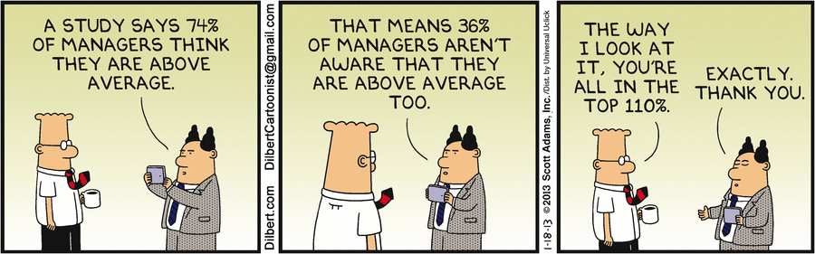


One response on “How To Debug Your Approach To Data Analysis”