Conceptualizing a business dashboard is a complex process. It requires an in-depth knowledge of the business processes involved and deep technical knowledge of how to go about implementing it too. But another aspect that is often overlooked is an understanding of how the end user will interact with the dashboard. A poor understanding of that leads to poorly designed dashboards, which hinders decision-making, and kills the very purpose of the dashboard.
With this post, we aim to equip you with a basic understanding of how end users interact with a dashboard and more generally, how you can conceptualize your business dashboards better.
What is a business dashboard?
Definition: A business dashboard is a multi-layered application, built on a business intelligence and data integration infrastructure that allows organizations to monitor, analyze and manage business process more effectively. This definition suggests that a dashboard is an application that is wired to the organization’s database/ERP system from where it draws data and presents it in a meaningful way. The fact that a dashboard is multi-layered implies that it presents different hierarchical views of data. Using a dashboard; executives can monitor, analyze and manage a business process.How do people interact with a dashboard?
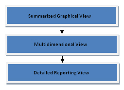
Dashboards are all about visualizing data. According to Wayne Eckerson, the director of research and services for TDWI (The Data Warehousing Institute) and a leading authority on business dashboards – business dashboards should allow visualization of data at three levels:- Summarized view
- Multi-dimensional view
- Detailed view

Architecture of a Dashboard
While building a dashboard application, planners and developers should establish well defined levels of abstraction with respect to data. This not only makes the application user friendly, but also makes it deployable at all levels of organizational hierarchy. As discussed previously in conjunction with end user interaction with dashboards, a dashboard should present data across three levels, viz; summarized view, multidimensional view and detailed view. Following are the design specifications for each data presentation layer of the dashboard:- Summarized view: This is the topmost layer of a business dashboard and it should display essential KPIs graphically (i.e. using graphs or gauges). The layer must also have an in-built control mechanism that triggers an alert when a KPI exceeds or drops below the normal value range.
- Multi-dimensional view: This layer should supplement the metrics displayed in the top layer with additional data. Analytical tools must be built into this layer in order to allow users to perform computational analysis on data.
- Detailed view: This layer should facilitate users to view reports pertaining to individual transactions (e.g. invoices, shipments etc).


ethan
April 17, 2010, 9:56 amNice Article,
It would have been great if any snapshot & images were included.
Thanks
Ethan
Sanket (FusionCharts Team)
April 17, 2010, 2:41 pmThanks for your comment Ethan. Yes, we are looking do a more detailed post on this topic some time soon which will have lots of images and examples.
Julia
June 11, 2010, 4:40 pmJust heard that Blue Query software has some sample charts which look almost the same as FusionCharts…Wondering if FusionCharts and BlueQuery have any cooperation…
https://www.bluequery.com.cn/
https://www.bluequery.com.cn/pdemo.htm
https://www.bluequery.com.cn/channel.php?tb_Name=channel&channel_ID=7
Sanket (FusionCharts Team)
June 14, 2010, 6:21 am@Julia: We just checked it out and found out that they are not using FusionCharts – it is a different component.