This is the fourth post in our series on Real-time Data Visualization.
In this post we go behind the scenes with Cleartrip, one of the leading online travel companies in India and the Middle East. We look at how they use data in the daily functioning of their business, and more specifically at how they handle payment failures.
Cleartrip’s tagline is ‘Making travel simple’ which shows in visible, and sometimes subtle ways across their user interface. However, simplicity doesn’t just happen. A lot of what seems simple in Cleartrip’s UI takes some intricate design in the background. We caught up with Ravdeep Chawla Product Manager, Analytics at Cleartrip to understand the role of analytics in their business, and how it makes their booking experience stand out from the pack.
 A booking on Cleartrip starts with a search on their website for a flight, or hotel, after which a selection is made, payment completed, and the booking is confirmed. This conversion process is critical to Cleartrip’s business, and requires close monitoring every second of the day. This is where they find the most viable use case for real-time analytics. This conversion path is tracked by various dashboards. Let’s take a look at four of them in this post. Keep in mind that for confidentiality reasons, the actual numbers have been removed from the dashboards. This actually helps focus even more on the design and visualizations, which is a good thing.
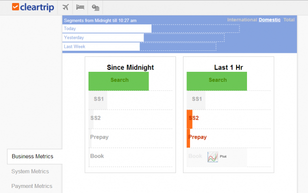 The first chart in this dashboard is right up top in the form of three white bars, which are further extended in the form of dotted bars. This chart compares today’s performance with that of the previous day, and the previous week. The solid white bars plot completed bookings, while the dotted bars are predictions based on historic trends, and current performance.
 In the chart above, the dotted line is the cumulative data from the previous week, and the solid line is the delta for every half an hour interval in near real-time. Green and red colors are used to visualize whether the data is better or worse than the previous week at a glance.

 A booking on Cleartrip starts with a search on their website for a flight, or hotel, after which a selection is made, payment completed, and the booking is confirmed. This conversion process is critical to Cleartrip’s business, and requires close monitoring every second of the day. This is where they find the most viable use case for real-time analytics. This conversion path is tracked by various dashboards. Let’s take a look at four of them in this post. Keep in mind that for confidentiality reasons, the actual numbers have been removed from the dashboards. This actually helps focus even more on the design and visualizations, which is a good thing.
Table of Contents
1. Bird.. er.. Eagle’s eye view
This is the first dashboard the Cleartrip analysts look at to get a feel for the pulse of the business at any time. The first chart in this dashboard is right up top in the form of three white bars, which are further extended in the form of dotted bars. This chart compares today’s performance with that of the previous day, and the previous week. The solid white bars plot completed bookings, while the dotted bars are predictions based on historic trends, and current performance.
A funnel walks into a bar
The two charts below that plot metrics for how users are progressing along each step of the conversion process on the Cleartrip website. It’s interesting to note that these charts could have been a horizontal column chart, or a funnel chart, and that would have worked just fine. However, in unorthodox fashion, they’ve used a (vertical) bar chart, placing each step in order, and ended up with a funnel that’s very intuitive.Colors for signals
The colors orange, green, and gray are based on a predictive algorithm, and inform the team of the performance at a glance. Green tells them that performance is above expectation, orange calls for attention if the performance is below expectation, and gray denotes the exact range that was predicted. Hovering over any of the bars allows to explore a particular metric in more detail as shown in the bottom left corner.Context is king
One thing that stands out with this dashboard is that it puts data in context. Whether comparing today’s performance with yesterday’s, and last week’s, or placing every step in the conversion process next to each other, it discourages looking at a standalone metric, and instead facilitates insights by comparing relevant metrics alongside each other.Thinking beyond available data
The next, and perhaps even more important feature of the dashboard is that it uses predictive analytics. Cleartrip’s algorithms predict overall booking volumes, and other metrics that lead to bookings, and use this data as a control on which actual performance is overlaid. This is a great example of how to think beyond available data when solving for businesses. Let’s take a closer look at how this predictive anlaytics works.2. History repeats itself
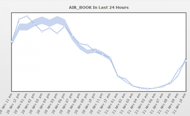
This chart visualizes the results of the predictive algorithm, and overlays it with actual performance data.
Band of blue
The light blue band is the range of the predictive algorithm which uses time of day, day of week, and week of year seasonality to predict how many searches, and bookings will happen each hour. The darker blue line running along the band is the number of actual bookings that happened compared to the prediction. This is a widely used predictive model which takes into account past performance of a metric to predict its outcome in future. [Related read: Predictive Analytics: No More the Way of the Analytics Ninjas]Calling it right
What’s fascinating about this predictive algorithm is that it boasts a whopping 95% confidence level. This mean, 95% of the time Cleartrip is aware of how booking volumes are going to trend even before it happens, and can respond accordingly. This is evident from how closely the actual data tracks the predicted range. Most analysts would kill for this level of accuracy. This predictive data is also used is to control the green/orange/gray coloring of the first dashboard. This way, the analyst has multiple alerts to spot when something is out of the ordinary, and needs attention. Additionally, each dashboard gives him a different perspective on the same situation.3. Near real-time trends
Next up is a near-real time monitoring chart for analyzing if bookings are on-track or lagging. This is the first chart that the Cleatrip team looks at when they notice any orange bars in dashboard 1. This chart helps analyze at one shot when things started going wrong. In the chart above, the dotted line is the cumulative data from the previous week, and the solid line is the delta for every half an hour interval in near real-time. Green and red colors are used to visualize whether the data is better or worse than the previous week at a glance.
Ear-to-the-ground approach
In this screenshot, the separation between the two lines is because Cleartrip pushed out a new release for their website around 9:00 AM. As expected, in the first hour, the booking numbers tanked. Users dropped in steps 3 and 4 of the funnel, as seen in Dashboard 1. This is when the analysts turn to their predictive algorithm (Dashboard 2) to assess the potential impact the issue could have. They then dive deeper to find the root of the issue. Armed with all this insight, they make an informed decision on how to respond to the situation. It takes business savvy to be a successful analyst today, and great dashboards are an important piece of the puzzle.4. Tracking failure-rate in milliseconds
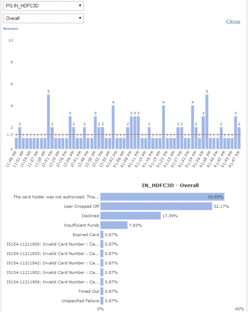
This final dashboard tracks real-time payment failures over the past two hours. Failures are logged as soon as they happen and are updated in this dashboard within milliseconds. It deep dives into payment issues when they’re spotted in steps 3 and 4 of Dashboard 1. This high frequency of updates allows for extremely quick evaluation and response to payment issues.