This is the second post in our Data Visualization in Education series where we showcase how different universities are using data visualization in a meaningful way.
Cornell University is an American private Ivy League research university located in Ithaca, New York. Founded in 1865 by Ezra Cornell and Andrew Dickson White, the university imparts education in all fields of knowledge—from the classics to the sciences, and from the theoretical to the applied.
Since its founding, Cornell has been a co-educational, non-sectarian institution where admission is offered irrespective of religion or race. Cornell counts more than 245,000 living alumni, 34 Marshall Scholars, 29 Rhodes Scholars and 41 Nobel laureates as affiliated with the university. The student body consists of nearly 14,000 undergraduate and 7,000 graduate students from all 50 American states and 122 countries.
 Cornell’s University Diversity Council has adopted an institutional diversity planning framework titled, “Toward New Destinations” according to which they will pursue full inclusion as a central component of their values and in their approach to each other and the world around them. “This framework organizes diversity initiatives around four core principles: composition, engagement, inclusion, and achievement.
 The Composition Dashboard splits information across 5 tabs—Overall, Undergrad Students, Grad & Professional Students, Ranked Professors and Other Academics and Staff. The Overall page gives a snapshot view of the composition of the university both in terms of gender and race/ethnicity. Users can select the required semester from a drop down menu located at the right-hand side of the page.
 The individual tabs give more detailed information about each segment. For eg: The Undergrad Students page gives users information about the college-wise diversity in undergraduate courses (radio button at the left helps users select the respective college).
 The Achievement Dashboard shares levels of attainment of the different groups, for eg: information about UG Grad rates (Freshmen who completed graduation within 6 years) and UG Retention in 2nd year (Percentage of Freshmen who return for second year).
 In addition, it also shares results from the Graduate Student Exit Survey of Master’s degree and PhD students. Drop down menus help users choose different parameters for comparison.

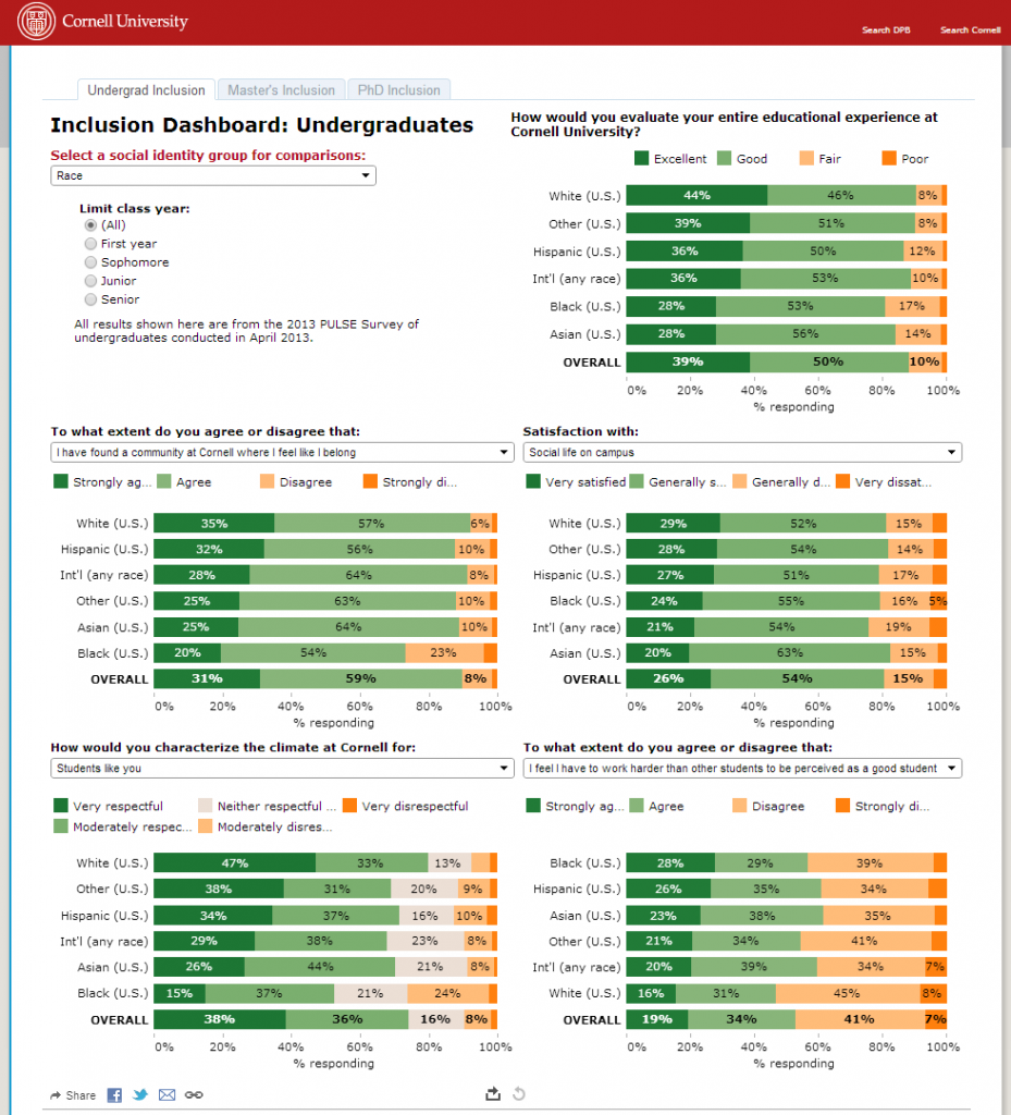
 Similar to the Master’s Outcomes (Achievement Dashboard), the Inclusion and the Engagement Dashboards too share results of surveys conducted with the Undergraduate, Master’s and PhD students. These surveys measure various interpersonal factors that help contribute to an inclusive community and the students’ commitment to institutional goals.
 Cornell’s University Diversity Council has adopted an institutional diversity planning framework titled, “Toward New Destinations” according to which they will pursue full inclusion as a central component of their values and in their approach to each other and the world around them. “This framework organizes diversity initiatives around four core principles: composition, engagement, inclusion, and achievement.
- Composition refers to the demographic make-up of the unit or the institution,
- Achievement reflects levels of attainment for underrepresented individuals or groups,
- Engagement reflects personal, social, professional commitment to institutional goals and activities, and
- Inclusion comprises climate and interpersonal relations.”
Table of Contents
Composition Dashboard
 The Composition Dashboard splits information across 5 tabs—Overall, Undergrad Students, Grad & Professional Students, Ranked Professors and Other Academics and Staff. The Overall page gives a snapshot view of the composition of the university both in terms of gender and race/ethnicity. Users can select the required semester from a drop down menu located at the right-hand side of the page.
 The individual tabs give more detailed information about each segment. For eg: The Undergrad Students page gives users information about the college-wise diversity in undergraduate courses (radio button at the left helps users select the respective college).
Achievement Dashboard
 The Achievement Dashboard shares levels of attainment of the different groups, for eg: information about UG Grad rates (Freshmen who completed graduation within 6 years) and UG Retention in 2nd year (Percentage of Freshmen who return for second year).
 In addition, it also shares results from the Graduate Student Exit Survey of Master’s degree and PhD students. Drop down menus help users choose different parameters for comparison.
Inclusion & Engagement Dashboards

 Similar to the Master’s Outcomes (Achievement Dashboard), the Inclusion and the Engagement Dashboards too share results of surveys conducted with the Undergraduate, Master’s and PhD students. These surveys measure various interpersonal factors that help contribute to an inclusive community and the students’ commitment to institutional goals.
Final Thoughts
Using interactive data visualizations, Cornell University makes the results of its extensive surveys available to one and all and that too in a form which can be easily understood. This lets different members of the community get value from these surveys. These dashboards are also instrumental in helping Cornell University track and monitor their progress towards achieving their goal of an inclusive community. In the next post of this series, read how The University of Texas System use the Productivity Dashboard to measure their productivity and bring in more transparency into the system. Related resource: 6 world-class enterprises (Walmart, Netflix, P&G, MailChimp, Twitter & Airbnb) making effective use of data visualization.Reference
- Towards New Destinations
- Diversity Dashboards
- Cornell University [Wikipedia]


