According to a wise man, a picture is worth a thousand words. It is extremely accurate, as data visualization makes it easier to quickly absorb large amounts of information. However, words play an important role as well. How often do you come across a data visualization that lacks text?
In this article, we’ll talk about the five text elements and how they enhance the meaning of any data visualization. The text elements that we are going to discuss are:
 While writing chart captions, it is best to avoid unnecessary adjectives. Let the user figure out if the revenue is ‘amazing’ or not.
 Related read: In this article, we share five tips for writing great chart captions.
 Rotated labels are difficult to read.
 If your data labels are too long, consider slanting them.
A slanted label is easier to read than broken labels or rotated ones.
Related read: In this article, we share 5 Quick Fixes to Ugly X-axis Labels.
 Legends should be arranged as per the order of appearance of the data plot (Eg: if ‘Search’ data is plotted first, the corresponding legend comes first).
It eases the process of interpretation for the user.
 Mention the functionality of the interactive legend clearly in the sub-caption.
If you use interactive legends (e.g., users can click on the icon for a data series to hide it and focus on the other series), make sure you mention this clearly in the sub-caption. Your user may overlook this feature if you do not specify it. [See our Interactive Legends in action.]
 Instead, you can use the tooltips.
 They will reveal the additional information only by hovering over the specific data plot and will keep your chart clutter-free.
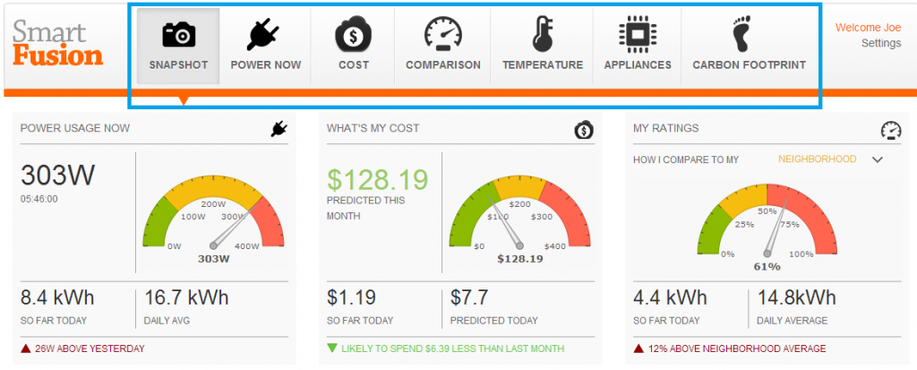
 However, it is best to use labeled icons for navigation ―a small icon followed by a 1-2 word description. This ensures that your new users are not left guessing the meaning of those icons/symbols.
[Looking for inspiration for your information dashboard? Check out our demos.]
As Enrico Bertini, Assistant Professor at NYU, points out in his article, ‘Text makes visualization alive. It gives meaning to what you see.’ Using these five text elements more effectively makes your data visualization more meaningful and easier for users to derive insights.
Do you think texts are essential in data visualization? How do you use them to enhance your data viz? Share your thoughts in the comment section below.
- Chart caption
- Date labels
- Data legends
- Tooltips
- Labeled icons
Table of Contents
Use the Chart Caption to Summarize
Chart captions are like an introduction to the contents of your chart. They should effectively summarize the key ideas in your chart well. However, verbosity is a strict no-no when it comes to writing compelling chart captions. Avoid unnecessary articles and adjectives. Keep it short, concise, and crisp. Also, do not forget to mention the units of measurement in your caption or sub-caption. While writing chart captions, it is best to avoid unnecessary adjectives. Let the user figure out if the revenue is ‘amazing’ or not.
 Related read: In this article, we share five tips for writing great chart captions.
If the Data Labels Are Too Long, Slant Them to Aid Readability
Data Labels describe the value associated with the specific point on the chart axes. We often do not pay too much attention to our data labels, but they can help take our story forward if adequately used. Rotated labels are difficult to read.
 If your data labels are too long, consider slanting them.
A slanted label is easier to read than broken labels or rotated ones.
Related read: In this article, we share 5 Quick Fixes to Ugly X-axis Labels.
Order of Data Legends Should Match Order of Data Plot
Legends are keys to understanding the chart. It contains a list of the variables appearing in the chart and an example of how they look. Legends should ideally be placed outside the chart plot area so that they do not clutter the space. Legends should be arranged as per the order of appearance of the data plot (Eg: if ‘Search’ data is plotted first, the corresponding legend comes first).
It eases the process of interpretation for the user.
 Mention the functionality of the interactive legend clearly in the sub-caption.
If you use interactive legends (e.g., users can click on the icon for a data series to hide it and focus on the other series), make sure you mention this clearly in the sub-caption. Your user may overlook this feature if you do not specify it. [See our Interactive Legends in action.]
Use Tooltip to Pack in Additional Information
Sometimes you may need to pack in more information for a specific data plot. Adding all the information to your chart labels will make your chart look cluttered. Instead, you can use the tooltips.
 They will reveal the additional information only by hovering over the specific data plot and will keep your chart clutter-free.


Jeff Hainsworth
June 12, 2014, 12:33 amTry this simple trick:
Switch the x&y axis when you need to visualize text data so that the text appears on the left axis. Here is a before and after of the same chart.
https://media1.dundas.com/downloads/comments/charts.html
You’ll see it’s instantly more readable because we don’t have to try to fit large labels under each bar in the chart. Apologies for the random data by the way.
Hope this helps too.
jeff
shilpi
June 12, 2014, 11:19 amHi Jeff,
Yup! changing from a Column to a Bar chart helps to tackle long data labels too. We covered this in detail in this article: https://fusioncharts.com/blog/bar-charts-or-column-charts/
Thank you for sharing the tip here 🙂