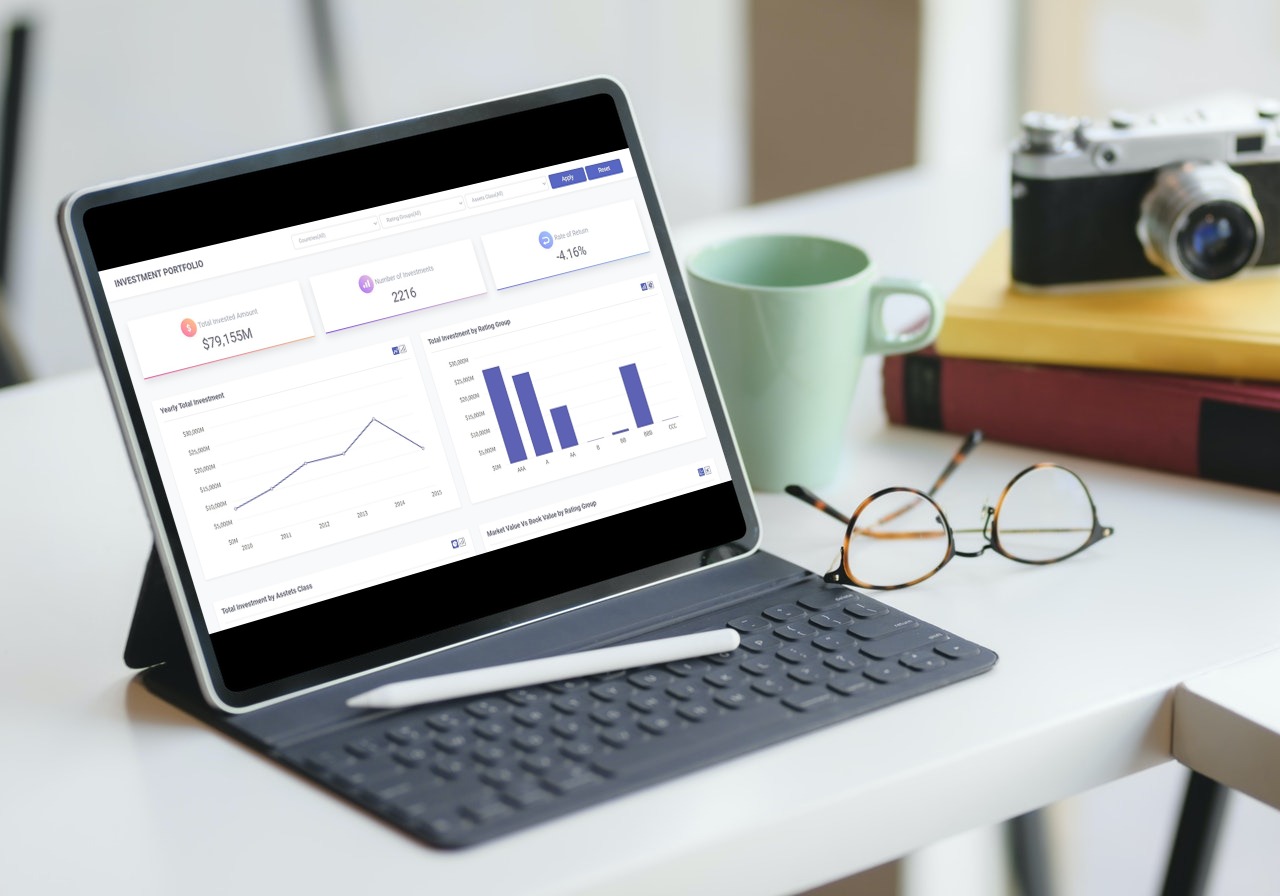
If you are looking to get the best out of your Investment Analytics, then Fusioncharts’ Investment Portfolio Dashboard is the ideal tool for you. Essentially, our Investment Portfolio Dashboard contains a series of charts and analytical tools that help you budget your finances. This JavaScript financial dashboard presents a detailed report of your investment spending, ordered by country, asset classes, as well as rating groups.
Furthermore, Fusioncharts’ Investment Portfolio Dashboard gives you key investment metrics. These include your rate of return, the extent of your portfolio distribution, and your level of risk.
 The scatter plot gives you an estimate of your rating group by weighing its market value against the book value. The Total Investment by Country displays your international assets by shading countries on a world map.
To take a closer look, explore the live demo packed full of features by switching between chart types or hovering over key points.
There are other options available if you choose to add JavaScript charts to your Angular app, though you would need to create an account to download the source code.
 One of them is Enterprise Software Solutions, responsible for distributing Microsoft Products, supplying Business Intelligence, and Data Mining services. They ran FusionCharts on BI Companion web technologies such as AJAX or MS SQL.
Their developers had access to both the active FusionCharts support forum, as well as numerous working demos to preview its charting capabilities. Overall, the team was very satisfied with FusionChart’s custom themes and chart animations. FusionCharts was also easy for them to integrate into their professional applications.
Another customer of FusionCharts is SolarWorld, a leading manufacturer of solar energy equipment. They construct power grids for rooftops and open ground. but lacked a way to assess the power output of their solar panels over time.
FusionCharts feature-rich charts and support for drill-downs were the answer. The FusionCharts interactive charting solution easily outshone the static bitmap charts they previously relied on to create reports in their Suntrol Portal.
Using FusionCharts, these and many other companies have seen massive improvements in their quantitative data reporting and their interpretation of comparative data.
Ready to make your investment portfolio more insightful than ever? See what we have on performance dashboards here.
Table of Contents
What can you do on the Investment Portfolio Dashboard?
The portfolio dashboard tells you a lot about your investment strategy. It keeps records of your assets’ increasing or depreciating value throughout the year. It also tracks your total amount invested, number of investments, and rate of return. FusionCharts displays these key figures clearly at the top of the dashboard. The bar graph sorts your investment dollar amount by rating group. In addition, the line plot measures trends collected from your investment decisions. The Total Investment by Asset Class is a pie chart that separates your corporate, cash, CMO, and other buy-ins by percent owned. The scatter plot gives you an estimate of your rating group by weighing its market value against the book value. The Total Investment by Country displays your international assets by shading countries on a world map.
To take a closer look, explore the live demo packed full of features by switching between chart types or hovering over key points.
There are other options available if you choose to add JavaScript charts to your Angular app, though you would need to create an account to download the source code.
How do you get the dashboard up and running in an Angular environment?
Before you open the program, as a minimum requirement, you must have Node JS 8.10 and npm 5.6 installed on your device. To install, Unzip the project files and extract the folder. Initialize npm install or npm i to download any remaining dependencies. Next, input the npm start or ng serve — baseHref=/demos/dashboards/investment-portfolio/ command to launch the server. The last step is to visit the server at https://localhost:4200 on your browser. For a demo installation of this lightweight Angular component, you need both the angular-fusioncharts and the original fusioncharts libraries. To begin, make a chart in Angular by importing the specified modules (e.g. BrowserModule, NgModule, AppComponent) from the README tutorial. Now, you want to add this code into your Angular AppComponent:import { Component } from '@angular/core';
@Component({
selector: 'my-app',
templateUrl: './app.component.html'
})
export class AppComponent {
dataSource: Object;
title: string;
constructor() {
this.title = 'Angular FusionCharts Sample';
this.dataSource = {
chart: {
caption: 'Countries With Most Oil Reserves [2017-18]',
subCaption: 'In MMbbl = One Million barrels',
xAxisName: 'Country',
yAxisName: 'Reserves (MMbbl)',
numberSuffix: 'K',
theme: 'fusion'
},
data: [
{ label: 'Venezuela', value: '290' },
{ label: 'Saudi', value: '260' },
{ label: 'Canada', value: '180' },
{ label: 'Iran', value: '140' },
{ label: 'Russia', value: '115' },
{ label: 'UAE', value: '100' },
{ label: 'US', value: '30' },
{ label: 'China', value: '30' }
]
};
}
}
The HTML snippet that goes along with it is here:
<!-- You can now use fusioncharts component in app.component.html -->
<h1>
  {{title}}
</h1>

<fusioncharts
    width="600"
    height="350"
    type="Column2D"
    dataFormat="JSON"
    [dataSource]="dataSource"
</fusioncharts>
If you’re working with events, you have to insert FusionCharts HTML into the template. This defines the block size and its data format (in this case, JSON). To import an event object, copy the JavaScript code for the class AppComponent, the constructor, and the plotRollOver that takes an event parameter.
Applying chart API is another story. This is because you’re using an instance from the initialized event directly on the template. Be sure to get the FusionCharts HTML block and save its chart instance. The chart instance has the title, type, dataSource object, and label captions. You can also implement FusionTime, though it deals with the visualization of time series analytics instead of events.
To learn more about integrating Angular dashboards, visit the JS library demo on GitHub.
What are the steps to implementing the Angular 2 Component?
If you want to browse the entire collection of custom charts, then you will appreciate FusionCharts’ Angular Directive. It gives you the freedom to build responsive, interactive, and exportable dashboards. The Angular 2 component preserves data binding. It also allows for JSON and XML formats, and offers advanced configurations at your fingertips. In addition, it offers you API support and many animations for drill-downs into the finer details of your graphs. From time series to world maps, you can even add charts during runtime to preview them before you deploy them to an app. Here is what you need to begin setting up an Angular project on FusionCharts:- The only prerequisites to initiating Angular 2 are Node.js and NPM downloads. Test it on your machine by executing node -v and npm -v. Install all utilities in the first project directory.
- To launch the dashboard you need the FusionCharts modules. Import the @NgModule as instructed to retrieve all dependencies and realize your first chart.
- Prepare your data in tabular form so that it fits into the labels and values of the x and y axes for a 2D plot. This is shown under the chartData constant.
- Once you have the data filled in, it’s time to edit the styling of your charts. Label the captions and axis names or change the theme to make it presentable.
- Add the finishing touches to your chart by rendering it using the AppComponent class, located in your root project file. Remember to set the chart container size via its HTML attributes.
// In app.component.ts
import { Component } from '@angular/core';
@Component({
selector: 'app',
templateUrl: 'app.component.html'
})

export class AppComponent {
dataSource: Object;
chartConfig: Object;

constructor() {
this.chartConfig = {
width: '700',
height: '400',
type: 'column2d',
dataFormat: 'json',
};

this.dataSource = {
"chart": {
"caption": "Countries With Most Oil Reserves [2017-18]",
"subCaption": "In MMbbl = One Million barrels",
"xAxisName": "Country",
"yAxisName": "Reserves (MMbbl)",
"numberSuffix": "K",
"theme": "fusion",
},

"data": [{
"label": "Venezuela",
"value": "290"
}, {
"label": "Saudi",
"value": "260"
}, {
"label": "Canada",
"value": "180"
}, {
"label": "Iran",
"value": "140"
}, {
"label": "Russia",
"value": "115"
}, {
"label": "UAE",
"value": "100"
}, {
"label": "US",
"value": "30"
}, {
"label": "China",
"value": "30"
}]
};
}
}
Here is the HTML template to accompany it:
<!-- in app.component.html -->
<fusioncharts
    [chartConfig]=chartConfig
    [dataSource]=dataSource >
</fusioncharts>
Design mobile pie, column, area, line, and other charts to implement on your web app.
Which companies are visualizing analytics with FusionCharts?
Many influential businesses across a wide range of industries attribute the success of their analyses to FusionCharts running with tools that are effective at generating lots of data. One of them is Enterprise Software Solutions, responsible for distributing Microsoft Products, supplying Business Intelligence, and Data Mining services. They ran FusionCharts on BI Companion web technologies such as AJAX or MS SQL.
Their developers had access to both the active FusionCharts support forum, as well as numerous working demos to preview its charting capabilities. Overall, the team was very satisfied with FusionChart’s custom themes and chart animations. FusionCharts was also easy for them to integrate into their professional applications.
Another customer of FusionCharts is SolarWorld, a leading manufacturer of solar energy equipment. They construct power grids for rooftops and open ground. but lacked a way to assess the power output of their solar panels over time.
FusionCharts feature-rich charts and support for drill-downs were the answer. The FusionCharts interactive charting solution easily outshone the static bitmap charts they previously relied on to create reports in their Suntrol Portal.
Using FusionCharts, these and many other companies have seen massive improvements in their quantitative data reporting and their interpretation of comparative data.
Ready to make your investment portfolio more insightful than ever? See what we have on performance dashboards here.


