If you are like most people, you would not mind making some money out of your website through advertisements. Sadly, one of the most neglected pages on a majority of the websites is the ‘Advertise’ page. It is usually a last minute addition with a mail ID thrown in somewhere. The truth is, a good informative Advertise page goes a long way in making that first impression with a prospective advertiser.
In this post, we take a look at what goes into making a good advertising page. We will be stressing on how to use data to make the page honest, informative and user friendly.
This will not only weed out a large section of misplaced advertisements, but will increase the chances of targeted ads being effective; which in turn will help you retain your advertisers on a long term.
Table of Contents
Visitor Numbers: Flaunt your vital stats
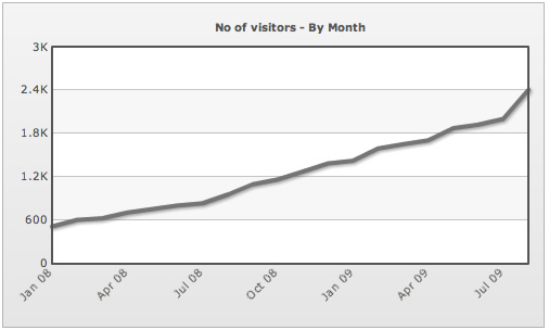
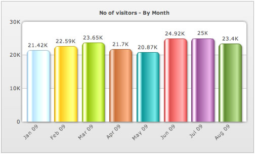
How popular is your website? Though there are 53 different ways an advertiser can ask you that question, they all want to know the same thing. So don’t be shy and give out the stats everyone is looking for.- Number of monthly unique Page Views
- Number of monthly unique Visitors
- No of Page Views/Visitor
- Number of Subscribers
Demographics: Mature Latina beauty or young Italian lass?
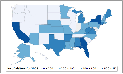
Visitor Location
Does your website get visitors from all over the world? Or is it very popular in your city? Remember, a limited local readership is not always never a bad thing. If you have a website on food that many people in your city like reading, don’t be surprised to hear from your friendly neighborhood pizza parlor one of these days, asking for some screen real estate. Depending on your readers’ locations, have an interactive world or state map to start with.
Visitor Interests:
Make it a point to keep collecting the search keywords that visitors use to reach your site. They may act as good indicators of their interests. Try to classify the keywords into some Interest Groups. Plot them in a Pie Chart to give a prospective advertiser a rough idea of what visitors look for when they come to your website.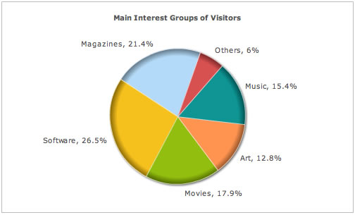
Age/Sex:
If you have some way of collecting information about the age or/and sex of the visitors positively do so. If your site has a member login or you have a feedback form, use the information collected to give your advertiser a solid ground to base his decisions on. For example, if most of the visitors to your site are women mostly in their twenties, a women’s magazine may find your website a good place to advertise. Plus, this will ensure that you get only relevant advertisements that your readers would not mind either. A multi-level pie chart comes in really handy over here; first to break down your audience gender-wise and then as per their age groups.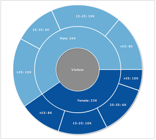
Rankings: How much does Google think you’re worth?
Social Media may be the buzzword at the moment, but the fact is, a large number of advertisers still want to know how you rank in Google’s Page Rank, Alexa, etc. Unless these ranks are comically bad for your website, you should display them on your Advertise page. A nice way of doing



Brian
September 10, 2009, 10:09 amHi,
I really liked the idea on line charts showing trends.. wonder if you could make anything to Show CPA, CPM rates.
Michelle
September 10, 2009, 12:35 pmHi. Nice post. I find the drill down map a good idea. I use Google Analytics on my site and now I am thinking I will use the data to make maps for the advertise page.
Keep posting guys. I have been reading for some time but first time I comented…
@ Brian: I think CPA, CPM rate will be important for the advertise page. If you are trying to show the variation of CPM/CPA over time, then a line chart is better. Is that what you want to show?
Rita
September 11, 2009, 5:22 amHey,
really nice read. I will start implementing these ideas on my website asap.
Looking forward to more posts from you guys!!!
article about media
April 10, 2013, 9:36 amexcellent post, very informative. I’m wondering why the opposite specialists of this sector don’t notice this.
You should continue your writing. I’m sure, you’ve a huge readers’ base already!
Marisol
December 7, 2013, 4:43 pmPretty nice post. I simply stumbled upon your weblog and wanted to mention that I have
really enjoyed surfing around your blog posts. After all I will be subscribing on your rss feed and
I’m hoping you write once more soon!