In our increasingly data-driven world of constantly evolving consumer expectations, businesses must make the most of the data they track and produce to stay relevant in any market. This involves understanding data, identifying trends, and making data-driven decisions. However, today’s sheer volume of data sets makes it nearly impossible to achieve all this using tabular data. This is where data visualization plays a key role. It helps users and stakeholders view large data sets in a visually compelling manner using different data charts, such as column charts and bubble charts. There are different types of data visualization. This article discusses the most important ones and their best practices.
But before we dive into the various ways to effectively represent data using data charts, let’s define data visualization.
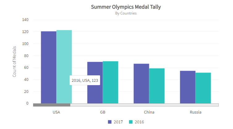
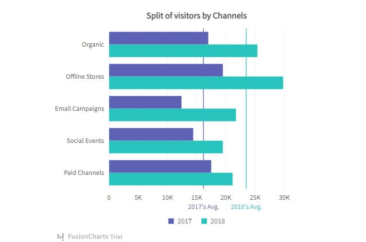
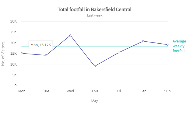
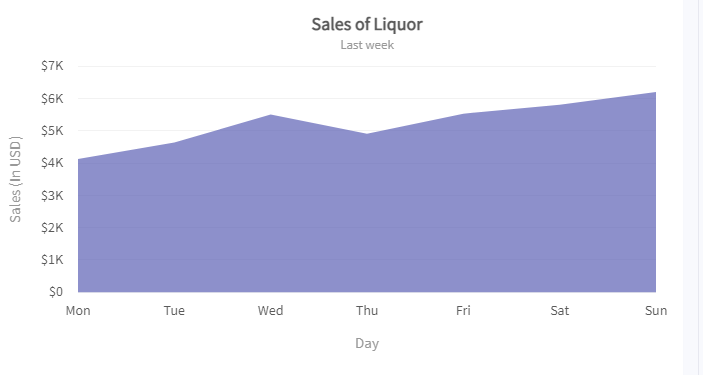
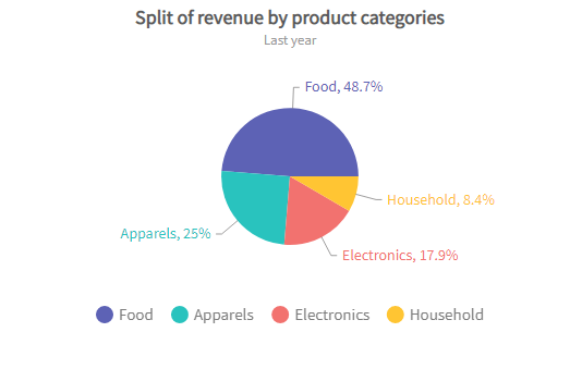
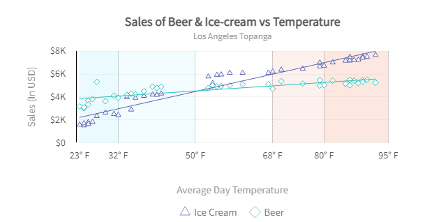
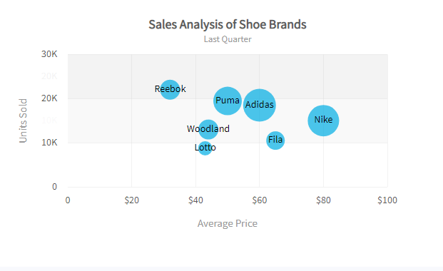
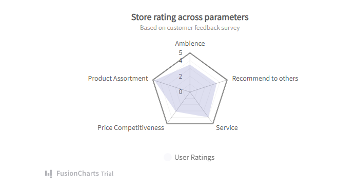
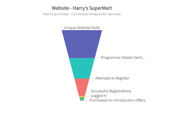
Table of Contents
What Is Data Visualization?
Data visualization is the practice of representing large data sets in a visually compelling manner. Such that it is easier for users to identify trends and infer actionable insights. Using easy-to-understand tools — charts, graphs, and maps — data visualization is a great way to display data to less technical audiences.Why Is Data Visualization Important?
The human brain is quickly drawn to pictures, colors, and patterns. In fact, you can say we are visual creatures. Data visualization is raw data’s visual art form that easily engages users’ attention. When we see charts, graphs, or maps, we easily spot patterns and outliers. If you’ve ever tried to identify trends using spreadsheets, you’ll appreciate the importance of data visualization. While there are different types of data visualization, they’re all equally important if used properly. Below are the most important types of data visualization charts.What Are The Different Types Of Data Visualization Charts?
Column Chart
Column charts use vertical columns to represent the relationships between data categories. While a column chart will display the data you feed in, ensure that the number of columns is not too large. Otherwise, you defeat the purpose of data visualization.
Bar Chart
Like column charts, bar charts represent data values using rectangular bars. However, a bar chart plots the variable value on the x-axis and the fixed value on the y-axis.
Line Chart
A line chart represents the change of data over short and long time intervals. It involves plotting several points along the plane and connecting each point using a straight line.
Area Chart
The area chart stems from the line chart. Only in this case, the real value is inferred from the area between the axis and the lines or between lines. Each area is marked using colors and hatchings. It is typically used to compare more than one quantity. Read: Dual Line Chart vs. Area Chart
Pie Chart
The pie chart is a circular representation of the proportions of different classifications. The arc length of each pie chart section is proportional to the data value it represents.
Scatter Plot
In a scatter plot, variables are represented by points on a rectangular coordinate system. A point’s location on the plot is proportional to its value. Also, the distribution of the data points tells the story of the correlation between variables.
Bubble Chart
The bubble chart is a variant of the scatter plot used to compare three variables. It’s fair to say that the line chart is to the area chart what the scatter plot is to the bubble chart. While the location of the points is a function of the x and y-axis, the area of each bubble represents the third variable.
Radar Chart
The radar chart is used to compare data values over multiple variables. For example, comparing wines over features like texture and sweetness. The radar chart plots each variable with its own axis and joins all axes in the center of the figure.
Frame Diagram
The frame diagram is used to display the hierarchical relationship between data categories. It is in the form of a tree structure.Funnel Chart
The funnel chart is a data visualization chart used to represent linear processes forming connected stages. For example, a sales funnel. Each stage visually represents the size of each module.