Ever had a data set that seemed more complicated than a Rubik’s cube? You’re not alone. Luckily, we’ve got a simple solution that breaks down complex information into bite-sized, easy-to-read visuals—the pie chart. Pie charts are the trusty workhorses of data visualization, turning dry numbers into a colorful and intuitive representation.
With just a glance, you can see how parts of your data relate to the whole. Want to know how sales are split between product lines? Or maybe you’re curious about the percentage breakdown of your company’s budget? A pie chart has you covered. Stick around, and we’ll dig into everything you need to know about creating and using pie charts like a pro.
Table of Contents
What Is a Pie Chart?
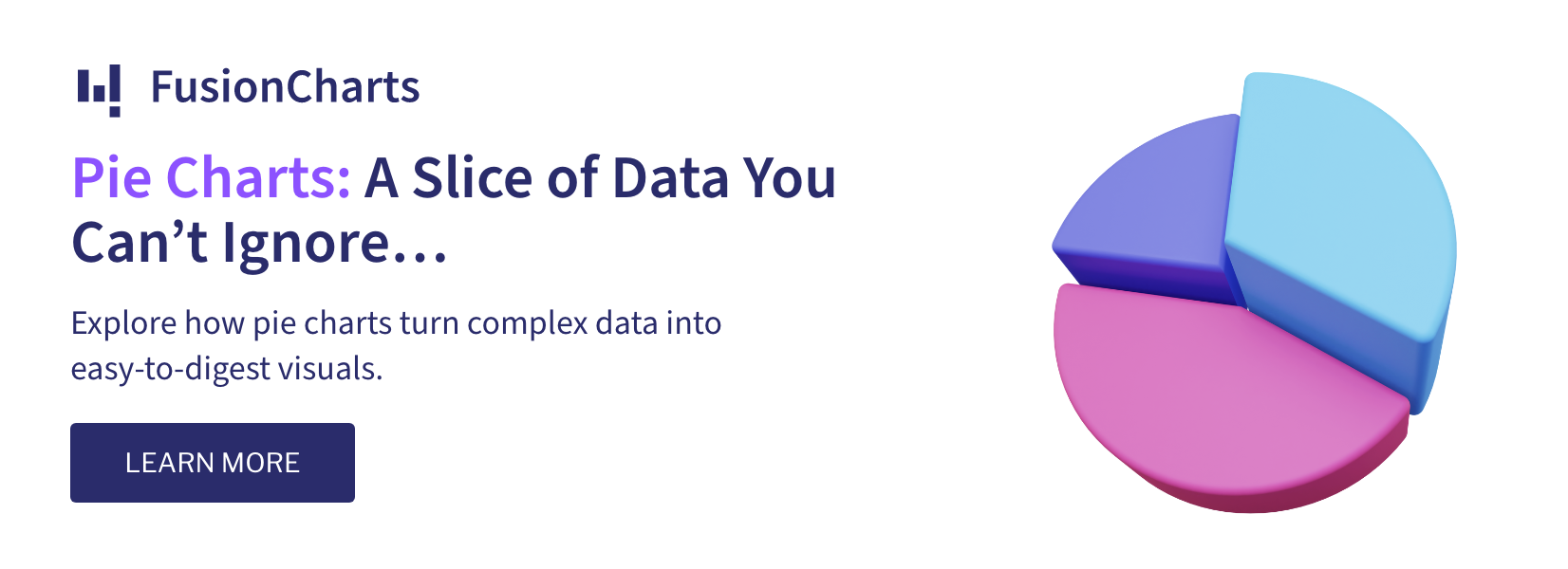
A pie chart is a circular chart divided into slices to illustrate numerical proportions. Think of it like a pizza, where each slice represents a piece of your data. The size of each slice is proportional to the quantity it represents, making it incredibly easy to see how different categories compare to the whole.
Pie charts are especially useful when you’re dealing with parts of a whole. For example, if you’re looking at the breakdown of your monthly expenses, a pie chart can quickly show you how much of your budget goes to rent, groceries, utilities, and so on.
Key Features of a Pie Chart:
- Slices represent data proportions: Each slice corresponds to a category, with its size relative to the value it represents.
- The whole equals 100%: A pie chart always represents a total sum, where all the slices together add up to 100%.
- Visual simplicity: Pie charts are easy to understand at a glance, making them a great choice for simplifying complex data.
Why Use a Pie Chart?
You’ve probably seen pie charts in everything from school textbooks to business presentations. But why are they so popular? Let’s break down the reasons:
- Easy to Understand
Let’s be honest: pie charts are one of the easiest data visualizations to interpret. You don’t need a math degree to figure out that a bigger slice means a bigger proportion. This makes pie charts perfect for audiences who may not be familiar with complex data analysis.
- Visualizing Parts of a Whole
Pie charts are ideal when you need to show how individual categories contribute to a whole. Want to see what percentage of your sales come from each product line? A pie chart will give you the answer in seconds.
- Instant Comparisons
Pie charts make it easy to compare proportions visually. Whether you’re looking at budget allocations, market share, or survey results, a pie chart gives you a clear picture of which categories dominate and which ones fall behind.
- Visually Engaging
Let’s face it, pie charts are kind of fun. Their circular shape and colorful slices are more engaging than a table of numbers, which makes them a popular choice for presentations or reports. Looking for inspiration to create visually stunning charts? Explore our tips on effective data visualization techniques.
Types of Pie Charts
Not all pie charts are created equal! While the classic pie chart gets most of the attention, there are a few variations that can help you visualize your data in slightly different ways:
-
Standard Pie Chart
The most basic version is where a circle is divided into slices based on data proportions. Each slice is labeled with either a percentage or a value.
- 3D Pie Chart
A variation on the classic pie chart that adds a 3D effect. While it looks cool, be cautious—sometimes the 3D effect can distort the data and make it harder to interpret.
- Exploded Pie Chart
In this variation, one or more slices are “pulled out” from the center of the pie for emphasis. This is useful if you want to highlight a particular category.
- Doughnut Chart
A doughnut chart is essentially a pie chart with a hole in the middle. It functions just like a pie chart but offers more space for labeling within the center, and it often looks cleaner in presentations.
How to Read a Pie Chart
Reading a pie chart is about as intuitive as it gets, but here’s a quick breakdown of the steps to ensure you’re getting the most out of it:
-
Look at the Whole
The entire pie represents 100% of the data set, so all the slices combined should give you the full picture of the whole. Each slice represents a proportion of that whole. - Check the Labels
Each slice should be labeled with either a category name, percentage, or both. This helps you quickly identify which part of the data the slice corresponds to. - Compare Slice Sizes
The larger the slice, the bigger the proportion. Simple, right? You can instantly see which categories dominate and which ones represent a smaller portion of the data. - Beware of Too Many Slices
Pie charts can get tricky when you have too many categories. If your pie chart starts to resemble a rainbow of tiny slivers, it might be time to consider a different chart type—like a bar chart—where individual comparisons are easier to make.
To learn more about comparing proportions, see our guide on bar chart uses and applications.
When to Use a Pie Chart
Pie charts are fantastic in certain situations but less ideal in others. Here’s when you should reach for a pie chart:
- Showing proportions: Pie charts are perfect when you want to show how different categories contribute to a whole.
- Simplifying data: If you’re dealing with just a few categories, a pie chart provides a clear and simple visual.
- Highlighting key data points: Want to emphasize how one category dominates the rest? A pie chart makes that easy.
When Not to Use a Pie Chart:
Too many categories: If you have more than five or six categories, a pie chart can get cluttered and hard to read.
Comparing similar values: If the values you’re comparing are too close in size, a pie chart won’t make the differences obvious. In this case, a bar chart might be a better option.
For alternatives to pie charts, check out our article on when to use a Venn diagram instead of a pie chart.
How to Create a Pie Chart
Ready to create your pie chart? Follow these simple steps:
- Gather Your Data
First, collect the data you want to represent. Pie charts work best when you have a small number of categories that add up to 100%. - Choose a Charting Tool
There are plenty of tools available to help you create pie charts. Here are a few options:
- FusionCharts: A robust JavaScript library that allows for customizable and interactive pie charts.
- Google Sheets: Great for quick pie charts, with built-in options for customization.
- Microsoft Excel: A tried-and-true tool for creating pie charts directly from your spreadsheets.
- Select Your Chart Type
Choose between a standard pie chart, 3D pie chart, exploded pie chart, or doughnut chart, depending on what best fits your data and audience. - Customize
Make sure your pie chart is easy to read by adjusting the colors, labels, and title. You want your audience to grasp the information at a glance. - Analyze and Share
Once your pie chart is ready, analyze the insights it provides and share it with your audience. Pie charts are a great way to communicate data in presentations, reports, or even social media posts.
FAQs about Pie Charts
Can I use a pie chart for time-based data?Not really. Pie charts are best suited for categorical data that represent parts of a whole. For time-based data, line or bar charts are usually more appropriate.
How many categories should a pie chart have?Aim for no more than five or six categories. More than that, and the pie slices can become too small to effectively compare.
Are 3D pie charts better than standard pie charts?While 3D pie charts can look more dynamic, they sometimes distort the data, making it harder to interpret. It’s usually best to stick with the standard pie chart for clarity.
Conclusion
The pie chart may seem like a simple tool, but its power lies in its simplicity. It’s an incredibly effective way to show proportions and make quick comparisons, making it a favorite for everyone from marketers to data scientists.
Whether you’re looking at your company’s budget breakdown, analyzing survey results, or comparing sales by product line, a pie chart can make your data easy to digest. But remember, pie charts work best when you keep things simple—too many categories or close values can muddy the waters.
So, next time you’ve got a data set that’s part of a whole, don’t hesitate to slice it up with a pie chart!
Want to add interactive charts on your web or mobile app? Fusionchart’s expansive library lets you build and use pie charts in minutes!


