When you have a table with 3 related dimensions of data, how do you represent it on a flat 2D chart? Put three column charts side by side, one for each dimension? Or use two XY-plot charts? But both of them will be ineffective in putting together all the 3 parameters in one elegant visualization. Time to say hello to the bubble chart.
In the third and last post of “Second base with charts”, we will show how bubble charts allow you to compare plotted entities in terms of dissimilar yet related criteria.
What are bubble charts?
Bubble charts plot data defined in terms of three distinct numeric parameters. They allow the comparison of entities in terms of their relative positions with respect to each numeric axis and their size as well. Column charts and line charts have 2 axes commonly – a numeric axis and a categorical axis. The Y-Axis is the numeric axis for column and line charts. This means that the quantitative magnitude of the plot is indicated by the position of the plot with respect to the Y-axis. Bubble charts are different, because both axes of a bubble chart are numeric. Hence, the position of the plot is an indicator of two numeric values. The area of the plot is an indicator of the magnitude of the third numeric characteristic.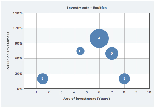
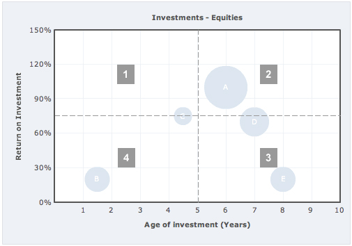
- Quadrant 1 – Best investments: Investments that have given high RoI in a short period of time. What else could you ask for? These investments are like jackpots.
- Quadrant 2 – Good investments: Long Age of Investment but great RoI. If you are planning to make further investments, you would surely invest in the equities in this quadrant.
- Quadrant 3 – Not-so good investments: Low RoI over a long period of time. Further investment on equities in this quadrant would be your last bet.
- Quadrant 4 – Decent investments: Manageable RoI over a short span of time. If you are thinking short-term investment, then this is your quadrant.
Variants of the bubble chart
What we have discussed till now are single-series bubble charts. You can also have multiple series of data plotted in the bubble chart. The series will then have different colors with the legend pointing out which color refers to which data series. In our Investments – Equities example, we can also show Mutual Funds in the same bubble chart.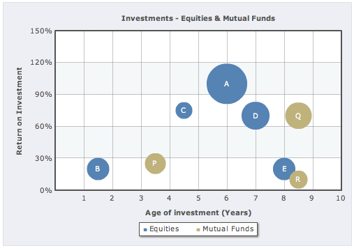
Where can bubble charts be used?
Apart from using bubble charts for investment, there are a whole lot of other places where bubble charts can be used. Some examples to stir up your imagination:- To see if higher promotional expenses lead to more footfall and in turn to more revenue for a bunch of retail stores for a month: The X-Axis can have the average daily footfall, Y-Axis the promotional expenses and the area of the plot will show the revenue generated by the outlet for that month. This can help find out which store was able to promote itself successfully and whose promos failed.
- Checking if higher CPC leads to higher clicks and better conversions in PPC Campaigns: To check if your excess spending on increasing the CPC to get better ad positions are getting you more clicks and finally leading to more conversions, a bubble chart will be useful.


John Beck Teleseminar
October 13, 2009, 9:39 amThese bubble charts are useful to manage your investments , they help you manage your investments in equities better.
Bindhu
November 29, 2011, 4:53 pmThe Four quadrant concept helped me a lot to analyse the data in a blink !! Thanks a lot !!
Haine ieftine
June 4, 2013, 5:23 amThis info was very usefull for my degree in this domain. Thank you 🙂
Thirugnanaselvi
January 24, 2018, 12:53 pmHi,
Is it possible to have Quadrants Coloration for all 4 Quadrants i.e., Top-Left quadrant, Top-Right quadrant, Bottom-Left quadrant and Bottom-Right quadrant with 4 different colors using fusionchart.
Thanks & Regards,
Selvi