Following up on the hugely popular previous post titled ‘3 Insanely Great Dashboards from Recorded Future,’ here’s an in-depth look at a dashboard from another company doing cutting-edge work in predictive analytics – Sift Science.
I’ve spoken in some detail about what Sift Science does in my previous post. As a quick reminder, Sift Science helps e-commerce businesses fight fraud using the power of machine learning and predictive analytics. They collect diverse data, glean signals from it, and assign a ‘Sift score’ to every user which predicts how likely it is that a particular user is a fraudster.
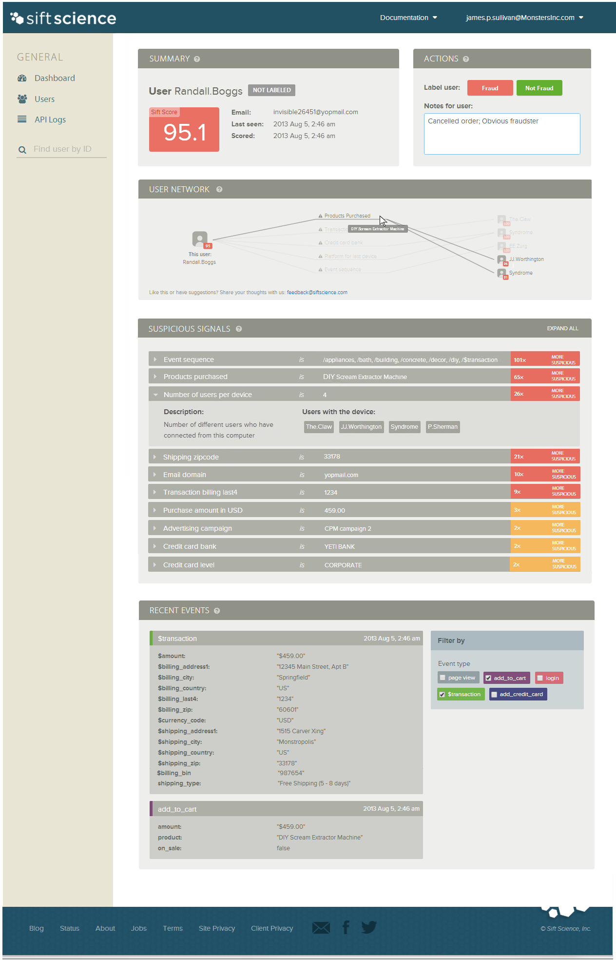 Now moving to their dashboard, its purpose is simply to alert an e-commerce website owner of suspicious activity, and prompt them to take action at the earliest. Let’s break it down, and see how well the dashboard does its job.
Summary section:
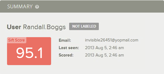 Right up top, the dashboard has two sections – Summary and Action. The Summary section has the most important information about the user in focus. What immediately catches the eye is the Sift score in large font, made even more noticeable by the block of solid red color surrounding it. What’s interesting to notice is the intentional use of a decimal for the score. This subtly helps build credibility for the score in the viewer’s mind. Around the score is some vital information about the user, which gives the viewer a chance to quickly assess the background of the user. This information is downplayed to direct attention to the score. The Sift score is the most crucial piece of information in this dashboard, and choice of formatting does justice to its importance.
Actions section:
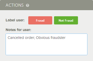 This section prompts the viewer to mark the user as fraud or not based on the information in the previous Summary section. The viewer immediately notices the apt use of colors red and green for the buttons, and can guess what they imply with very little cognitive load.
When dealing with fraud, the time to response is of critical importance. In a time-sensitive environment as this, having the Actions section right next to the Summary section makes the dashboard actionable and intuitive. In fact, with just these two sections at the top, the dashboard achieves its purpose of informing the viewer, and prompting them to take action. The viewer can ignore the rest of the dashboard and still do what they came for. The use of colors, formatting, and layout all serve to reduce the delay between analysis and action.
User Network section:
 The rest of the dashboard elaborates on the Summary section. The next ‘User Network’ section draws connections between this user and other suspicious users. This is at the heart of how Sift Science works, trying to correlate all available data points to identify suspicious patterns, and assign a data-driven, accurate Sift score.
This section is interactive, allowing the viewer to click on each detail, and view just the data that interests them. The use of connecting lines makes this information easier to understand at a glance. In fact, the graying of details that are not selected allows the viewer to gauge the level of suspicion without even clicking through – the more the number of connecting lines, the more the suspicion.
Suspicious Signals section:
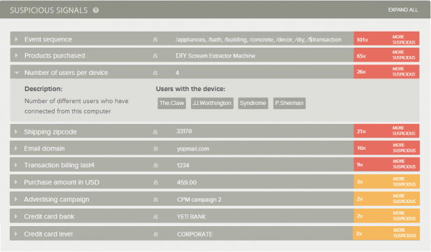 If the previous section is a teaser on how Sift Science identifies suspicious behavior, this section takes the hood off, going into the juicy details. The first two columns here show a list of data points captured by the system. Viewers can click in for more details. This data is downplayed in a gray background to give priority to the next column.
The next and more colorful column is the closest glimpse we get of the secret sauce Sift Science uses to predict fraudulent activity. For each of the data points collected, Sift Science predicts the likelihood that this user is fraudulent. This is done in a logical, data-driven manner by assigning a number to each prediction. The signals are arranged in order or priority with the most suspicious ones on top. Complex algorithms running in the background do the heavy lifting and arrive at a number that’s presentable, and easily understood by the viewer of the dashboard.
The use of color across the dashboard is exceptional. We saw the use of red and green earlier, which was used for an ‘either/or’ decision. In this section, with a range of data, the colors orange and red show different levels of intensity. Importantly, in all three sections we’ve seen so far, the captured raw data is always shown in gray, and when there’s insight gleaned by Sift Science, or action to be taken by the viewer, it’s highlighted in solid color tones. This intelligent use of colors serves to highlight Sift Science’s value add as a product.
Recent Events section:
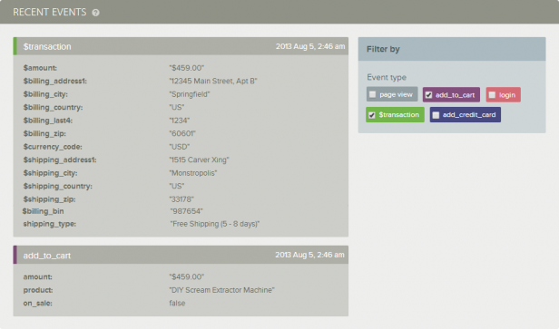 The final section of the dashboard gets to the minute details that were not part of the previous section. A filter allows the viewer to segment the data they’d like to see. This is perhaps the most ‘regular’ part of the dashboard, and rightly so. It simply has all the raw data that the viewer can deep dive into if they choose to.
Concluding thoughts & suggestions:
While I was mostly gazing in appreciation of this dashboard, a few suggestions did spring up along the way. First, while the dashboard stands out as an effective text-based dashboard, there are sections that may benefit from visuals. The Sift score works well as is, but it could communicate the sore more intuitively and powerfully via an interactive gauge. Similarly, the ‘Suspicious Signals’ section has perhaps the most fascinating pieces of data in the dashboard, but instead of using hard-to-read text like ‘101x’ and ‘65x’, a bar chart (horizontal) would reduce cognitive load on the viewer, and further bring out the significance of this data.
Additionally, while the text is laid out very well across the dashboard, telling the story of this fraudster in the form of well-presented data points, there is opportunity for the same story to be told in more powerfully using a visual. For example, an area chart showing the progressive growth of the Sift score over time, with each suspicious activity, will serve to visualize the same story in a way that immediately resonates with the viewer. I don’t at all suggest using gimmicky visuals that rob this dashboard of its subdued, yet intense energy. Rather, visuals that stick to, and in some ways enhance the existing design philosophy may be a welcome addition.
In summary, this dashboard oozes predictive analytics, and boasts of a refreshing design that does justice to the advanced technology powering it. Starting with the most vital information up top, it gradually and charmingly reveals deeper layers of insight at every step. The exquisite blend of colors serves not just to accurately interpret the data, but more importantly, to project the strengths of the product. With this dashboard, Sift science gives us a lesson on effective dashboard design.
With that we end our review of another impressive dashboard, and are almost at the end of our series on predictive analytics. If you enjoyed reading this, be sure to check out the other posts in this series:
Part 1 – Predictive Analytics: No More the Way of the Analytics Ninjas
Part 2 – 5 Businesses on the Frontier of Predictive Analytics
Part 3 – 4 More Businesses on the Frontier of Predictive Analytics
Part 4 – 3 Insanely Great Dashboards from Recorded Future
Part 6 – 9 Ways We Use Predictive Analytics Without Even Knowing It
 Now moving to their dashboard, its purpose is simply to alert an e-commerce website owner of suspicious activity, and prompt them to take action at the earliest. Let’s break it down, and see how well the dashboard does its job.
Summary section:
 Right up top, the dashboard has two sections – Summary and Action. The Summary section has the most important information about the user in focus. What immediately catches the eye is the Sift score in large font, made even more noticeable by the block of solid red color surrounding it. What’s interesting to notice is the intentional use of a decimal for the score. This subtly helps build credibility for the score in the viewer’s mind. Around the score is some vital information about the user, which gives the viewer a chance to quickly assess the background of the user. This information is downplayed to direct attention to the score. The Sift score is the most crucial piece of information in this dashboard, and choice of formatting does justice to its importance.
Actions section:
 This section prompts the viewer to mark the user as fraud or not based on the information in the previous Summary section. The viewer immediately notices the apt use of colors red and green for the buttons, and can guess what they imply with very little cognitive load.
When dealing with fraud, the time to response is of critical importance. In a time-sensitive environment as this, having the Actions section right next to the Summary section makes the dashboard actionable and intuitive. In fact, with just these two sections at the top, the dashboard achieves its purpose of informing the viewer, and prompting them to take action. The viewer can ignore the rest of the dashboard and still do what they came for. The use of colors, formatting, and layout all serve to reduce the delay between analysis and action.
User Network section:
 The rest of the dashboard elaborates on the Summary section. The next ‘User Network’ section draws connections between this user and other suspicious users. This is at the heart of how Sift Science works, trying to correlate all available data points to identify suspicious patterns, and assign a data-driven, accurate Sift score.
This section is interactive, allowing the viewer to click on each detail, and view just the data that interests them. The use of connecting lines makes this information easier to understand at a glance. In fact, the graying of details that are not selected allows the viewer to gauge the level of suspicion without even clicking through – the more the number of connecting lines, the more the suspicion.
Suspicious Signals section:
 If the previous section is a teaser on how Sift Science identifies suspicious behavior, this section takes the hood off, going into the juicy details. The first two columns here show a list of data points captured by the system. Viewers can click in for more details. This data is downplayed in a gray background to give priority to the next column.
The next and more colorful column is the closest glimpse we get of the secret sauce Sift Science uses to predict fraudulent activity. For each of the data points collected, Sift Science predicts the likelihood that this user is fraudulent. This is done in a logical, data-driven manner by assigning a number to each prediction. The signals are arranged in order or priority with the most suspicious ones on top. Complex algorithms running in the background do the heavy lifting and arrive at a number that’s presentable, and easily understood by the viewer of the dashboard.
The use of color across the dashboard is exceptional. We saw the use of red and green earlier, which was used for an ‘either/or’ decision. In this section, with a range of data, the colors orange and red show different levels of intensity. Importantly, in all three sections we’ve seen so far, the captured raw data is always shown in gray, and when there’s insight gleaned by Sift Science, or action to be taken by the viewer, it’s highlighted in solid color tones. This intelligent use of colors serves to highlight Sift Science’s value add as a product.
Recent Events section:
 The final section of the dashboard gets to the minute details that were not part of the previous section. A filter allows the viewer to segment the data they’d like to see. This is perhaps the most ‘regular’ part of the dashboard, and rightly so. It simply has all the raw data that the viewer can deep dive into if they choose to.
Concluding thoughts & suggestions:
While I was mostly gazing in appreciation of this dashboard, a few suggestions did spring up along the way. First, while the dashboard stands out as an effective text-based dashboard, there are sections that may benefit from visuals. The Sift score works well as is, but it could communicate the sore more intuitively and powerfully via an interactive gauge. Similarly, the ‘Suspicious Signals’ section has perhaps the most fascinating pieces of data in the dashboard, but instead of using hard-to-read text like ‘101x’ and ‘65x’, a bar chart (horizontal) would reduce cognitive load on the viewer, and further bring out the significance of this data.
Additionally, while the text is laid out very well across the dashboard, telling the story of this fraudster in the form of well-presented data points, there is opportunity for the same story to be told in more powerfully using a visual. For example, an area chart showing the progressive growth of the Sift score over time, with each suspicious activity, will serve to visualize the same story in a way that immediately resonates with the viewer. I don’t at all suggest using gimmicky visuals that rob this dashboard of its subdued, yet intense energy. Rather, visuals that stick to, and in some ways enhance the existing design philosophy may be a welcome addition.
In summary, this dashboard oozes predictive analytics, and boasts of a refreshing design that does justice to the advanced technology powering it. Starting with the most vital information up top, it gradually and charmingly reveals deeper layers of insight at every step. The exquisite blend of colors serves not just to accurately interpret the data, but more importantly, to project the strengths of the product. With this dashboard, Sift science gives us a lesson on effective dashboard design.
With that we end our review of another impressive dashboard, and are almost at the end of our series on predictive analytics. If you enjoyed reading this, be sure to check out the other posts in this series:
Part 1 – Predictive Analytics: No More the Way of the Analytics Ninjas
Part 2 – 5 Businesses on the Frontier of Predictive Analytics
Part 3 – 4 More Businesses on the Frontier of Predictive Analytics
Part 4 – 3 Insanely Great Dashboards from Recorded Future
Part 6 – 9 Ways We Use Predictive Analytics Without Even Knowing It
