So let’s say you have to analyze a company’s daily stock performance over the past 25 years. Quite a likely scenario when you are considering a serious investment or acquisition. But that’s 20,000 data points to analyze- fewer than the number of parts in most space stations!
The trouble is, often the only way to visualize both the overall trends and the underlying details is to juggle around with a dozen charts and scrolling back and forth to decipher any meaningful insight. But what if you could get an overview across all your data and zoom right in to the details when you see an interesting trend?
Introducing, the Zoom Line chart! In this post we will walk you through the zoom line chart, and show you how you can harness it to the best.
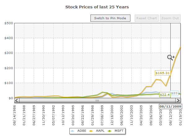
 The entire data is compressed to fit the chart’s width, providing a quick overview . The zoom line chart also features information-packed tooltips. When you hover over a particular point on the overview, you can get the values and tips from all the data sets in that x-axis.
 To zoom into the details, you just have to select the range in the chart.
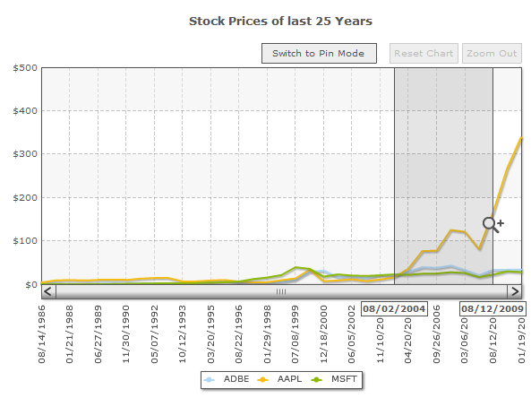 Notice that the date range shown in the tooltips below the scroll bar. This shows you the data range that is currently selected. By default, the selection snaps to the nearest vertical divisional line for easy interaction. Once you release the mouse button, the chart zooms to show the selected range in the available space.
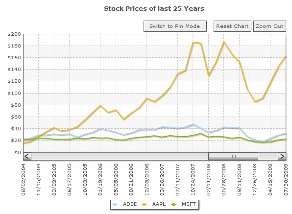 To see data beyond the currently selected range, you can simply scroll left or right using the scrollbar. The
 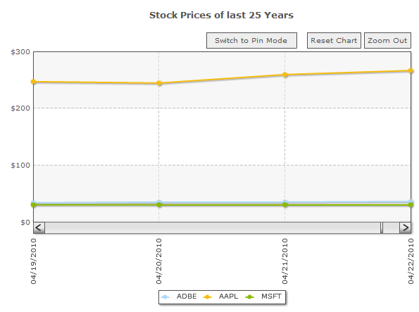 And snap right back to see the overall trends for a 25 year – instantly…
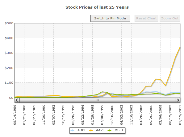 Pretty nifty, wouldn’t you say?
But there’s more depth to the zoom line chart than just zooming. Lets say you want to compare the daily trends during September 2009 with that during September 2010. Since they’re far apart, you would have to compare them with your naked eye.
The zoom line chart brings in an innovative feature called Pinning. Pinning literally enables you to pin one range of points over another, making trend-comparisons a lot more visual. To do Pin a range, click [cciel lang=”javascript”]Switch to Pin Mode[/cciel]. You will now see that the mouse pointer has changed from a magnifying glass to a cross-hair.
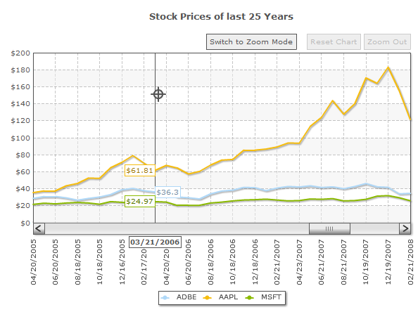 Now you just need to select the target range- September 2009, in this case. The mouse pointer will turn to another icon upon releasing the mouse button. A ghost of the selected line segment gets imprinted on the canvas, thus letting you compare the pinned segment with the rest of the chart by just scrolling through.
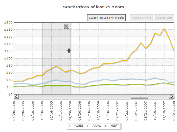 The pinned segment can be dragged to any part of the chart canvas.
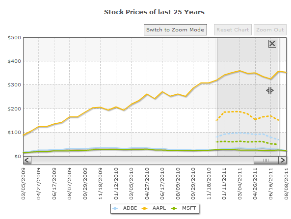 Once you’re done pinning the data points, you can switch back to the zoom mode from the
To quote Shneiderman’s mantra Overview first, zoom and filter, then details-on-demand.The zoom line chart is probably the best application of this mantra. First off, this chart can handle a larger amount of data points than any other chart. The example below has around 18 thousand data points of stock prices across 25 years.
 The entire data is compressed to fit the chart’s width, providing a quick overview . The zoom line chart also features information-packed tooltips. When you hover over a particular point on the overview, you can get the values and tips from all the data sets in that x-axis.
 To zoom into the details, you just have to select the range in the chart.
 Notice that the date range shown in the tooltips below the scroll bar. This shows you the data range that is currently selected. By default, the selection snaps to the nearest vertical divisional line for easy interaction. Once you release the mouse button, the chart zooms to show the selected range in the available space.
 To see data beyond the currently selected range, you can simply scroll left or right using the scrollbar. The
 Zoom Out button would take you to the previous zoom level. If you want to jump back to the default chart view, click Reset Chart.
That’s the beauty of the zoom line chart – you can zoom down all the way to view fluctuations by the day, or even minutes..
 And snap right back to see the overall trends for a 25 year – instantly…
 Pretty nifty, wouldn’t you say?
But there’s more depth to the zoom line chart than just zooming. Lets say you want to compare the daily trends during September 2009 with that during September 2010. Since they’re far apart, you would have to compare them with your naked eye.
The zoom line chart brings in an innovative feature called Pinning. Pinning literally enables you to pin one range of points over another, making trend-comparisons a lot more visual. To do Pin a range, click [cciel lang=”javascript”]Switch to Pin Mode[/cciel]. You will now see that the mouse pointer has changed from a magnifying glass to a cross-hair.
 Now you just need to select the target range- September 2009, in this case. The mouse pointer will turn to another icon upon releasing the mouse button. A ghost of the selected line segment gets imprinted on the canvas, thus letting you compare the pinned segment with the rest of the chart by just scrolling through.
 The pinned segment can be dragged to any part of the chart canvas.
 Once you’re done pinning the data points, you can switch back to the zoom mode from the
 Switch to Zoom Mode button.
As you can see, the Zoom Line chart proves very useful in making sense of large datasets, especially when you want to see the overall trends and the minute patterns simultaneously. While the Zoom Line chart will not be able to handle data in the realm of Big Data that is about a few gigabytes, it can handle about 20,000 data points quite easily.
Creating a zoom line chart is similar to creating other multi-series charts. Let us walk through the process of creating a zoom line chart which plots the daily stock prices of Adobe (ADBE), Apple Inc. (AAPL) and Microsoft (MSFT) for the last 25 years.
First you need to have the <chart> element. <chart caption="Stock Prices of last 25 Years" numberprefix="$" dynamicAxis="1" bgcolor="ffffff">
Then specify the <categories> for the chart, which in this case are the dates.
<categories>
<category label="08/14/1986"/>
<category label="08/15/1986"/>
<category label="08/18/1986"/>
...
...
<category label="08/22/2011"/>
<category label="08/23/2011"/>
<category label="08/24/2011"/>
</categories><set> the value of the stock price for that date.
<set value="356.03"/>
<set value="356.44"/>
<set value="356.44"/>
<set value="373.6"/>showVDivLines="1" attribute of the <chart> element.
This readies your XML data for the chart.
The zoom line chart also supports an alternative compact XML/JSON format, which simplifies the XMLization/JSONization of large quantities of data. In compact XML/JSON format categories and datasets are defined in the following manner:
<categories>Label 1|Label 2|Label 3|Label 4|Label 5| ... </categories>
<dataset seriesName='ABDE'>182|236|17|406|676|... </dataset>
<dataset seriesName='AAPL'>294|170|450|120|844|... </dataset>
<dataset seriesName='MSFT''>294|170|450|120|844|... </dataset>compactDataMode="1" and dataSeparator="|" attributes in the <chart>element.
In your HTML file, copy the following to get the zoom line chart:
<html>
<head>
<title>Share Price of ADBE, AAPL and MSFT for last 25 years</title>
<script language="JavaScript" src="FusionCharts.js"></script>
</head>
<body bgcolor="#ffffff">
<!-- Start Code for FusionCharts chart -->
<div id="chartdiv" align="center">FusionCharts</div>
<script type="text/javascript">
var myChart = new FusionCharts("ZoomLine.swf", "chartID1", "600", "450", "0", "1");
myChart.setDataURL("data.xml");
myChart.render("chartdiv");
</script>
<!-- End Code for FusionCharts chart -->
</body>
</html>
