One of the most readily identifiable kinds of data visualization, pie charts are a mainstay in every organization’s toolkit. Yet, despite their apparent simplicity, you may need to be made aware of a few important types of pie chart concepts.
You can design engaging pie charts with legends, data labels, sub-captions, captions, and more with FusionCharts. Creation of pie charts is possible by using MySQL. You will discover more about Pie Charts in this blog, including their varieties and applications. In addition, you will learn about FusionCharts, a flexible design tool, and how to construct an interesting pie chart fast.
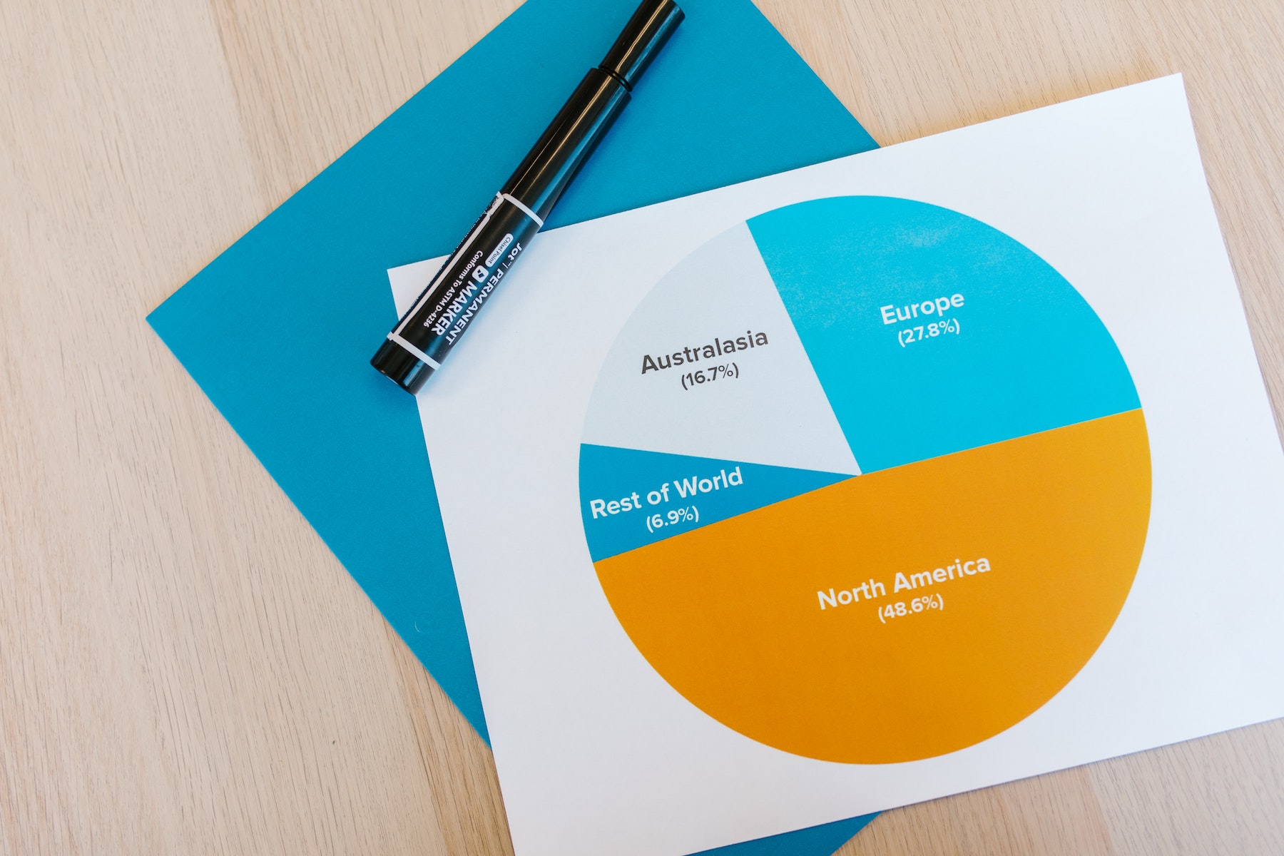 Pie chart is the information shown in a circular sectioned chart. It is a graphical representation of data where the pie slices depict the data’s relative sizes. A list of numerical and categorical variables is necessary for a pie chart. Pie, in this context, refers to the entire thing and slices it into its component portions.
The pie chart, commonly referred to as a “circle chart,” divides the circular statistical visual into sectors or portions to show mathematical issues. A proportional amount of the whole is indicated by each section. The Pie-chart is now the most effective method for determining the composition of anything. Pie charts typically take the role of other graphs, such as bar graphs, line plots, histograms, etc.
 Although a pie chart cannot precisely represent all percentages, they are utilized to depict them. A pie chart is still mostly used to illustrate percentages or components of a whole.


 There are many alternatives to pie charts such as bar and waffle charts. Let’s discuss these examples in more detail.
 FusionCharts makes creating React Native graphs simple. Without a doubt, the full JavaScript framework for interactive and dynamic charts. You can include FusionCharts in your online application using only a few lines of code. This website provides a variety of graph examples. They are all bug-free, constantly updated, and have access to the source code. Additionally, it offers one-on-one assistance to assist you in swiftly resolving technical problems and information on various charts and dashboards to assist you in comprehending all the options. FusionCharts also provides a selection of graphs and pie charts to aid in accurately visualizing your data.
Now that you know the types of pie charts, their use cases, and how to generate them, click here to start using FusionCharts.
Table of Contents
What Is a Pie Chart?
 Pie chart is the information shown in a circular sectioned chart. It is a graphical representation of data where the pie slices depict the data’s relative sizes. A list of numerical and categorical variables is necessary for a pie chart. Pie, in this context, refers to the entire thing and slices it into its component portions.
The pie chart, commonly referred to as a “circle chart,” divides the circular statistical visual into sectors or portions to show mathematical issues. A proportional amount of the whole is indicated by each section. The Pie-chart is now the most effective method for determining the composition of anything. Pie charts typically take the role of other graphs, such as bar graphs, line plots, histograms, etc.
When Should Pie Charts Be Used or Appropriate?
 Although a pie chart cannot precisely represent all percentages, they are utilized to depict them. A pie chart is still mostly used to illustrate percentages or components of a whole.
What Are the Distinct Parts of a Pie Chart?
A pie chart works well to depict data divided into discrete pieces. Use of pie chart is to compare how much each component of the data contributed to the overall data.Does a Pie Chart Have Time Representation?
Unlike other graph styles, the pie chart lacks a dimension that expresses time. Therefore, the only use of pie chart is to compare data for a single point in time. Time series analysis should not be done.Should a Pie Chart Be Used for a Few Components?
A pie chart performs well when there are few components in the sample data. For complex or large datasets, other chart alternatives are available.Does the Use of a Pie Chart Help in Easy Visualization?
A pie chart is the easiest way to see how much each group contributes to the data sample. Making it interactive and aesthetic adds to better visualization.Can a Pie Chart Help in Budget and Financial Planning?
A pie chart shows percentages and hence, can better manage budgets and keep tabs on where and what people spend their money on. This will make smarter financial decisions and plans to increase revenue and cut expenditures easier.What Are the Common Types of Pie Charts?

What Is a Donut Chart?
A donut chart is a particular type of pie chart with the distinction that its center is blank. The whole ring serves as a representation of the data series being studied. Both 2D and 3D donut charts are available. A donut chart is excellent for displaying the proportion of elements in the whole. Users can also employ doughnut slices to emphasize certain data points. The radius of the arc on the graph’s circumference is inversely proportional to the size of the dependent variable. It is employed to demonstrate the distribution of data that makes up 100%. For example, to illustrate division of population into age groups and how different product categories affect the bottom line.What Is a 3D Pie Chart?
The 3D Pie Chart is a circle divided into sections, each section representing a proportion of the total values in a dataset. The 3D pie chart’s depth enhances its aesthetic attractiveness over a flat pie chart. The graph does a great job of illustrating how the percentage of each part fits into the larger image. The size of the dependent variable has an inverse relationship with the radius of the arc on the graph’s circumference. By joining the arcs with radial lines, which breaks the pie into slices, we may get to the center of the circle. It shows the percentage breakdown of a number of variables, such as the division of sales by product category or the market share of several brands in a given sector.What Is an Exploded Pie Chart?
Exploded Pie Chart is a pie chart with one or more segments separated from one another. People enlarge the pie chart to highlight one or more portions. It is beneficial since it increases the visibility of the highlighted area. Exploded pie charts may enhance the visual appeal of the chart but may make it harder to understand. Therefore, it is essential to utilize it when required.What Are the Best Practices for Using a Pie Chart?

Should You Include Annotations?
Outside of tiny fractions like 1/4 (25%), 1/3 (33%), and 1/2 (50%), it is quite challenging to infer precise ratios from pie charts. Furthermore, pie charts often need the tick marks to estimate values directly from slice sizes if the slice values are intended to represent quantities rather than proportions.Should You Consider The Order Of Slices?
A reader can comprehend the storyline much more easily if the slices are presented in proper order. When there are categories with values that are quite comparable, a common ordering that goes from the largest segment to the smallest segment is highly helpful. Meanwhile, plotting slices in the category levels’ intrinsic ordering is typically preferable.Should You Merge The Smaller Categories?
A pie chart works well when there are only a few data types. The size of the slices gets smaller as the number of classifications rises. It’s recommended to keep the number of slices to five or less. It is preferable to mix smaller categories when there are more than five segments.What Are Some Common Pie Chart Alternatives?
 There are many alternatives to pie charts such as bar and waffle charts. Let’s discuss these examples in more detail.
What Is Absolute Frequency vs. Relative Frequency?
A frequency table is a graph that shows the prevalence or typical distribution of certain data. The frequency that an event occurs inside a particular context is what we examine when we look at frequency. Relative frequency table is a chart that displays the prevalence or pattern of a certain data distribution of the population sampled. To calculate relative frequency, we must first determine how frequently a certain event happens concerning all other events.What Is a Bar Chart?
A set of categorical data can be summarised using a bar chart. The bar plot uses several bars to illustrate data, each bar denoting a distinct category. For example, each bar’s height corresponds to a certain aggregate. The categories could include things like age brackets or regions. In order to examine how different categories contributed to each bar or group of bars in the bar chart, it is also feasible to color or divide each bar into a separate category column in the data. Read about the difference between a Pie Chart and a Bar chart.What Is a Stacked Bar Chart?
A stacked chart is a type of bar chart that displays the comparison and composition of a small number of variables through time, whether they are relative or absolute. These charts, sometimes known as stacked bars or columns, have the appearance of several columns or bars that have been layered on top of one another. Stacked bar charts are a powerful tool for comparisons when used properly, to compare sum values between different groups.What Is a Waffle Chart?
A waffle chart is just a square display that often has 100 smaller squares set up in a 10-by-10 configuration. Similar to how you would color the various slices of a pie chart, the squares are colored to correspond to the proportions you are trying to see. The chart’s name is immediately made clear by the square arrangement, which somewhat resembles a delectable waffle.Why Should You Choose FusionCharts to Make Pie Charts?
 FusionCharts makes creating React Native graphs simple. Without a doubt, the full JavaScript framework for interactive and dynamic charts. You can include FusionCharts in your online application using only a few lines of code. This website provides a variety of graph examples. They are all bug-free, constantly updated, and have access to the source code. Additionally, it offers one-on-one assistance to assist you in swiftly resolving technical problems and information on various charts and dashboards to assist you in comprehending all the options. FusionCharts also provides a selection of graphs and pie charts to aid in accurately visualizing your data.
Now that you know the types of pie charts, their use cases, and how to generate them, click here to start using FusionCharts.


