Everyone knows LinkedIn now. It is the largest professional social networking site with over 100 million members. Not to mention a certain bell they recently rang. We at FusionCharts, are proud to be a part of LinkedIn.
LinkedIn has made FusionCharts a part of a number of their paid modules, and pretty extensively at that. Whether you are job hunting and want to know what your peers in the industry are being paid, or snooping on your competitor’s vital stats, you will see FusionCharts being used liberally for everything data.
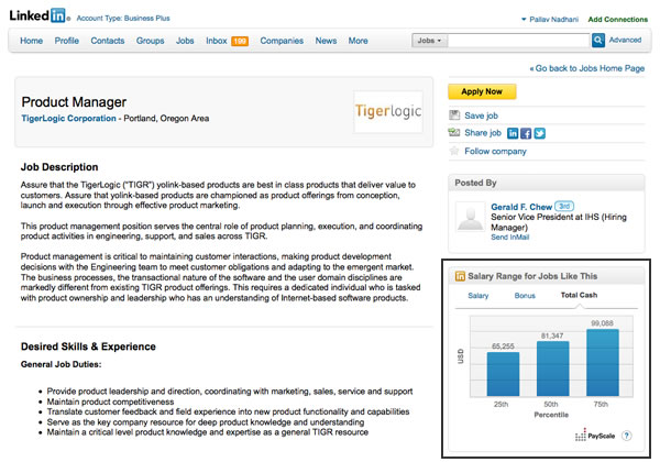
Here’s a screenshot from a job posting made by a company – one of LinkedIn’s main offerings:
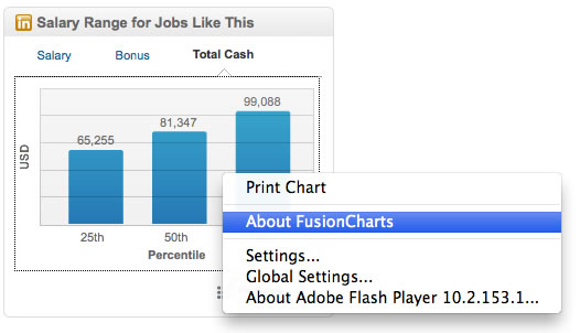
 The proof of the pudding is, of course, in the the right-click.
 On another occasion, if you head over to the company statistics section that gives you valuable insights on the employees of any company, you will see more liberal sprinkling of FusionCharts. Let’s do some snooping on LinkedIn itself to learn a lesson or two about growth.
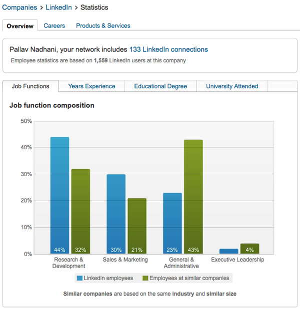 The javascript charts here are both stunning and easy-to-understand. You can get various insights like how the employees of a company are divided by job roles and how experienced they are.
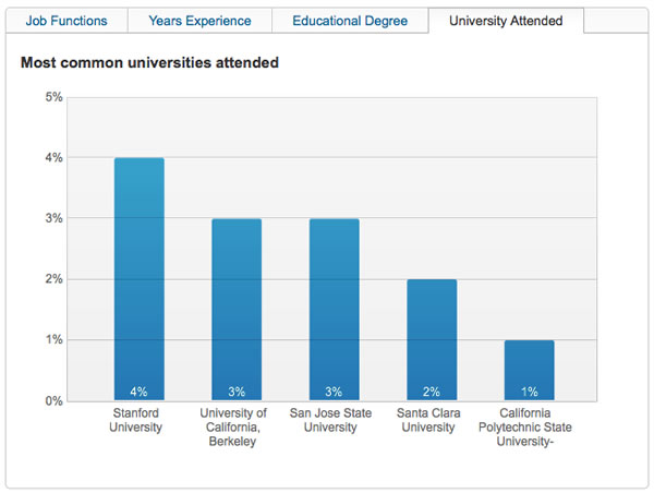
Here’s a look at the universities that the LinkedIn employees have attended:
 Now let’s take a look at something that has been the topic of many a discussions recently – How fast has LinkedIn been growing?
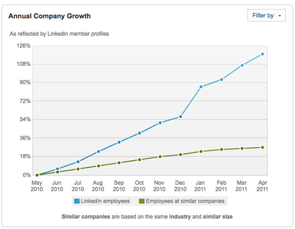 And this story, just like the others, is presented using FusionCharts.
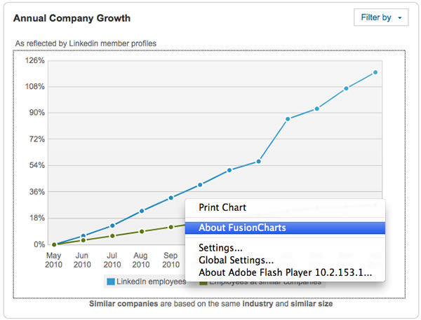 To meet some of their specific needs, LinkedIn has not shied away from modifying the source code of our charts either.
Team LinkedIn – we love what you guys have done with our charts. Keep that going, and keep growing!
 The proof of the pudding is, of course, in the the right-click.
 On another occasion, if you head over to the company statistics section that gives you valuable insights on the employees of any company, you will see more liberal sprinkling of FusionCharts. Let’s do some snooping on LinkedIn itself to learn a lesson or two about growth.
 The javascript charts here are both stunning and easy-to-understand. You can get various insights like how the employees of a company are divided by job roles and how experienced they are.
Here’s a look at the universities that the LinkedIn employees have attended:
 Now let’s take a look at something that has been the topic of many a discussions recently – How fast has LinkedIn been growing?
 And this story, just like the others, is presented using FusionCharts.
 To meet some of their specific needs, LinkedIn has not shied away from modifying the source code of our charts either.
Team LinkedIn – we love what you guys have done with our charts. Keep that going, and keep growing!



Saghar
November 21, 2012, 11:05 pmcan you provide the links to these charts on LinkedIn? I can’t find them.
Swarnam
November 26, 2012, 5:08 pmHi Saghar,
Please check out the usage of FusionCharts in Linkedn at:
https://www.linkedin.com/groups?groupDashboard=&gid=100988&trk=myg_ugrp_an&goback=.myg