Table of Contents
ClickTale
ClickTale is a Web Analytics tool that provides businesses with insights into their customers’ online behavior to optimize website performance, improve usability, and dramatically increase conversion rates.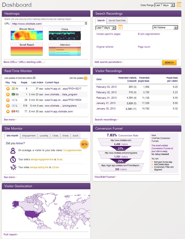 Their dashboard shows the most critical components upfront — Heatmaps, Search Recordings, Visitor Recordings, Conversion Funnel, and Visitor Geolocations. Then, you can drill down into any of them for a closer look.
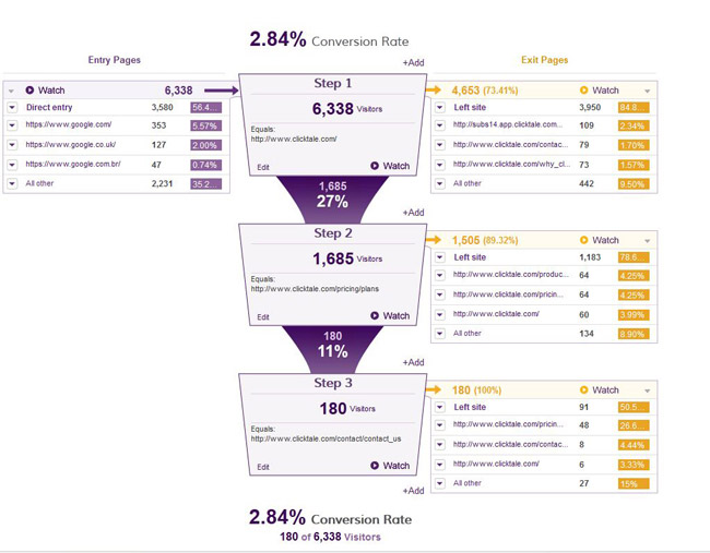 Having both the percentage and absolute values helps you analyze your data both ways. Also, the neat little captions everywhere only help further with the analysis. That’s something you will find with all their JavaScript charts so that a user is never left guessing.
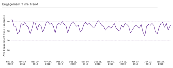 Please take careful notice of the descriptive caption and y-axis label.
[Also read: Reporting lessons you can learn from Google Analytics]
Fitbit
Fitbit is a pedometer that measures personal data such as the number of steps walked, distance traveled, calories burned, and quality of sleep. Then, it puts them together on a dashboard that becomes your stay-fit monitor. The dashboard shows a breakdown of your activity and sleep patterns, compares it to the ideal numbers, and then awards badges if you have done well. Here’s a part of the dashboard.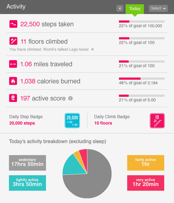
(Image credits: liverungrow.com)
Showing the activity as a percentage of the goal reached pushes you to complete it. Similarly, it adds more context to your sleep pattern by sharing info about your overall sleep efficiency.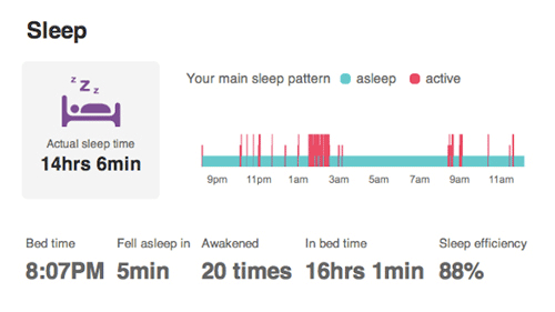
(Image credits: Gizmodo)
Sprout Social
Sprout Social is a social media management software that helps businesses manage and understand the engagement of their social presence across Twitter, Facebook, LinkedIn, and more.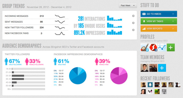
(Image credits: SlingShot SEO)
The dashboard follows a nice information hierarchy going from the overall group trends to the breakdown of demographics for Twitter and Facebook. The sparklines sum up the trend of new followers and messages in a small space, and the sweet icons for male and female followers aid data comprehension. When you dive into their Twitter report, you will find the same principles carried forward there as well.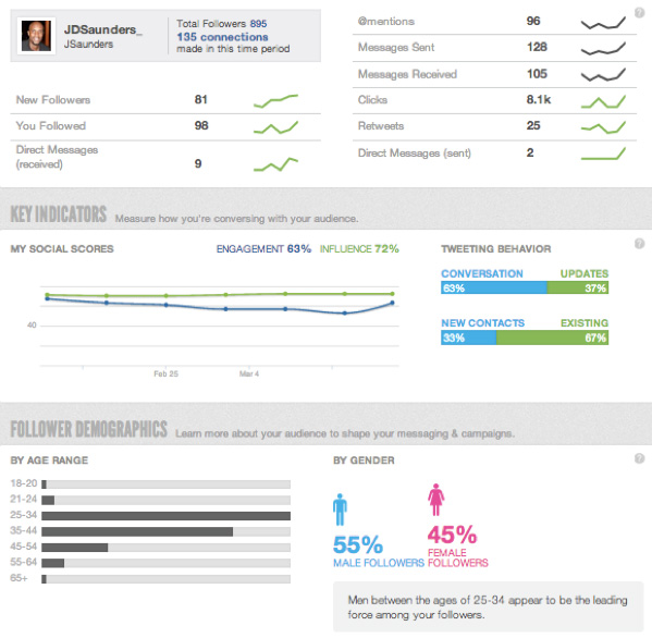
(Image credits: johnsocial.com)
MailChimp
MailChimp is an online email marketing solution to manage contacts, send emails, and track results. When you look at the report section of a particular campaign, the dashboard will show you the important metrics — Opens, Clicks, Unsubscribes, and RoI. The metrics are compared to the list and industry average to help you understand where you stand in the competitive landscape. Isn’t that sweet?
MailChimp also shows you how your list has grown over time in its reports.
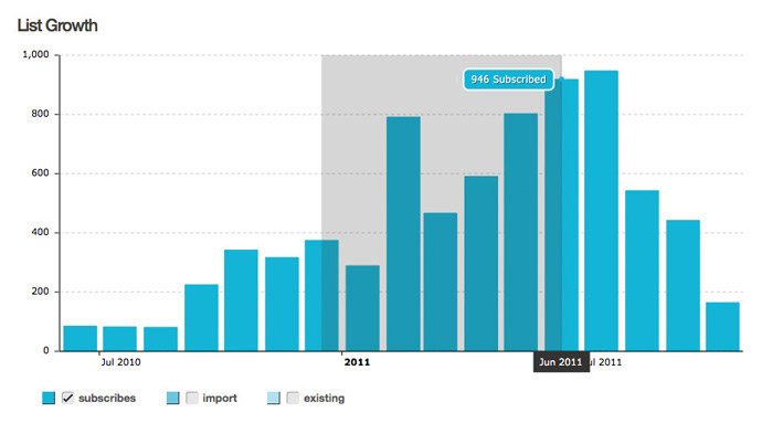 In this chart, if you just want to see the number of new subscribers, you can switch off the existing subscribers by clicking on its key in the legend. And when you want it back on, just click on it in the legend again. Also, if you want a closer look at the data for a particular period, you can simply zoom into it by selecting the time period. Now that’s what’s called power-packed reporting!
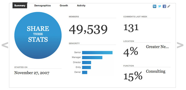 The LinkedIn reports are definitely one of the cleanest reports out there with whitespace being the only demarcator between the two metrics.
The stats are then split into 4 tabs — Summary, Demographics, Growth, and Activity — to reduce the cognitive load of each tab and break down the info into digestible chunks.
Here’s a look at the demographics tab.
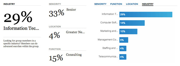 While the charts show the top 5-6 job functions, locations, and industries, the top performers have been neatly mentioned in the text itself to get a quick summary.
And in charts plotting a lot of data, for example, the number of members in the group right from the day it started, they use tooltips to give additional information about a data point. This way you have all the data you need yet the chart remains uncluttered.
 Which of these reports and dashboards did you find most inspiring? What other apps have you used with great reports and dashboards? Add them in the comments below. We would love to know.
[Bragging rights: FusionCharts is the charting partner for LinkedIn and ClickTale (PDF)]



Thomas
August 23, 2013, 6:21 amThere are some really impressive dashboards here. I particularly like the fitbit dashboard.
Are there any open source frameworks that these are based on? Any good recommendations for starting points?