
FusionTime is a revolutionary data visualization tool that provides cutting-edge features and numerous advantages for charting users that can elevate your data visualization experience to new heights.
FusionTime helps visualize time-series and stock data in JavaScript, all with just a few lines of code. Whether it’s a simple time-series chart, stock chart, millions of data points in a chart, or even complex multivariate analysis, you can render all of them with the same ease-of-use.
In this blog, we detail FusionTime’s numerous offerings and the benefits it can bring to your data visualization and reporting efforts.
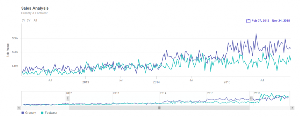
Table of Contents
FusionTime: An Overview
FusionTime is all about ease-of-use when it comes to visualizing large amounts of complex data, and its supported feature-set reflects its purpose. The tool offers includes time navigator, date range selectors, tool-tips with cross-lines, an interactive legend, and other interactive capabilities. Furthermore, customers may plot their data as a column, line, area, candlestick, OHLC, and even variations like stacked column & area, and then overlay these with event and data markers. Below, we break down the numerous facets of FusionTime and how you can leverage it.1. Interactive and Real-time Visualization
FusionTime provides an interactive and real-time visualization environment, enabling users to create dynamic charts and graphs that respond to user interactions and data updates in real-time. With FusionTime, customers can bring their data to life and create engaging visualizations that captivate your audience. Whether it’s stock prices, sales data, or sensor readings, FusionTime empowers them all to explore and present the data in a compelling manner.2. Time Series Visualization
One of FusionTime’s standout features is its ability to handle time series data effortlessly. Time-based data, such as historical trends, stock prices, or weather patterns, can be visualized seamlessly using FusionTime’s intuitive and robust interface. Customers can zoom in and out, pan across time periods, and analyze intricate details of their data with ease, unlocking valuable insights hidden within temporal patterns.3. Wide Range of Chart Types
FusionTime offers a diverse selection of chart types, allowing the customers to choose the most suitable visualization for the data. From line charts and area charts to candlestick charts and heat maps, FusionTime covers a broad spectrum of visualization options. This versatility ensures that customers can effectively represent their data, regardless of its nature or complexity.


