If you have ever done anything web, chances are you have heard of Google Analytics. Heck, you would have dived into it and spent countless hours together. It does a great job of pulling out vital stats from the ocean of data that website analytics can be, and presents it to us in an easy-to-understand way. There are some very valuable reporting lessons we can learn from Google Analytics that we will discuss here.
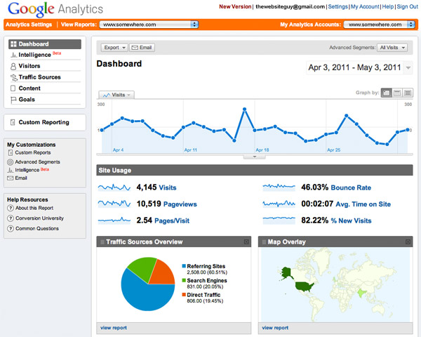
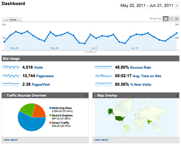 You would notice that the data is not only prioritized correctly, it is summarized well too. They make use of small word-sized graphics called sparklines to summarize the important stats in a small space. And to make it even more usable, they put the actual figures in text as well to give you a context of the graph.
 Also, every time you are plotting two metrics on a chart, they use dual axes for it. Many a times, when the metrics you are plotting have a similar magnitude (say number of visitors and page views), you would be tempted to use the same y-axis for that. It saves time, so why not? 🙂 But what happens is that the metric with the bigger magnitude (page views in this case) pushes the upper limit of the chart higher making the changes in the other metric over time (visitors) seem less obvious. In other words, the ups and downs in the number of visitors would not be very pronounced since the upper limit of the chart is pretty high. As I have discussed earlier, this is in fact a good way to report poor performance and get away with it. So Google Analytics using a dual y-axis chart every time there are two metrics being plotted on the chart makes sure that such unintended manipulations do not creep in.

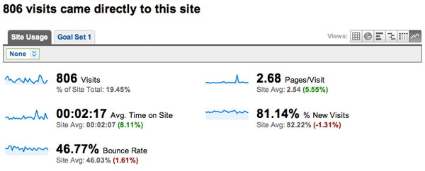 By comparing this data to the site average, Analytics gives me such an easy way to understand the behavior of my direct visitors. They spend more time on the site and see more pages per visit (as expected) but very surprisingly have a higher bounce rate than the rest of the visitors. The context immediately makes all the data meaningful. Without it, I would be comparing all these metrics to some other standard benchmark metrics or would have to do it manually which would have taken up a lot of time.
What else can we learn from Google Analytics about reporting? Is there anything from here that you have already implemented? We would love to know in the comments.

Good prioritization of data
As soon as you log in, you will see that all the data is laid out in order of priority. The amount of traffic your site is generating is the first thing you will want to know. Then you would like to know how many pages the visitors are viewing, how much time they are spending and where they are coming from both in terms of URL and geography. Google Analytics understands your needs very well. You would notice that the data is not only prioritized correctly, it is summarized well too. They make use of small word-sized graphics called sparklines to summarize the important stats in a small space. And to make it even more usable, they put the actual figures in text as well to give you a context of the graph.
Right chart selection
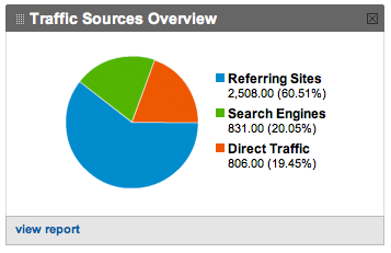
The chart selection is done correctly too. The line chart used for showing the total number of visits is perfectly suited for showing the overall trend of traffic. The usage of the pie chart for showing the different traffic sources is spot on as well. Essentially the pie chart is showing composition of data, i.e. how your entire traffic breaks down into its constituents. Also, every time you are plotting two metrics on a chart, they use dual axes for it. Many a times, when the metrics you are plotting have a similar magnitude (say number of visitors and page views), you would be tempted to use the same y-axis for that. It saves time, so why not? 🙂 But what happens is that the metric with the bigger magnitude (page views in this case) pushes the upper limit of the chart higher making the changes in the other metric over time (visitors) seem less obvious. In other words, the ups and downs in the number of visitors would not be very pronounced since the upper limit of the chart is pretty high. As I have discussed earlier, this is in fact a good way to report poor performance and get away with it. So Google Analytics using a dual y-axis chart every time there are two metrics being plotted on the chart makes sure that such unintended manipulations do not creep in.

Addition of context
Another thing that you will find very useful is the context Google Analytics adds to data. When I want to take a look at the behavior of people who visit our site directly (as opposed to a search engine or a referring site), I get to see something like this: By comparing this data to the site average, Analytics gives me such an easy way to understand the behavior of my direct visitors. They spend more time on the site and see more pages per visit (as expected) but very surprisingly have a higher bounce rate than the rest of the visitors. The context immediately makes all the data meaningful. Without it, I would be comparing all these metrics to some other standard benchmark metrics or would have to do it manually which would have taken up a lot of time.
What else can we learn from Google Analytics about reporting? Is there anything from here that you have already implemented? We would love to know in the comments.



Dipanmoy
July 6, 2011, 2:02 pmThis is done by Adobe’s Omniture too 🙂