
Table of Contents
Key takeaways
- AI is revolutionizing data visualization by automating insights and simplifying complex analysis.
- Ask FusionDev AI accelerates chart development within FusionCharts through smart, AI-powered assistance.
- This blog compares 10 top AI data visualization tools for 2026, covering their key functionalities, pros, cons, and ideal use cases.
- Great AI visualization tools share four traits: user-friendliness, seamless data connectivity, customization power, and built-in collaboration.
- Tools range from all-in-one BI platforms (Tableau, Domo, Yellowfin) to natural-language and no-code options (ThoughtSpot, Polymer, Infogram) to developer-first solutions (Quadratic AI, Explo).
Do you feel like your data is a cryptic puzzle, hiding its true potential? Imagine effortlessly transforming complex datasets into clear, insightful stories. This is the power of Artificial Intelligence in data visualization. Traditionally, creating impactful visuals demanded time and expertise, often slowing businesses down.
But the game is changing! In 2026, AI-powered data visualization tools now automate tasks, streamline workflows, and enable anyone, regardless of technical skill, to tell compelling data stories. In this blog, we’ll explore the Top 10 AI Data Visualization Tools for 2026, designed to enhance visual design, uncover insights, and revolutionize how you interact with your data.
AI in data visualization – a new era of insights
While traditional data visualization has been a powerful tool, it often requires significant manual effort and expertise. This limited the ability to uncover hidden insights and tell compelling data stories. However, the integration of AI visual tools is ushering in a new era of data visualization, empowering users at all levels to unlock the true potential of their data.
How AI is revolutionizing the data visualisation game?
- Intelligent Automation: Forget tedious tasks like chart selection and data cleaning. AI can analyze your data and automatically recommend the most appropriate visualizations, saving you time and effort.
- Smart Data Discovery: AI acts as a virtual detective, uncovering hidden patterns, trends, and relationships within your data that might go unnoticed by human eyes. This empowers you to delve deeper and explore new possibilities.
- Real-time insights: AI can create interactive visualizations that update dynamically, reflecting changes in your data in real time.
- Enhanced data preparation: Cleans and enriches data for accurate, reliable visuals. (suggest)
What Are the Differences Between Traditional BI and AI Visualization?
Traditional BI tools require analysts to manually query data, choose chart types, and interpret results, a process that can take hours per report. AI visualization platforms handle much of this automatically:
| Features | Traditional BI | AI Visualization |
| Chart selection | Manual, based on analyst experience | Automated, based on data patterns |
| Data prep | Time-intensive manual cleaning | AI-assisted cleaning and enrichment |
| Insight discovery | Relies on analyst expertise | AI surfaces hidden trends automatically |
| Querying | SQL or dashboard filters | Natural language questions |
What makes a truly great AI data visualization tool?
Beyond the core AI functionalities, here are some key features to consider:
- User-friendliness: Intuitive interfaces that work for non-technical users.
- Data Connectivity: Integrates seamlessly with your data sources while ensuring data security.
- Customization Power: Lets you tailor charts, layouts, and branding.
- Collaboration: Supports sharing and teamwork for effective data storytelling.
By leveraging the power of AI and choosing the right tools, you can unlock the hidden gems within your data and transform it into impactful stories that drive informed decision-making. Organizations looking to scale these efforts often rely on AI consulting services by Kanerika to implement AI solutions with a clear strategy and measurable business impact.
What Are the Top 10 AI Data Visualization Tools for 2026?
A new era of innovation in data presentation and interpretation has been caused by the increasing demand for quicker, smarter insights. Users can automate difficult tasks, produce real-time insights, and find patterns with little effort when they use AI for data visualization.
1. Ask FusionDev AI – your AI-powered co-pilot for streamlined data visualization

As a leading provider of data visualization solutions, FusionCharts is proud to introduce Ask FusionDev AI, a revolutionary integration that empowers you to unlock the full potential of your data. If you’ve ever thought about which AI tool is best for analyzing and visualizing data, Ask FusionDev AI goes beyond traditional data visualization tools by acting as your personal AI assistant, streamlining your workflow, and accelerating development cycles.
Key functionalities
- AI-powered documentation retrieval and code suggestions
- Automated chart generation based on user inputs
- Context-aware help for troubleshooting and visualization best practices
- Seamless integration into the FusionCharts 4.0 environment
Target audience
- Developers, product managers, and analysts using FusionCharts
- Teams looking to reduce development time and streamline data storytelling
- New users seeking guided help for creating compelling visuals
Pros
- Eliminates manual documentation searches with instant AI-powered search responses
- Speeds up chart development with smart code snippets
- Offers consistent support 24/7 through natural language queries
Cons
- Currently limited to the FusionCharts ecosystem
- May require onboarding for non-technical users unfamiliar with AI assistants
Unique features
- AI trained on up-to-date, expert-curated knowledge base
- An interactive and intelligent assistant available directly inside FusionCharts
- Auto-generation of code snippets and visual charts for developers
- Hands-on, conversational support to guide you through chart customization and integration
Get a head start with your free trial of FusionCharts 4.0 and unlock the full potential of your
data, with Ask FusionDev AI as your guide!
2. Yellowfin BI: the comprehensive BI solution with AI-driven insight
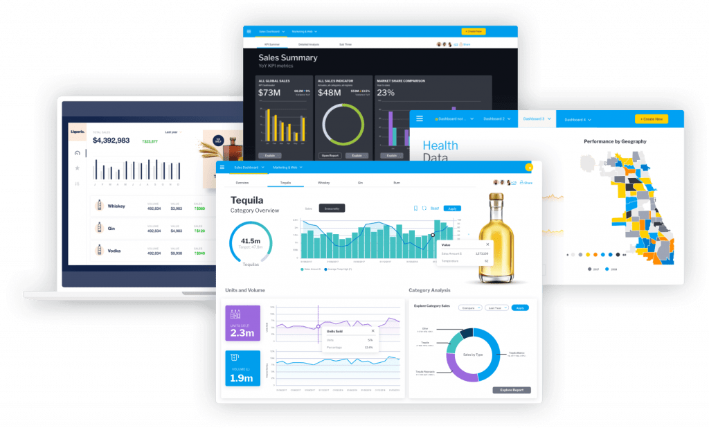
Yellowfin BI stands out as a powerful end-to-end business intelligence platform designed to turn complex data into actionable insights. It blends automation, AI, and collaboration tools to help businesses make faster, smarter decisions.
Key functionalities
- Automated business monitoring (ABM) for continuous data analysis and alerting
- Machine learning (ML) to enhance predictive analytics and automate insights
- Natural language query (NLQ) for intuitive data interaction using everyday language
Target audience
- Business analysts, data scientists, and non-technical users/li>
- Enterprises looking for a comprehensive BI solution with advanced AI capabilities
Pros
- A comprehensive suite of AI-driven features for deep data insights
- User-friendly interface with guided NLQ for easy data querying
- Real-time monitoring and alerting for proactive decision-making
Cons
- May require a learning curve for users new to advanced AI functionalities/li>
- Higher cost for full feature access compared to some competitors
Unique features
- Yellowfin Signals: Automated alerts for significant data changes and patterns
- Assisted Insights: Click-to-analyze feature providing immediate, actionable insights
- Guided NLQ: Proactively generates data filters and suggestions to simplify querying
3. Quadratic AI: the AI spreadsheet with Python-powered data visualization
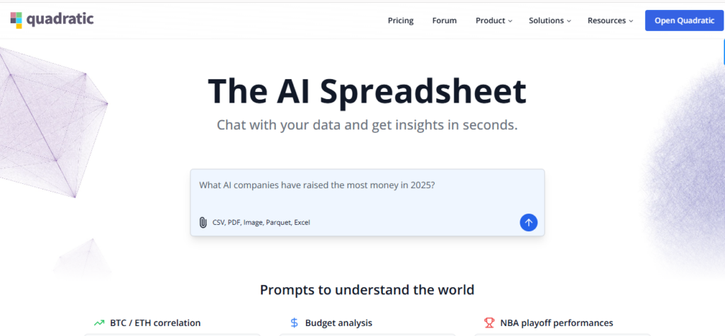
Quadratic AI bridges the gap between spreadsheets and coding notebooks, empowering teams to analyze and visualize data using Python, SQL, or JavaScript—all within a familiar interface.
Quadric AI spreadsheet homepage screenshot for Fusioncharts AI tool listicle
Key functionalities
- Native AI chat to generate charts, summary tables, and narratives automatically
- Code cells for Python, SQL, and JavaScript alongside traditional formulas
- Live dashboards that refresh as data or code changes
- Easy data imports from databases, APIs, CSVs, PDFs, and images with AI-powered parsing
- Real-time multiplayer editing with granular permissions
Target audience
- Data-driven teams that want self-serve analytics without heavyweight BI tools
- Marketers, product managers, and educators who feel at home in spreadsheets
- Developers who need code-level flexibility without juggling notebooks
Pros
- Familiar spreadsheet interface lowers the learning curve for non-technical users
- Combines AI, formulas, and full programming languages in a single workspace
- Free individual tier, plus SOC 2 & HIPAA-compliant options for enterprises
- Seamless collaboration—no version-control nightmares or “file-locking” alerts
Cons
- Browser-based environment can strain with billion-row datasets
- Advanced coding features may require ramp-up for spreadsheet-only users
Unique features
- AI Research agent that sources web data and surfaces citations in chat
- Prompt Library and ready-made templates for rapid insight generation
- Optional self-hosting for organizations with strict data-residency needs
- Automated AI formatting for presentation-ready dashboards
4. Infogram: the all-star for interactive storytelling
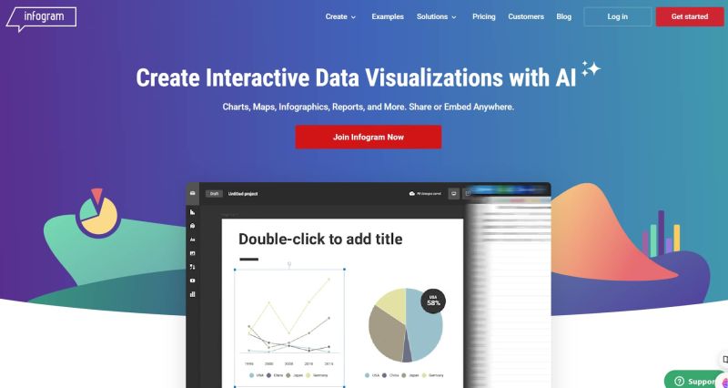
Infogram is the go-to tool for turning raw data into captivating visuals, making it perfect for marketing teams, journalists, and educators aiming to tell stories through data.
Key functionalities
- Drag-and-drop interface for easy chart creation
- Extensive library of interactive chart types
- Real-time data updates and dynamic dashboards
- Collaboration features for seamless teamwork
Target audience
- Marketers, designers, and business professionals
- Anyone who wants to create engaging and interactive data visualizations
Pros
- User-friendly interface with a minimal learning curve
- Wide variety of chart types and customization options
- Ideal for creating data stories that resonate with audiences
Cons
- Limited data source integrations compared to some competitors
- The free plan has restrictions on features and exports
Unique features
- AI-powered recommendations for chart types based on your data
- Automated data storytelling features to help you craft compelling narratives
5. ThoughtSpot: ask natural language questions, get AI-powered answers
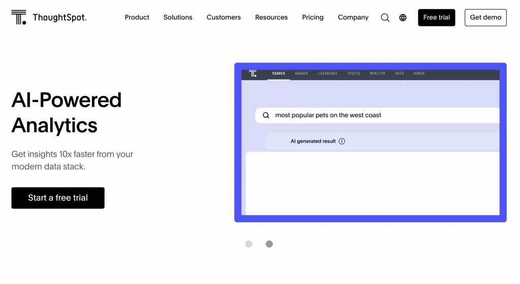
ThoughtSpot revolutionizes analytics by allowing users to explore data simply by asking questions in natural language, instantly turning those queries into powerful visual insights.
Key functionalities
- Explore data using natural language search queries
- Unveils hidden patterns and trends through AI analysis
- Creates data visualizations tailored to your specific questions
Target audience
- Business analysts, data scientists, and non-technical users
- Anyone who wants to gain insights from data without complex queries
Pros
- Natural language interface makes data exploration accessible
- AI uncovers insights you might miss with traditional methods
- Empowers data-driven decision-making for all user levels
Cons
- It can be expensive for large-scale deployments
- Requires some training to leverage advanced functionalities
Unique features
- AI-powered search that understands context and intent
- Automated data storytelling capabilities
6. Tableau: user-friendly champion with AI-powered insights
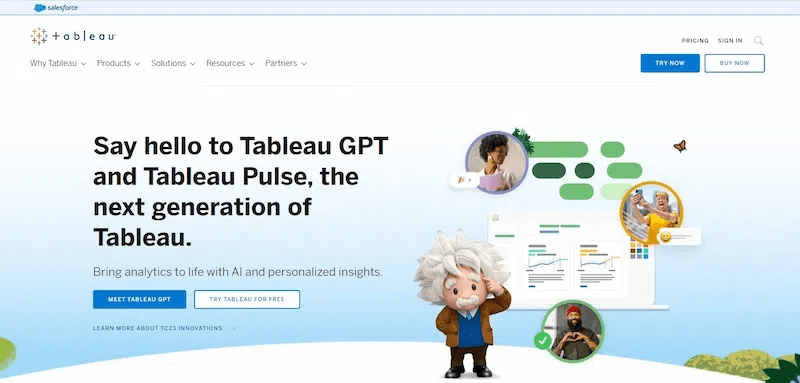
Tableau remains one of the most recognized BI tools, offering users intuitive data visualization and AI-powered analytics that enhance both data exploration and storytelling.
Key functionalities
- Cloud-based platform for creating interactive dashboards and reports
- Connects seamlessly with Google Cloud data sources
- AI-powered recommendations for charts and data exploration
Target audience
- Data analysts, business intelligence professionals, and data visualization specialists
Pros
- User-friendly interface with powerful features
- Extensive data source integrations for flexibility
- AI-driven insights augment human analysis capabilities
Cons
- Can be expensive for enterprise-level usage
- The steep learning curve for advanced functionalities
Unique features
- Tableau AI features for automated data analysis and visualization suggestions
- Integration with other analytics platforms like Salesforce and Google BigQuery
7. Domo: proactive insights with AI-driven actionable recommendations
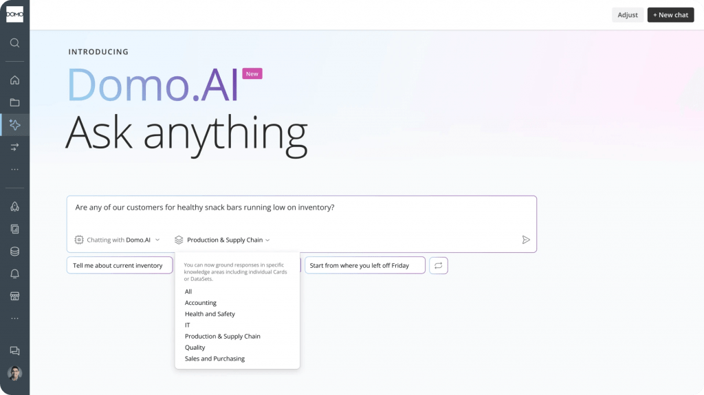
Domo combines business intelligence, AI, and collaboration into one platform, empowering teams to act on data insights proactively with real-time alerts and AI-driven recommendations.
Key functionalities
- All-in-one business intelligence platform for data visualization, analytics, and collaboration
- AI-powered recommendations for insights and actions
- Real-time data monitoring and alerts
Target audience
- Enterprises looking for a comprehensive BI platform
- Ideal for organizations that require data-driven decision-making across all departments
Pros
- Comprehensive BI platform with a wide range of features
- AI proactively identifies trends and suggests actions
- Real-time data monitoring ensures informed decision-making
Cons
- The most expensive option on this list
- The steep learning curve for the complex feature set
Unique features
- AI-driven recommendations go beyond just insights, suggesting actionable steps
- Real-time data monitoring and alerts for proactive decision-making
8. Polymer: AI dashboard builder for instant data insights
It is a powerful AI visual analysis platform and data visualisation tool that transforms raw spreadsheets into dynamic dashboards with zero coding required. With an emphasis on speed and automation, it helps users instantly identify patterns, trends, and actionable insights.
Key functionalities
- One-click data import and automatic dashboard generation
- AI-powered insights discovery and trend detection
- Dynamic filtering and search across datasets
- Easy integration with Google Sheets, CSVs, and other data sources
Target audience
- Small teams and business users looking for fast data insights
- Non-technical professionals who work with spreadsheets
- Startups and SMBs need agile reporting and lightweight BI
Pros
- Intuitive, no-code interface for rapid dashboard creation
- Affordable pricing with a free plan available
- Great for quick exploratory analysis and decision support
Cons
- Limited customisation compared to enterprise-level tools
- May not scale for large, complex datasets or advanced analytics
Unique features
- AI-powered dashboards
- AI “Smart Insights” that explain data shifts in plain language
- Google Sheets add-on for seamless spreadsheet connectivity
9. Julius: the marketing intelligence tool with AI data visualization
Julius brings together AI-powered data visualization and marketing analytics, making it ideal for brands that want to turn campaign data into performance insights. It simplifies analysis with natural language search and intelligent dashboards.
Key functionalities
- Natural language query for exploring marketing metrics
- Campaign performance dashboards are built automatically
- AI-generated insights for paid, owned, and earned media
Target audience
- Marketing teams and agencies focused on digital performance
- CMOs and brand managers looking for centralized analytics
- Professionals who want simplified, cross-channel reporting
Pros
- AI automates report creation, saving marketing teams hours
- Provides unified campaign insights from multiple platforms
Cons
- Primarily focused on marketing data — limited beyond that
- More expensive than general-purpose data tools
Unique features
- Julius GPT for automated insights and campaign recommendations
- Marketing-specific KPIs baked into visualizations
- Campaign annotation and storytelling tools for client reporting
10. Explo: embed interactive dashboards with developer flexibility
It empowers developers to embed interactive dashboards into web apps or SaaS platforms. It combines the ease of drag-and-drop dashboarding with SQL-powered flexibility, making it a go-to tool for product teams.
Key functionalities
- SQL-powered interface for customized queries and charting
- No-code drag-and-drop dashboard builder for rapid iteration
- Secure embedding and permissions-based access control
Target audience
- SaaS companies and product teams embedding analytics into apps
- Developers needing control and customization
- B2B platforms requiring white-labeled dashboards
Pros
- Developer-first approach without sacrificing usability
- Secure, granular data access controls for embedded analytics
Cons
- May require SQL knowledge for more advanced use
- Limited built-in AI functionalities compared to others on this list
Unique features
- Whitelabeling for seamless product integration
- Supports both internal dashboards and customer-facing analytics
- Rapid setup and deployment without full-scale BI tools
What Are the Best Practices for Effective AI Data Insights?
- Start with clean, well-connected data sources — AI can only surface accurate insights if the underlying data is reliable.
- Match the tool’s AI features to your team’s technical skill level rather than choosing the most feature-heavy option available.
- Treat AI-generated insights as a starting point, and pair them with human review before acting on major decisions.
- Revisit your dashboards regularly, since AI recommendations tend to improve as more data flows through the system.
Which Industries Benefit from Automated Data Insights?
- Marketing: Campaign performance tracking and cross-channel reporting, as seen in tools like Julius.
- Retail and SaaS: Customer-facing embedded analytics and real-time operational dashboards, as seen in tools like Explo.
- Finance and enterprise operations: Real-time monitoring and proactive alerting, as seen in tools like Domo and Yellowfin BI.
- Product and engineering teams: Self-serve, code-level analytics without a dedicated BI team, as seen in tools like Quadratic AI.
How Does Natural Language Processing Assist Data Exploration in Visualization Tools?
Natural language processing (NLP) lets users ask questions about their data in plain English instead of writing queries or navigating complex filters. The tool interprets the intent behind the question and automatically generates the relevant chart or answer — a capability built into platforms like ThoughtSpot’s natural language search and Yellowfin’s guided NLQ.
Conclusion
Artificial Intelligence is reshaping how we visualize and interact with data. With the rise of these powerful AI Data Visualization Tools from user-friendly platforms like Infogram to robust developer-focused tools like Expol, there’s a solution for every data need. And with FusionCharts’ Ask FusionDev AI, users can now leverage expert-level support and automation within a single intuitive interface.
FAQs
What are the top AI-powered data visualization tools available?
Leading options for 2026 include Ask FusionDev AI, Yellowfin BI, Quadratic AI, Infogram, ThoughtSpot, Tableau, Domo, Polymer, Julius, and Explo — each suited to different team sizes, technical skill levels, and use cases.
How do intelligent tools enhance data storytelling?
AI enhances data storytelling by automatically recommending the right chart types, surfacing narrative-worthy trends, and even generating plain-language summaries of what the data shows — turning raw numbers into a story anyone can follow.
Can you recommend AI tools for creating interactive data dashboards?
Yes — Infogram, Polymer, and Explo are all strong choices for interactive dashboards, ranging from no-code drag-and-drop builders to developer-first, embeddable options.
What are the benefits of using automated data insight platforms?
Automated data insight platforms save time on manual analysis, catch patterns humans might miss, provide real-time updates as data changes, and make advanced analytics accessible to non-technical users.
What are the key features of advanced analytics dashboards?
Strong analytics dashboards typically offer real-time data updates, natural language querying, customizable visualizations, and secure, seamless connectivity to your existing data sources.
How do AI data visualization tools compare for business intelligence purposes?
BI-focused AI tools like Tableau, Domo, and Yellowfin emphasize enterprise-scale dashboards, monitoring, and alerting, while more specialized tools like ThoughtSpot and Julius focus on natural-language exploration or marketing-specific analytics, respectively.
Which AI data visualization services offer free trials or demos?
FusionCharts offers a free trial that includes access to Ask FusionDev AI, and several other platforms on this list, including Polymer and Quadratic AI, offer free tiers or trials to test core functionality before committing.
What skills are needed to use AI visualization software?
Most modern AI visualization tools are designed for non-technical users and require no coding at all, though developer-focused platforms like Quadratic AI and Explo offer optional SQL or Python-level flexibility for more advanced use cases.
What AI solutions are best for visualizing large datasets efficiently?
Enterprise-grade platforms like Tableau, Domo, and Yellowfin BI are generally built to handle large, complex datasets more efficiently than lightweight, browser-based tools.
