Understanding the Significance of Spark Charts in Data Visualization

Understanding the Significance of Spark Charts in Data Visualization
- Unveiling the Spark Chart
- History & Applications of Spark Charts
- Types of Spark Charts
- Best Practices for SparkCharts Usability
- Spark Charts in Information Dashboards
- References
Unveiling the Spark Chart
Let's consider this chart:
This chart plots the website traffic for the last 24 months. Now you have an idea as to how your website has done this month with respect to its past performance. This "data-intense, design-simple, word-sized graphic" which is used to visualize the general shape of a variation (in this case, your website traffic) is called the Spark Chart, so called because of their "active quality over time". Designed by Edward Tufte, this chart does not have any axes and coordinates.
Unlike other charts, Spark Charts are placed within the content and are used to provide a quick context to data without taking too much space.
Check out live examples of Spark Charts in our charts gallery and JSFiddle gallery.
History of Spark Charts
Spark Charts are not a new concept. In his book, Beautiful Evidence, Tufte shows some examples from Galileo's works where he used small graphics adjacent to texts to show how planets like Saturn can be seen through the telescope.
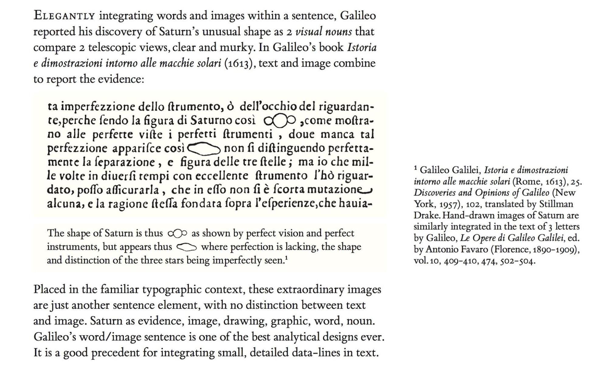
Image source: edwardtufte.com
Images embedded within text have found their use in other fields as well.
Rockwell Kents illustrated work on Candides' Voltaire.
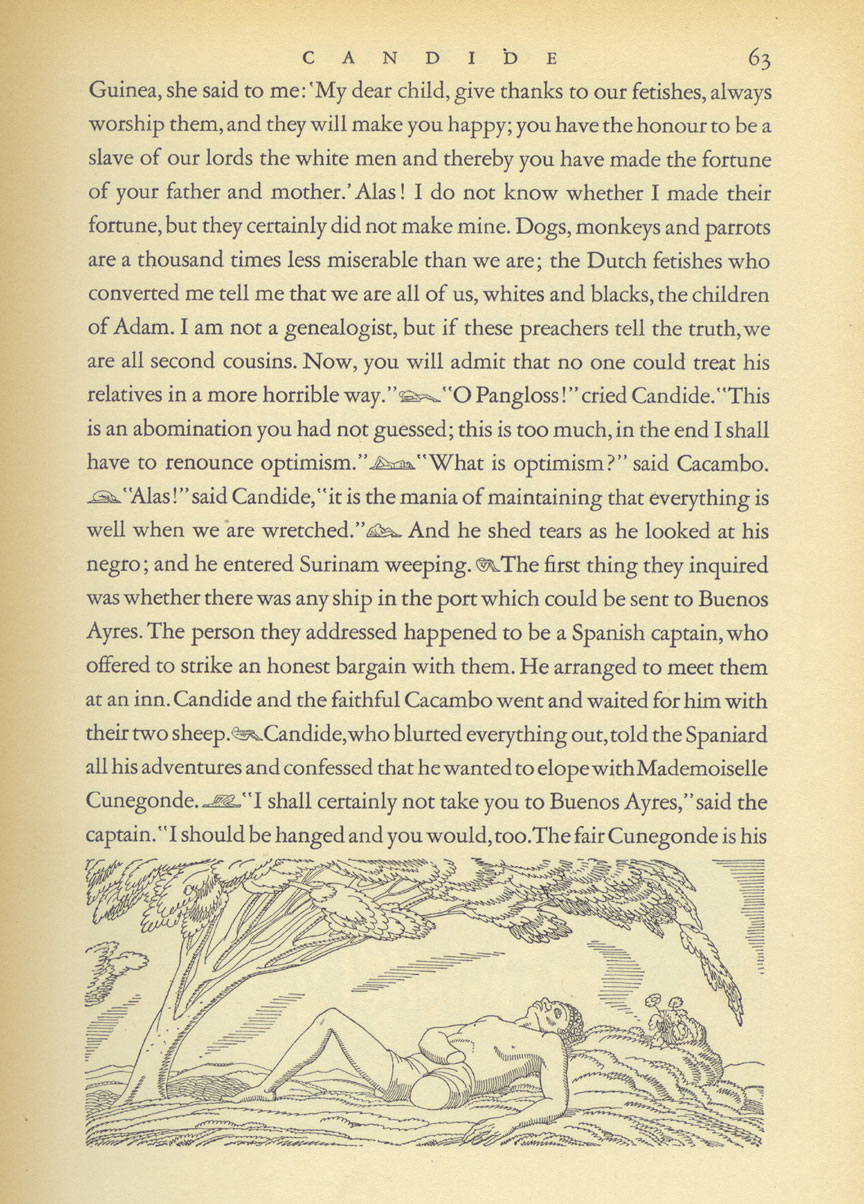
Image source: edwardtufte.com
Mike Richmond "Walking Bass Techniques," in The Bass Player Book.
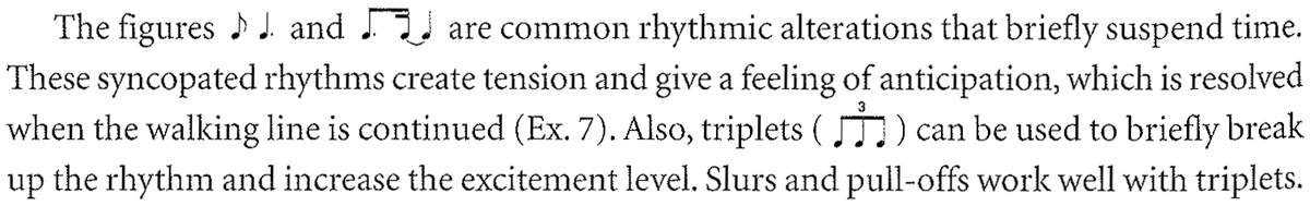
Image source: edwardtufte.com
Today, Spark Charts find applications in data visualizations across the board―stock price monitoring, temperature displays, patient monitoring systems, etc.
Types of Spark Charts
Sparklines are the most commonly used Spark Charts followed by the Spark Column and the Spark Win/Loss chart.
- Sparklines: Similar to a Line chart, Sparklines are used to visualize data that is continuous (time series).
E.g., Website Traffic
Spark Columns: Similar to a Column chart, Spark Columns are used to facilitate comparison. E.g., Revenues earned
Spark Win/Loss: A Spark Win/Loss chart is used to visualize a Win/Loss scenario, e.g., the Yankees' current season results. The upward column indicates a Win, the downward column indicates a Loss, and the flat column (3rd from left) indicates a Draw.
Usability tips on using the Spark Charts
1.Aspect Ratio
The aspect ratio is the ratio of the width of a shape to its height. It plays an important role in the display of a graphic. Consider this example:
All the three Sparklines above represent the same data but look very different due to the difference in their aspect ratios.
By its very nature, a Spark Chart has to be wider than higher. In his work, Visualizing Data, William S. Cleveland shows how the aspect ratio of a line chart can affect an analyst's perception of trends in the data. He suggests that the variations in slopes are best detected when the slopes are around 45°, uphill or downhill. This technique is called banking to 45°.
Tufte draws on this idea and suggests that for a Sparkline, use the maximum reasonable vertical space available under the wordlike constraint; then adjust the horizontal stretch of the timescale to meet the criterion of the overall average of 45-degree slopes, uphill and downhill, throughout the time-series. Simply put, the chart should be more lumpy (Fig:1) than flat or spiky(Fig: 2 & 3).
2. Add reference points
As mentioned earlier, Spark Charts do not have axes and coordinates and as such have no explicit reference points. To overcome this, we can use color coding and trendlines to highlight areas of special interest.Colors to highlight specific data value The Sparkline below uses blue for Open & Close price, green for High and red for Low in this stock sparkline chart.
The Spark Column chart below uses green and red to highlight maximum and minimum revenues respectively.
The Spark Win/Loss chart below uses gray when there is a Win and red when there is a Loss. Additionally, the flat gray column (3rd from left) symbolizes a Draw.
Industry average/target as trendline The chart below plots the industry average stock price as a trendline. It helps to identify how a particular stock is doing with respect to the industry average. Alternatively, target value as a trendline can help identify how far the achieved value is from the target.
Spark Charts in information dashboards
In addition to the use cases already mentioned in the article, due to their compact sizes and their ability to convey a lot of information, Spark Charts are gradually finding their use in information dashboards too. They help provide context to nuanced analysis as well as remove dependency on the most recent data for making decisions (recency bias). When multiple Sparklines representing different metrics are used together, they provide the user with a quick snapshot in one glance. Here are some examples of dashboards using Spark Charts.Google Analytics uses Sparklines to summarize the variation in metrics like Visits, page views, Average Visit Duration, etc. Users get an overall picture on a single screen and have the option to drill down for more details.
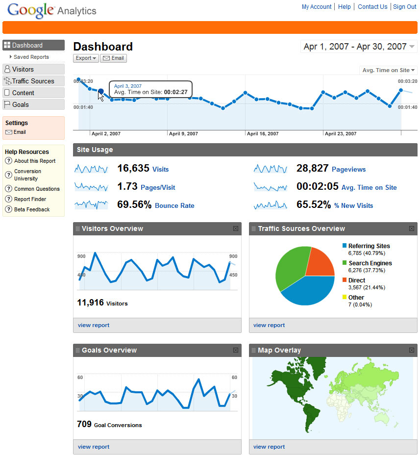
Image source: google.com/analytics
Google Finance's Stock screener uses Spark Columns to help users choose stocks with features in a certain range.
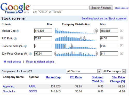
Image source: google.com/finance/stockscreener
SproutSocial uses color-coded Spark Charts to visualize the variation in metrics like New Twitter Followers, New Facebook Fans, Incoming Messages, etc.
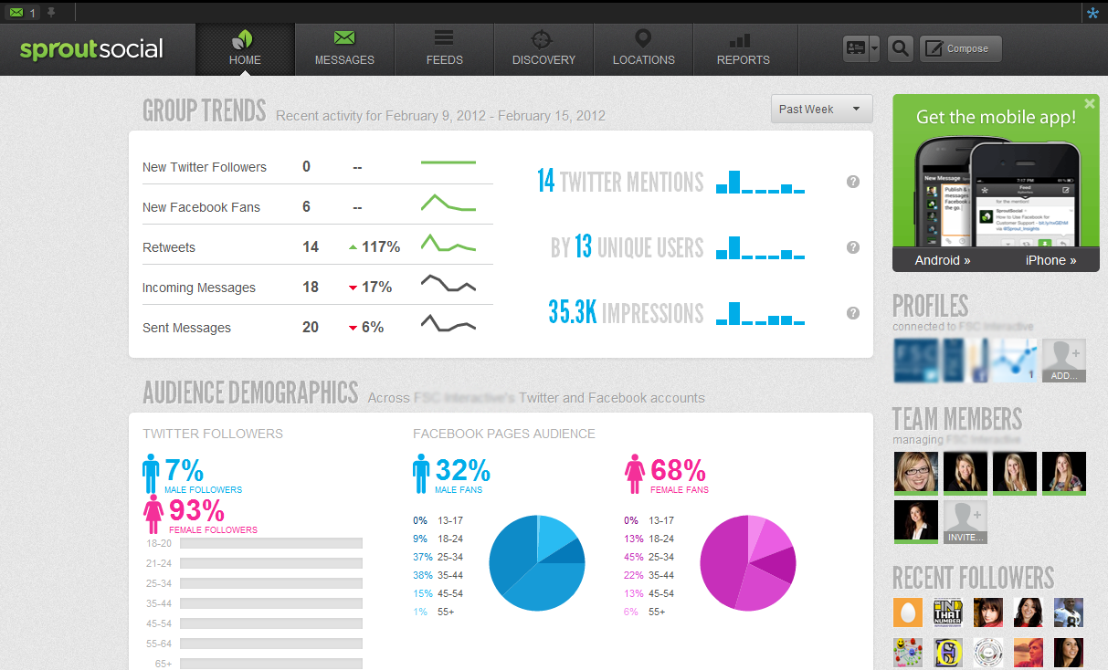
Image source: sproutsocial.com
Spark Charts are pretty amazing tools for presenting data in a clear and engaging way. Instead of bombarding people with lots of numbers and graphs, Spark Charts distill the essential info into tiny packages that are easy to digest. This makes them perfect for all sorts of applications, whether it's business reports, dashboard displays, or even social media posts.
Just remember to use them wisely and consider the unique needs of your audience. With practice, you'll find that these little powerhouses can deliver big results! FusionCharts is your one-stop solution for all your charting needs. Click here to get a free 14-day trial.


